Jarvis TaxFlex

Jarvis TaxFlex

Salary sacrifice impact calculator for employers

Salary sacrifice impact calculator for employers

My role

Lead designer

Skills
Responsive design
Data Visualization
Accessibility design
Project MGMT
Team

1 Marketing Mnagaer, 1 PM &
1 Developer

Timeline:

6 Weeks

(Shipped in Jan 2025)
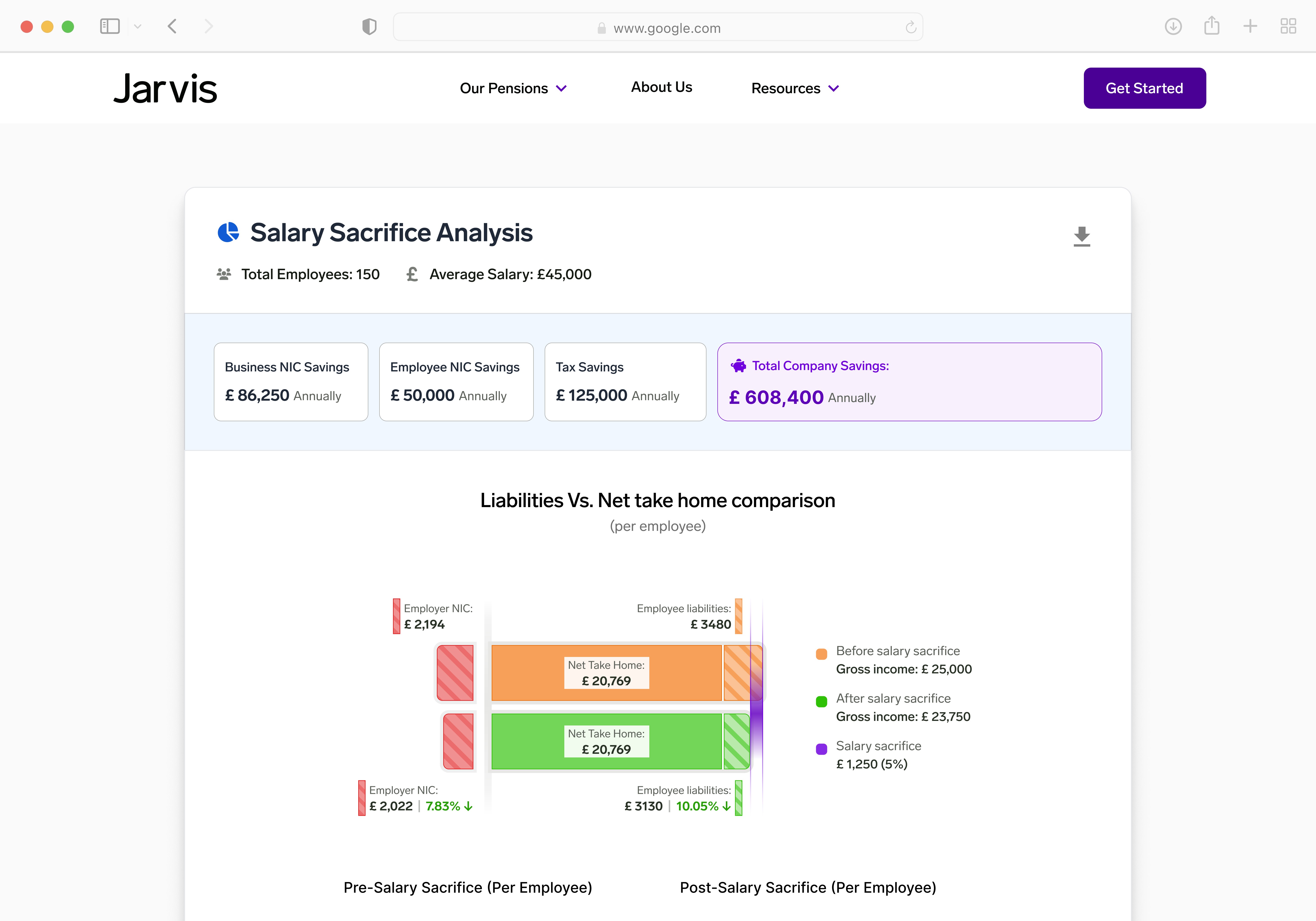
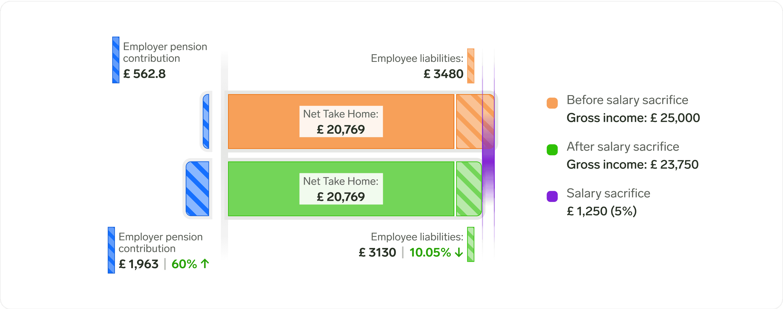
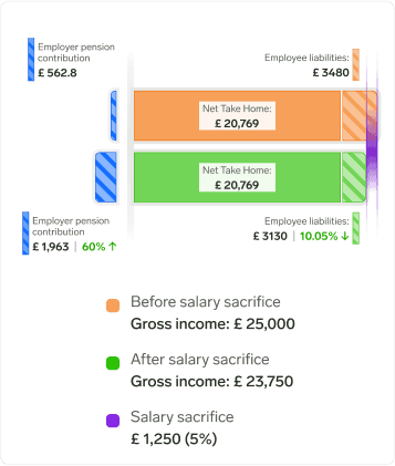
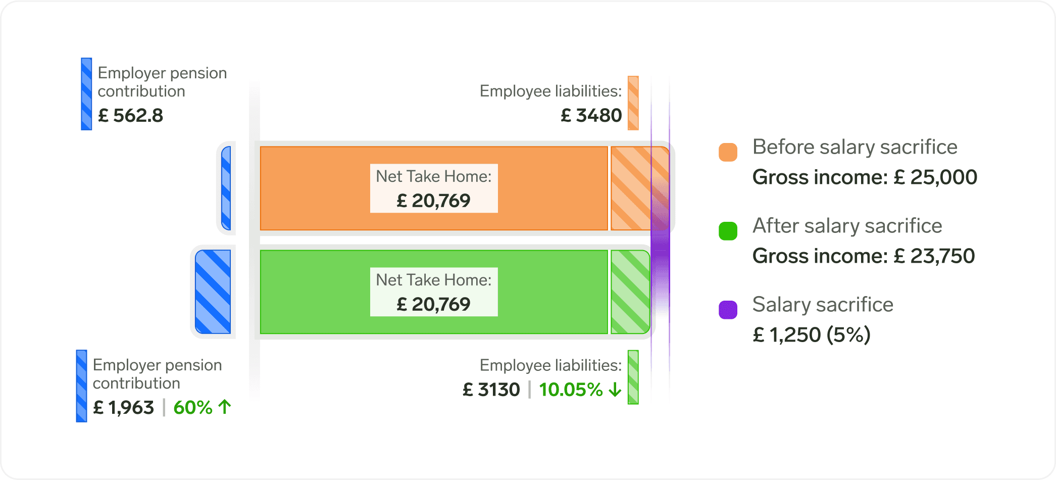
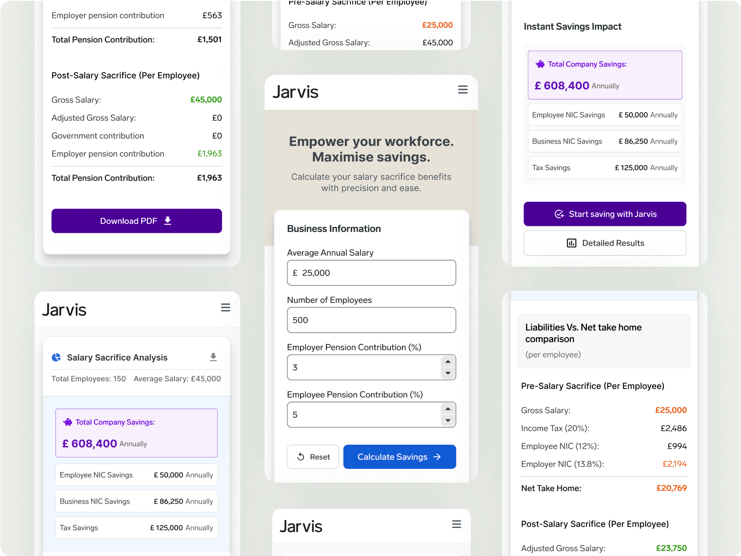
About Jarvis:

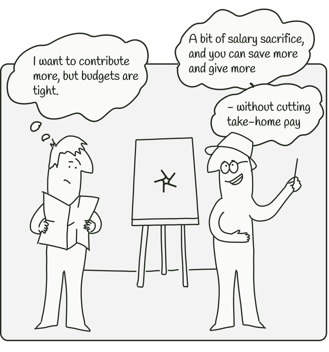
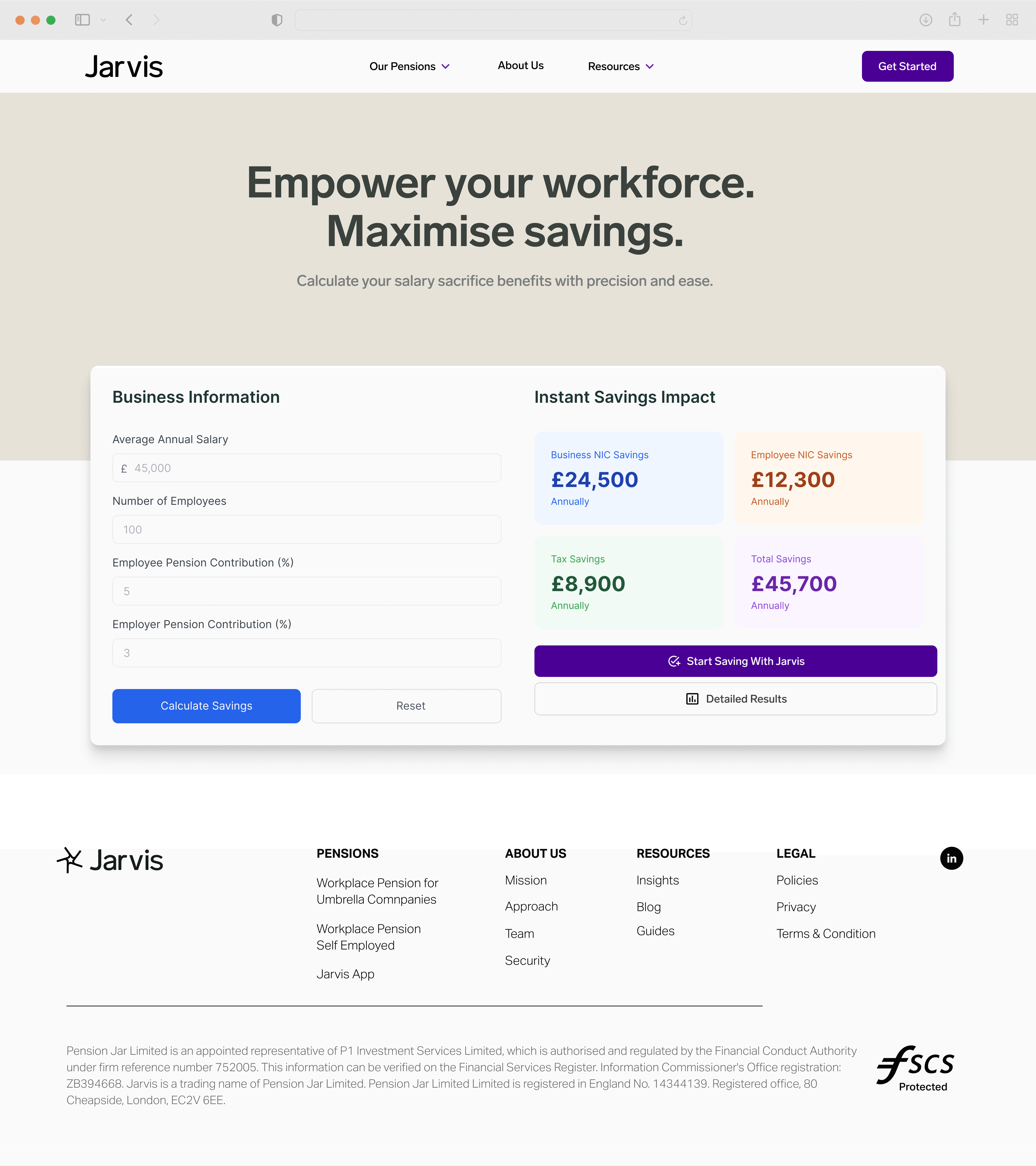
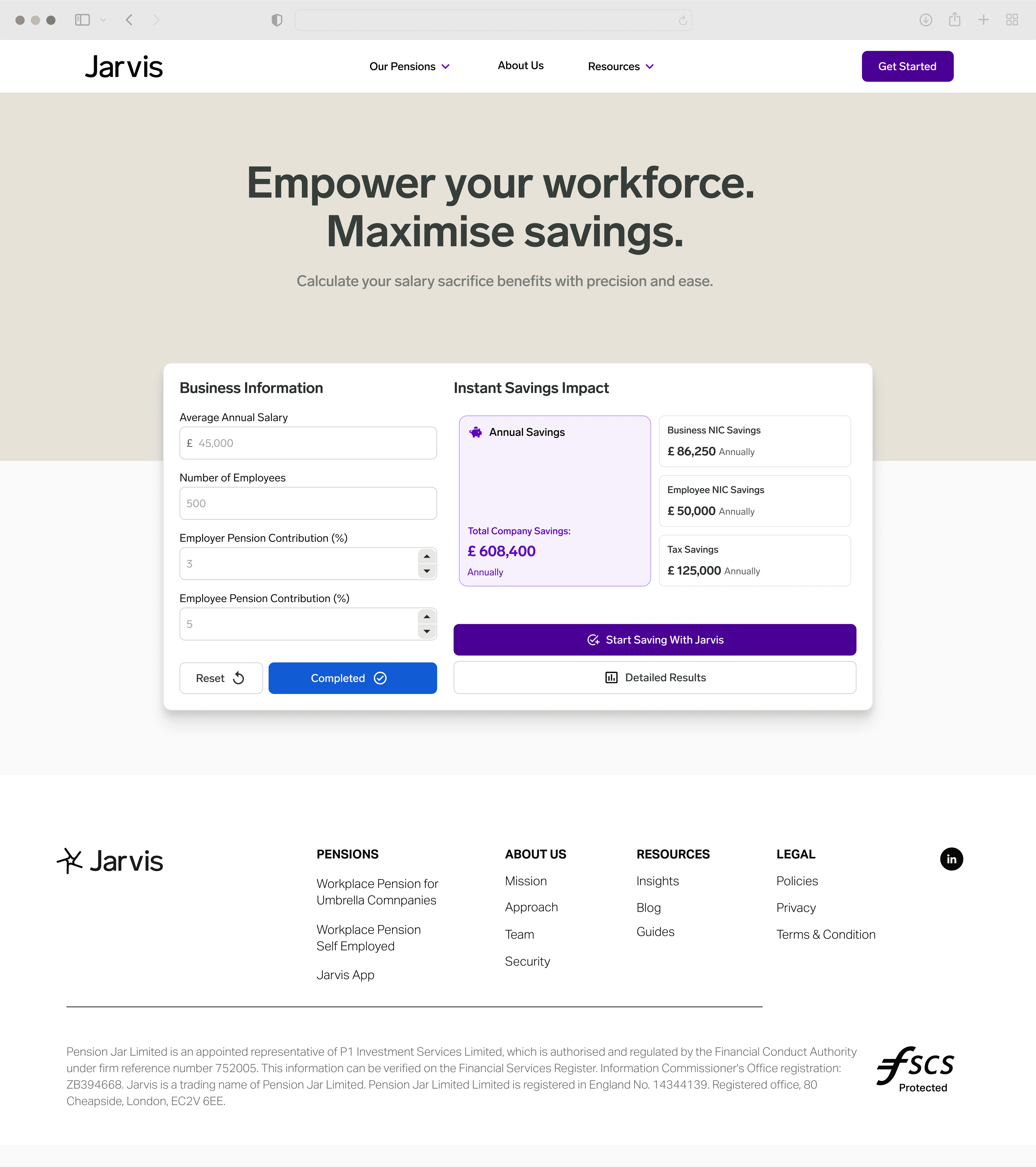
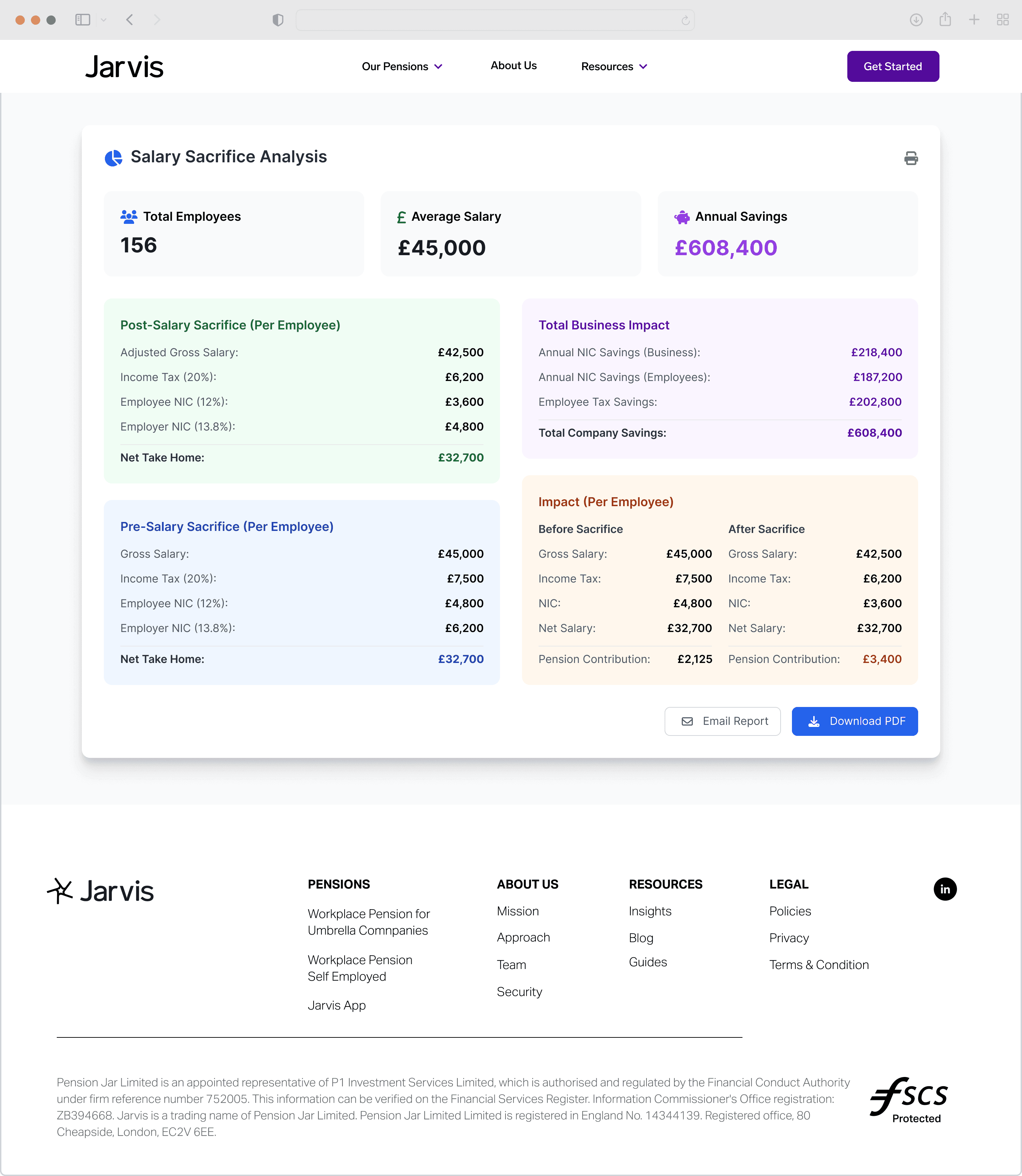
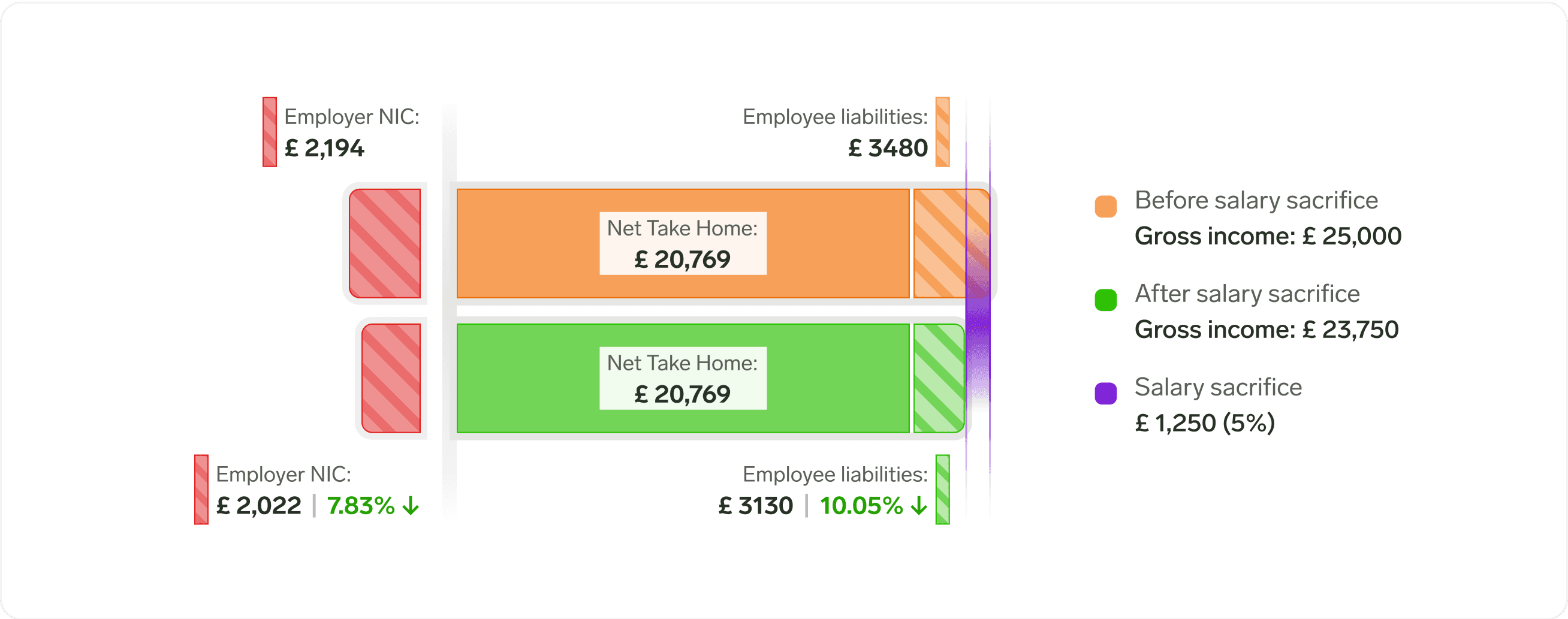
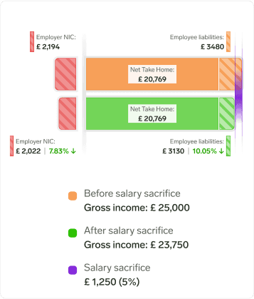
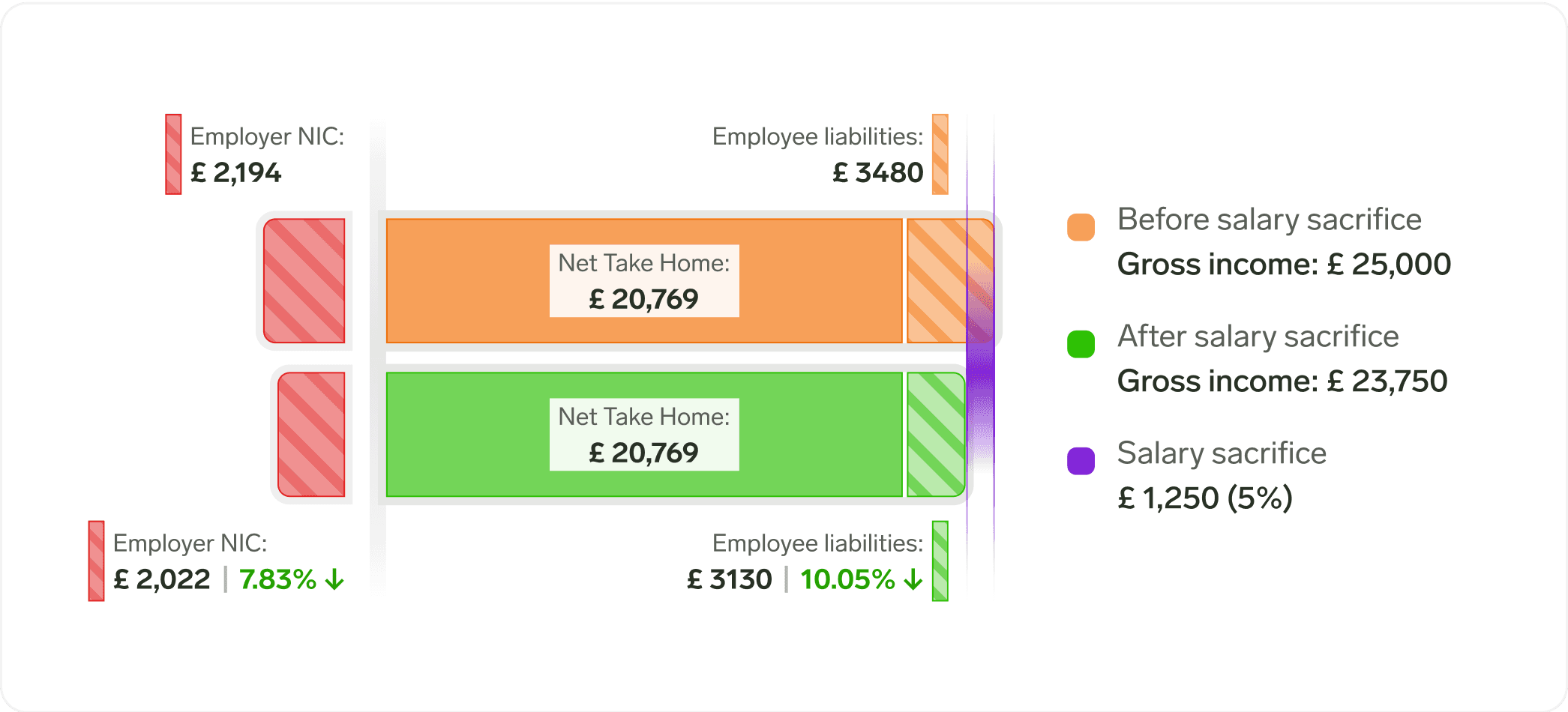
Jarvis is a UK-based pension management company. Their TaxFlex tool helps employers calculate salary sacrifice benefits.

Key Impact

A redesigned experience that helps employers see the impact of salary sacrifice at a glance.

A redesigned experience that helps employers see the impact of salary sacrifice at a glance.

Working prototype of calculator

Context

In the UK, employers and employees pay National Insurance Contributions (NICs) to fund government benefits.

Opportunity

Salary sacrifice lets employees trade some salary for benefits like pension contributions, saving both them and their employers on NIC costs.

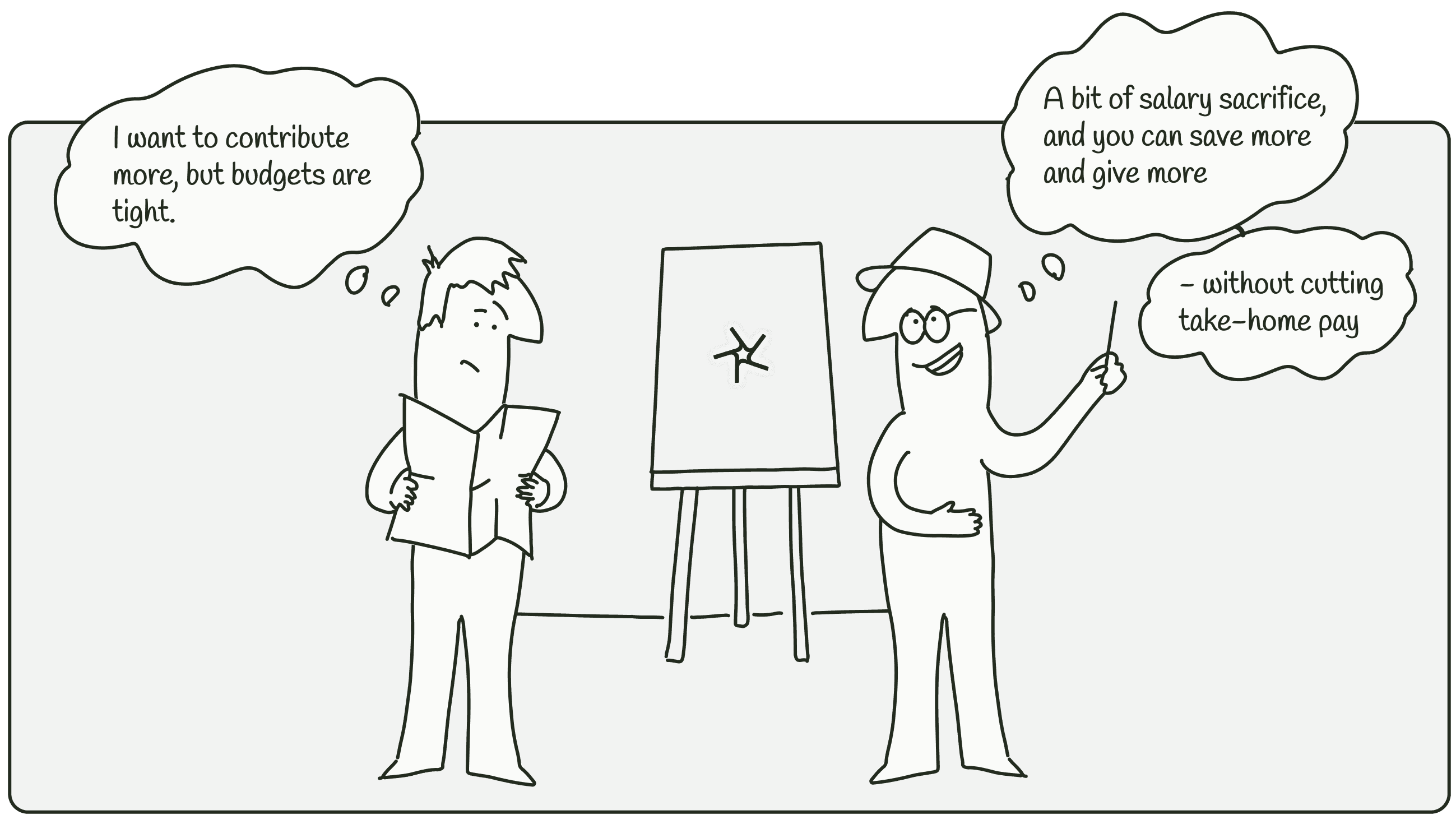
✦ Balancing Priorities

Aligning Employer Needs with Jarvis’ Goals

User needs

Employers need to cut costs, help employees save, and support financial well-being—without one goal affecting the other.

Jarvis’ goals

Make salary sacrifice an attractive option for employers by increasing pension contributions and encouraging the use of Jarvis’s platform.

✦ Task

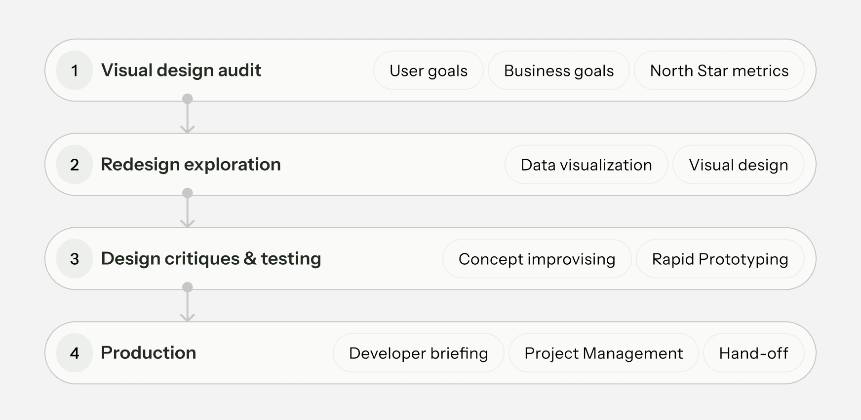
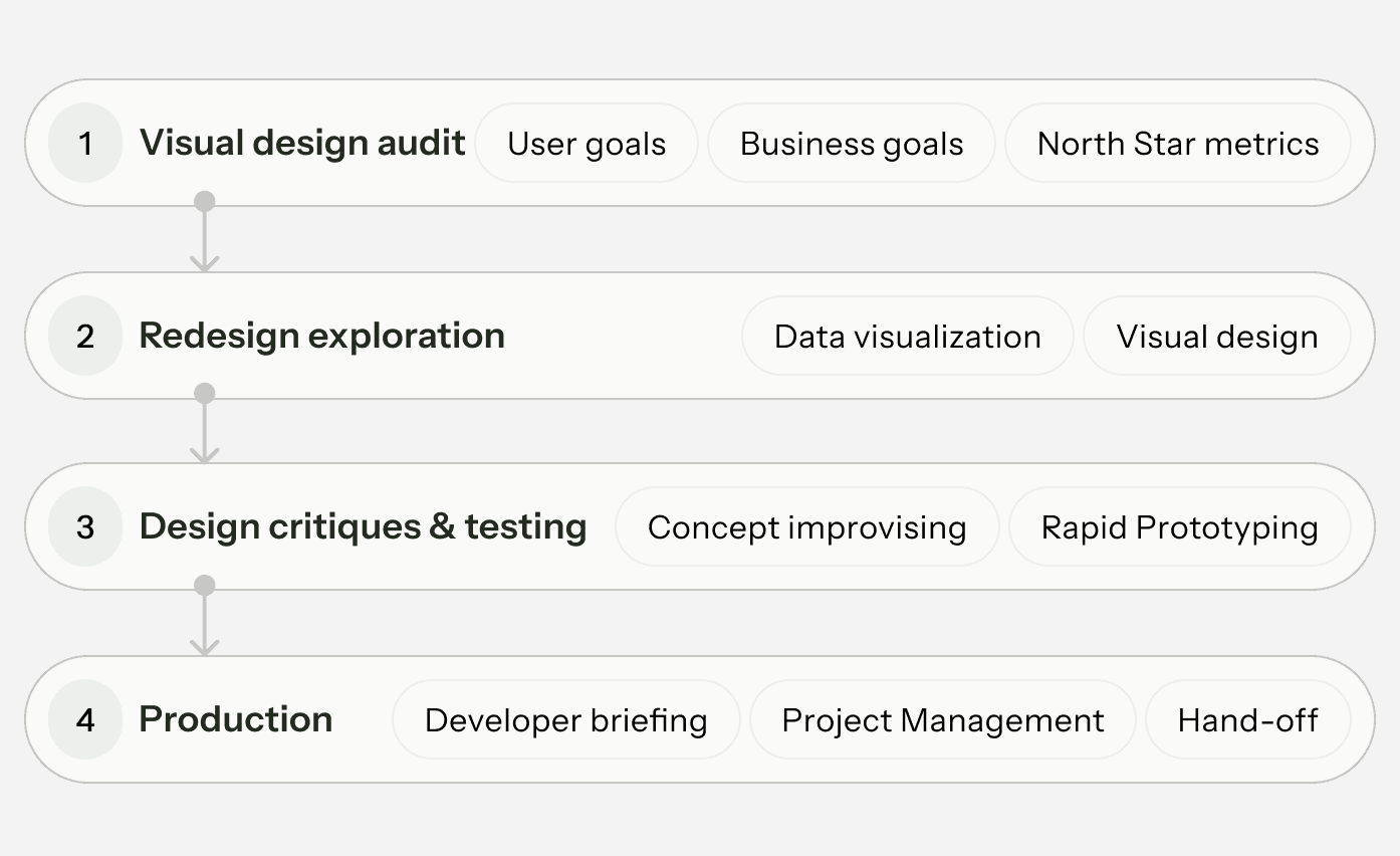
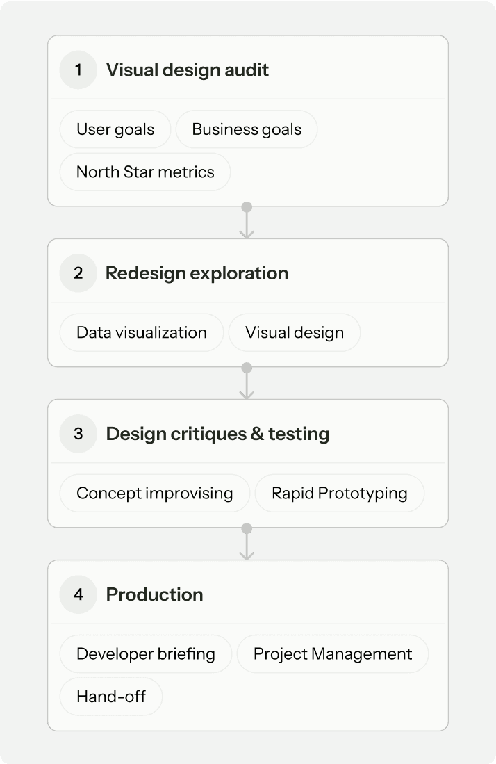
Concept Evolution & Process

Marketing team used a ready-made template to explore how the solution might look, but it was still a static concept.

My role was to audit the visual design, refine the content structure and data presentation, and collaborate with the team to bring it to production.

Project Process

Project Process

✦ Insight 1
✦ Insight 1
✦ Insight 1

Making Key Info Stand Out

Making Key Info Stand Out

Making Key Info Stand Out

Hover over image to zoom out

Equal visual weight was applied to all results, making it difficult to distinguish key insights from supporting details.

Excessive use of fill colors across all cards added cognitive load, requiring to interpret colors rather than insights.

Hover over image to zoom out

Equal visual weight was applied to all results, making it difficult to distinguish key insights from supporting details.

Excessive use of fill colors across all cards added cognitive load, requiring to interpret colors rather than insights.

Hover over image to zoom out

Equal visual weight was applied to all results, making it difficult to distinguish key insights from supporting details.

Excessive use of fill colors across all cards added cognitive load, requiring to interpret colors rather than insights.

Glanceability

Applied visual hierarchy by grouping supporting details separately to highlight key info.

Cognitive ease

Reduced visual noise by using fill color only for the primary insight.

Hover over image to zoom out

Glanceability

Applied visual hierarchy by grouping supporting details separately to highlight key info.

Cognitive ease

Reduced visual noise by using fill color only for the primary insight.

Hover over image to zoom out

Glanceability

Applied visual hierarchy by grouping supporting details separately to highlight key info.

Cognitive ease

Reduced visual noise by using fill color only for the primary insight.

Hover over image to zoom out

✦ Insight 2
✦ Insight 2
✦ Insight 2

Structuring for Recognition & Clarity

Structuring for Recognition & Clarity

Structuring for Recognition & Clarity

Hover over image to zoom out

User input was presented at the same level as key insights, making it difficult to separate reference data from critical information.

Key insights were buried in tables, making it harder for users to quickly recall or connect with what they had seen earlier on the landing page.

Contextual Relevance

Added tags to provide instant recognition & relevance without drawing focus away from key insights.

Recall & Recognition

A structured header section visually distinguished key insights, maintaining their importance while showing familiar data points.

Hover over image to zoom out

✦ Layout Ideation
✦ Layout Ideation
✦ Layout Ideation

Making Layout Easy to Compare

Making Layout Easy to Compare

Making Layout Easy to Compare

Hover over to remove markups

The comparison layout mixed different data points without a clear structure, making it difficult to identify relationships and key takeaways.

Inconsistent alignment disrupted reading flow, making comparisons less intuitive and requiring extra effort.

Hover over to remove markups

The comparison layout mixed different data points without a clear structure, making it difficult to identify relationships and key takeaways.

Inconsistent alignment disrupted reading flow, making comparisons less intuitive and requiring extra effort.

Hover over to remove markups

The comparison layout mixed different data points without a clear structure, making it difficult to identify relationships and key takeaways.

Inconsistent alignment disrupted reading flow, making comparisons less intuitive and requiring extra effort.

Simplicity is not about removing complexity; it's about eliminating confusion.

Simplicity is not about removing complexity; it's about eliminating confusion.

Simplicity is not about removing complexity; it's about eliminating confusion.

John Maeda

John Maeda

John Maeda

VP of Design & AI @Microsoft.

The main content area was simplified to focus on two meaningful comparisons:

Liability comparison: Aligned with employee savings (user needs).

Increased Pension Contribution capacity:
Reflecting employee well-being(user needs), & Jarvis' goal.

Strategic Layout

Refined structure to emphasize the link between savings and contributions, making it easier to understand the impact.

Layout Ideation

✦ Chart ideation
✦ Chart ideation

Visualizing Impact Clearly

Visualizing Impact Clearly

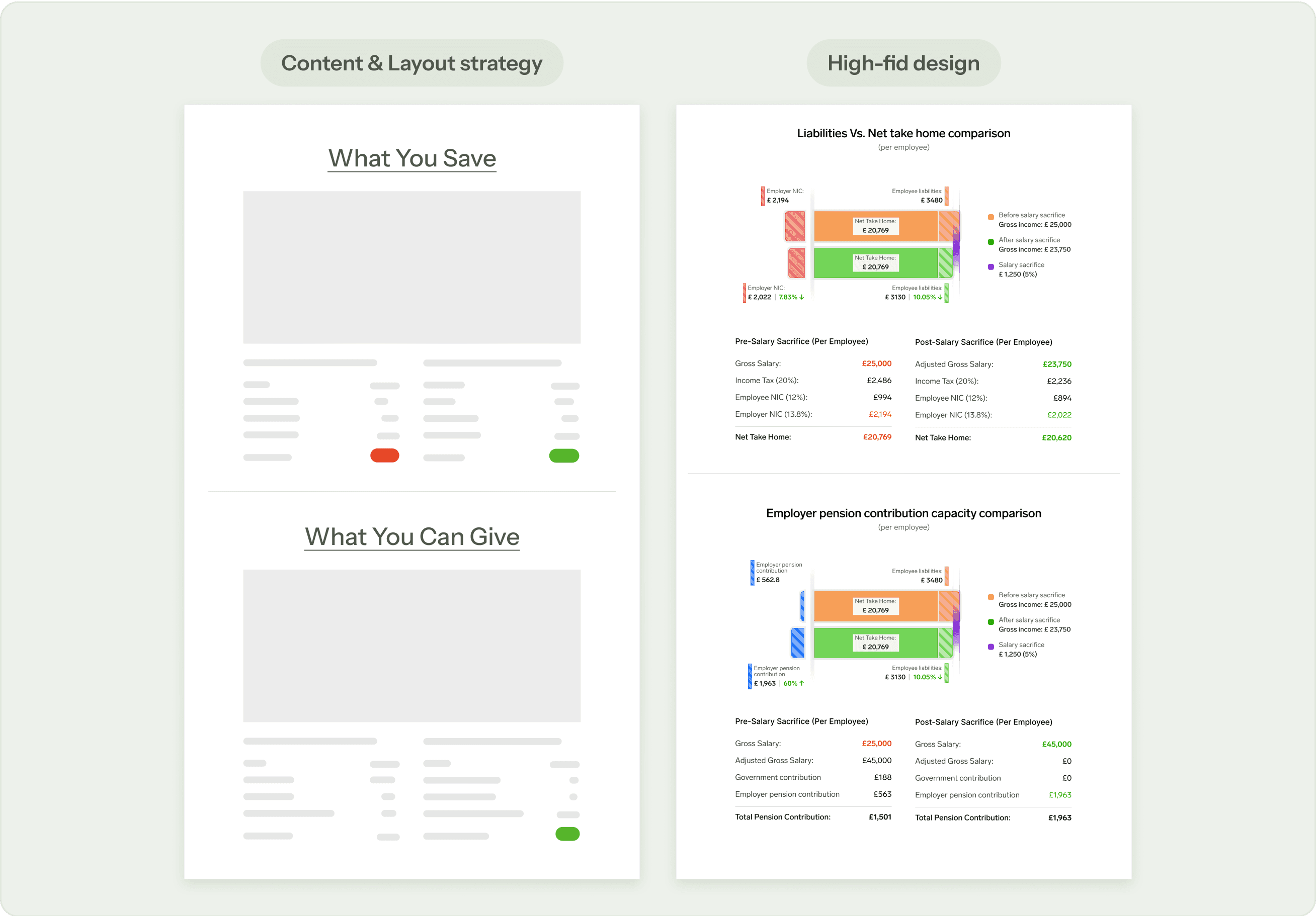
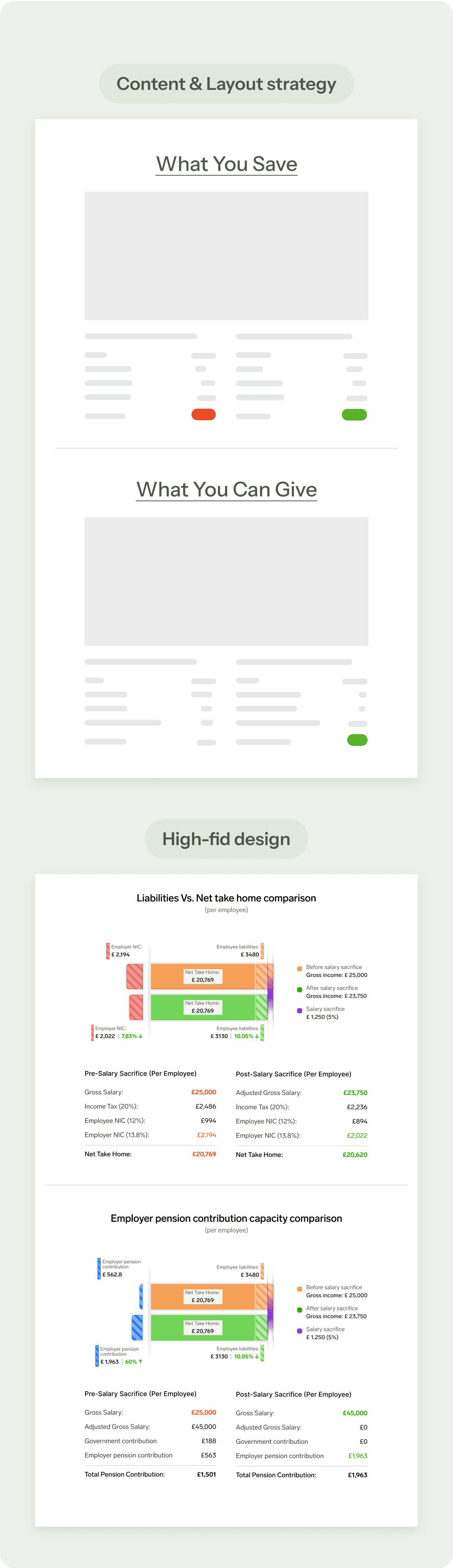
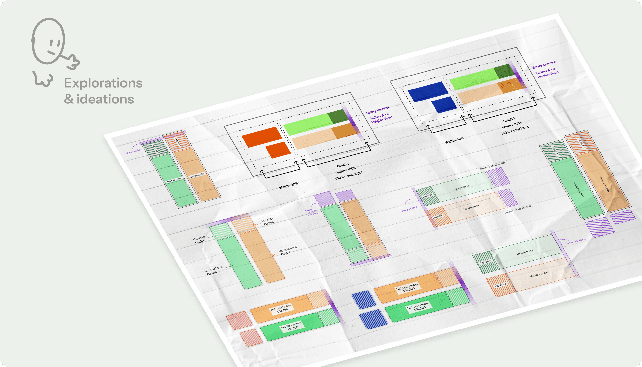
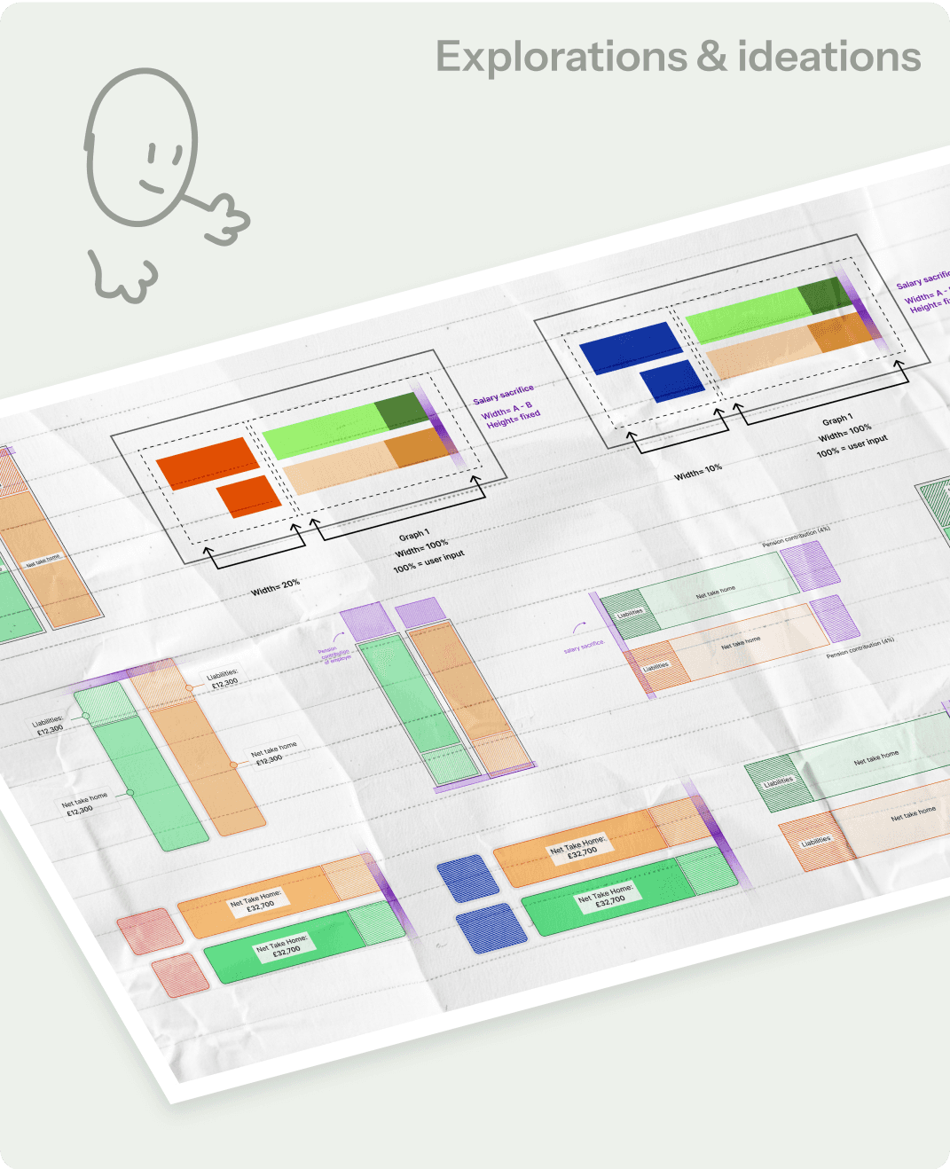
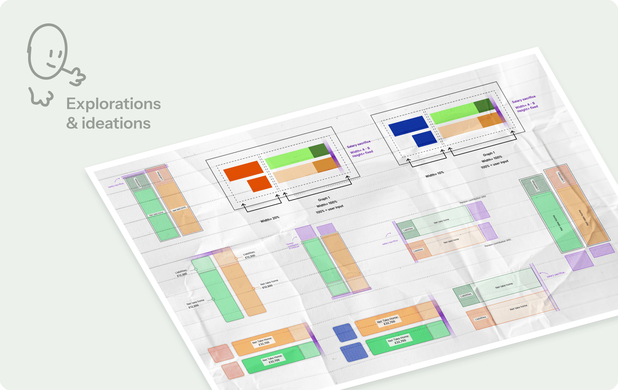
Sketching & Ideation of data representation

Key insights such as employer savings and pension contributions lacked clarity in relation to salary changes before and after salary sacrifice.

Before & After Clarity

The graphs were structured to anchor insights around salary sacrifice, making it easier to compare changes and spot savings at a glance.

Going through tables to piece everything together made it harder to see the big picture right away.

Consistent Visual Framework

A familiar flow was introduced, with the savings comparison shown first, making it easier to absorb the pension data that followed without needing to relearn the format.

Going through tables to piece everything together made it harder to see the big picture right away.

Consistent Visual Framework

A familiar flow was introduced, with the savings comparison shown first, making it easier to absorb the pension data that followed without needing to relearn the format.

Going through tables to piece everything together made it harder to see the big picture right away.

Consistent Visual Framework

A familiar flow was introduced, with the savings comparison shown first, making it easier to absorb the pension data that followed without needing to relearn the format.

✦ Hand-off
✦ Hand-off
✦ Hand-off

Collaboration & Production

Collaboration & Production

Collaboration & Production

Production-ready design required clear documentation and efficient implementation guidelines.

Production-ready design required clear documentation and efficient implementation guidelines.

Production-ready design required clear documentation and efficient implementation guidelines.

Back-end Support

Detailed annotations clarified backend calculations and supported frontend development.

Front-end Support

Chart documentation with computational tokens provided clear guidance for accurate implementation.

Accessibility Support

Accessibility components and design tokens were shipped to maintain consistency across the interface.
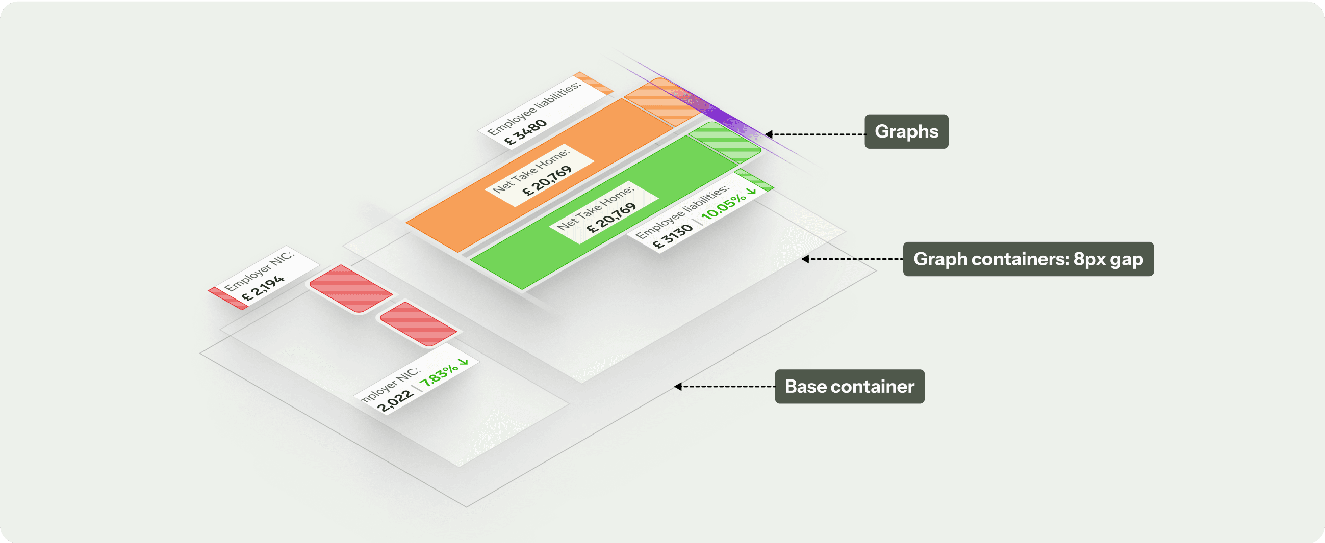
Graph Structure

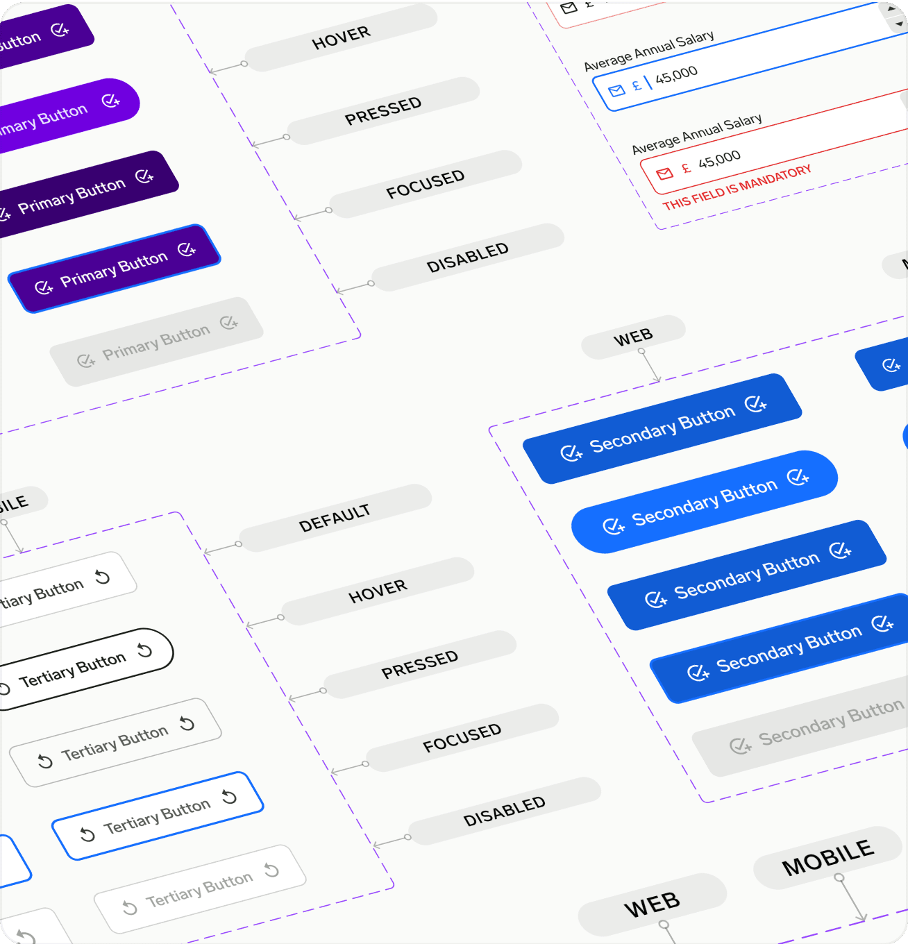
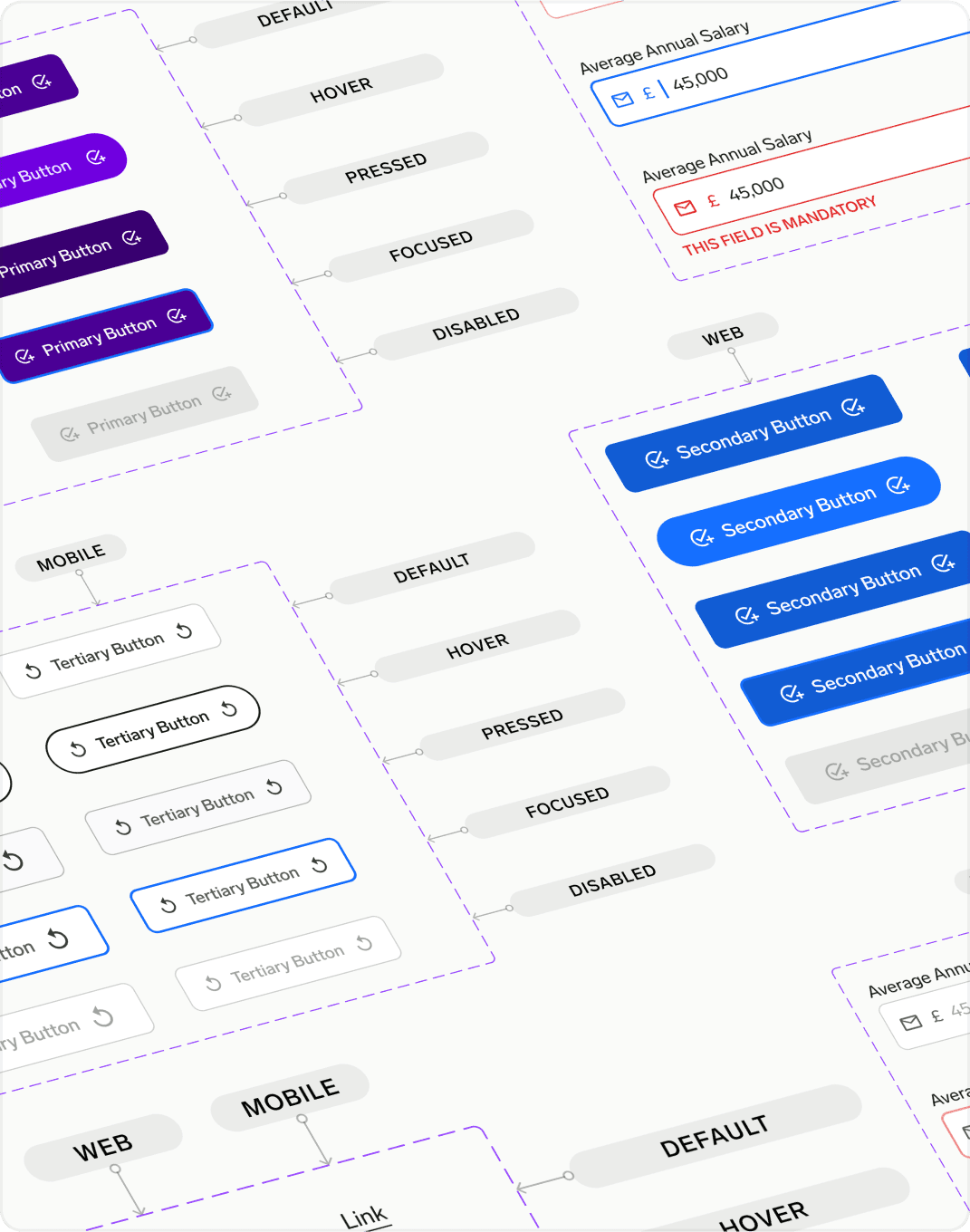
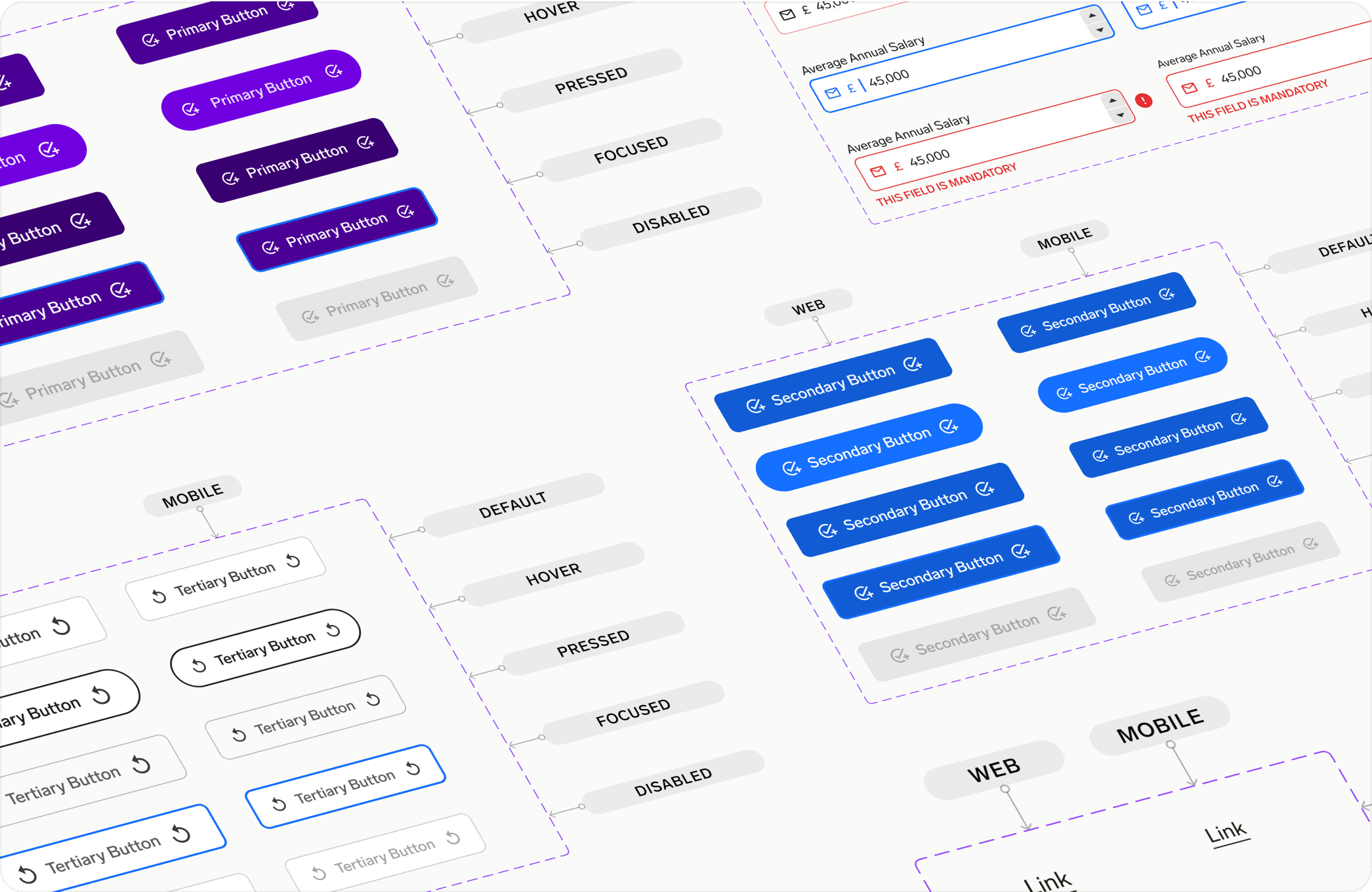
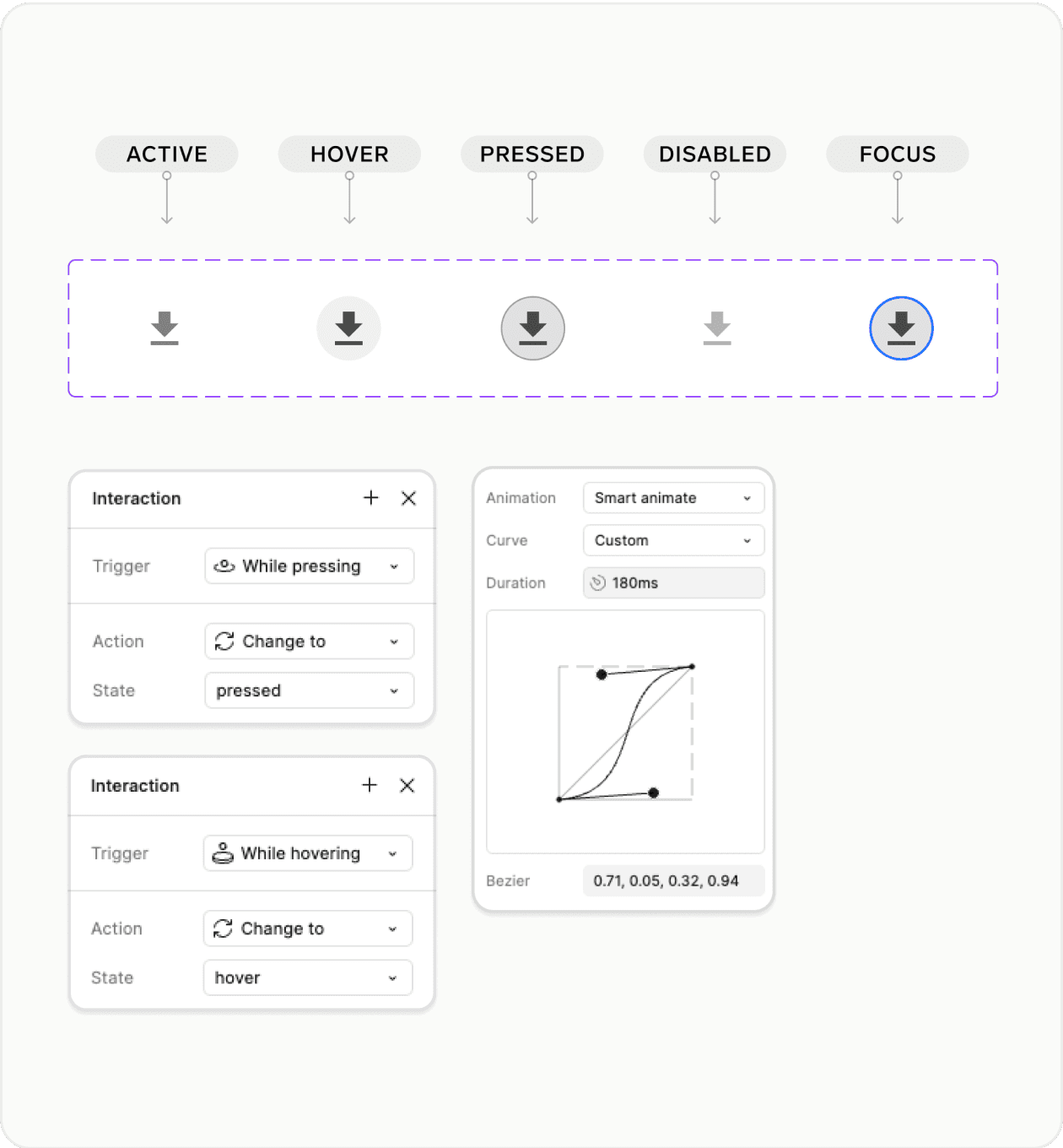
Components & Interaction System

Responsive design

Learnings & Reflections

Learnings & Reflections

First ideas rarely stick - iterating and staying open-minded leads to stronger solutions.

Success lies in finding the sweet spot between user needs and business objectives

Collaboration is more than just meetings - it's understanding and supporting your teammates' goals

Using computational tokens effectively simplifies complex data visualization

Create a free website with Framer, the website builder loved by startups, designers and agencies.