My role
Product Designer
(0.1 → 1 Design, Functionality-to-Scalable MVP)
Skills
Lean UX
Data-Driven IA Restructuring
Content Strategy
Responsive Architecture
Scalable UI Patterns
Interaction Design
Rapid Prototyping
Team
CEO (Domain Expert), 1 PM,
1 Engineer
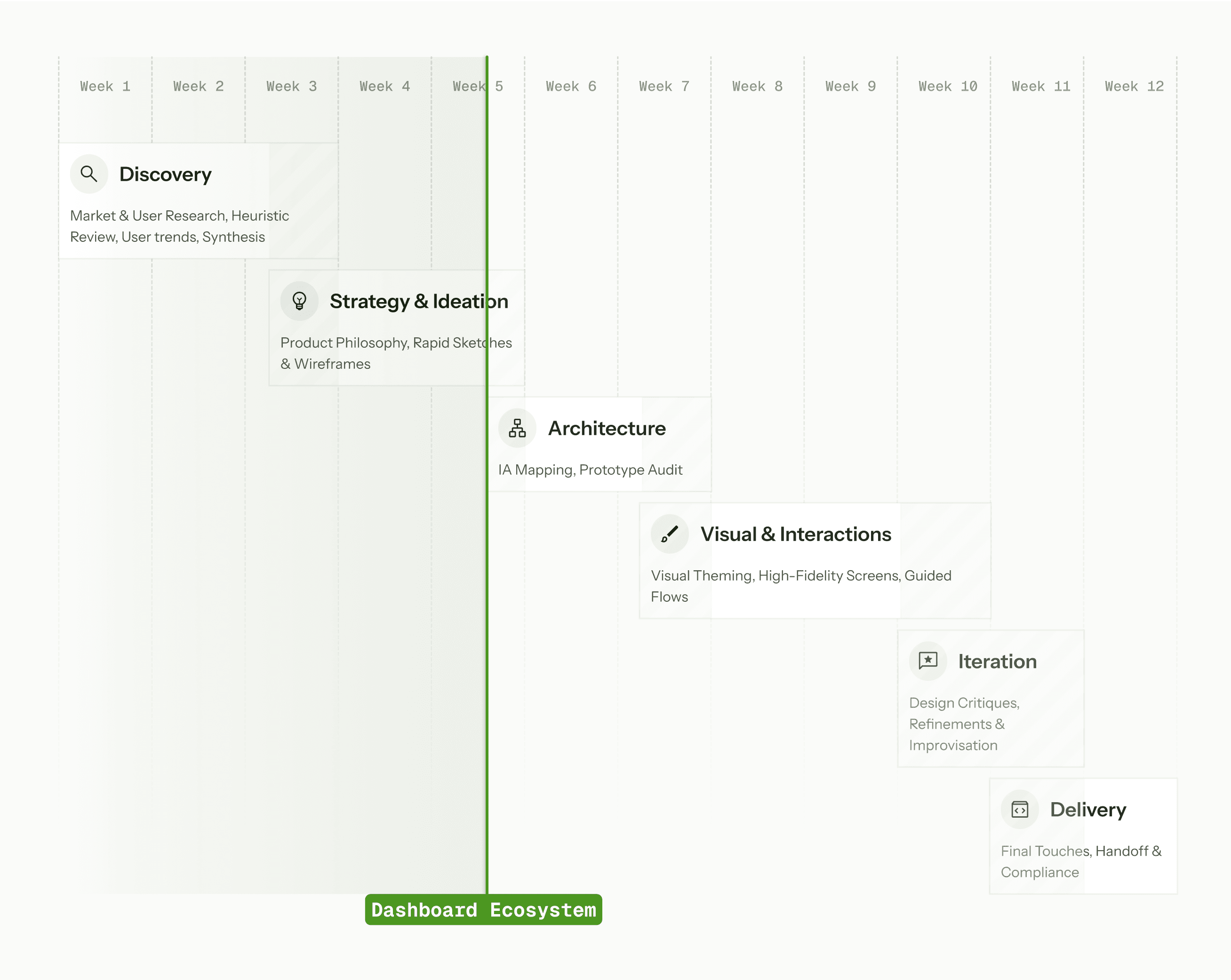
Timeline:
2 Months
(Q4 2024: Pre-Launch MVP)
Overview:
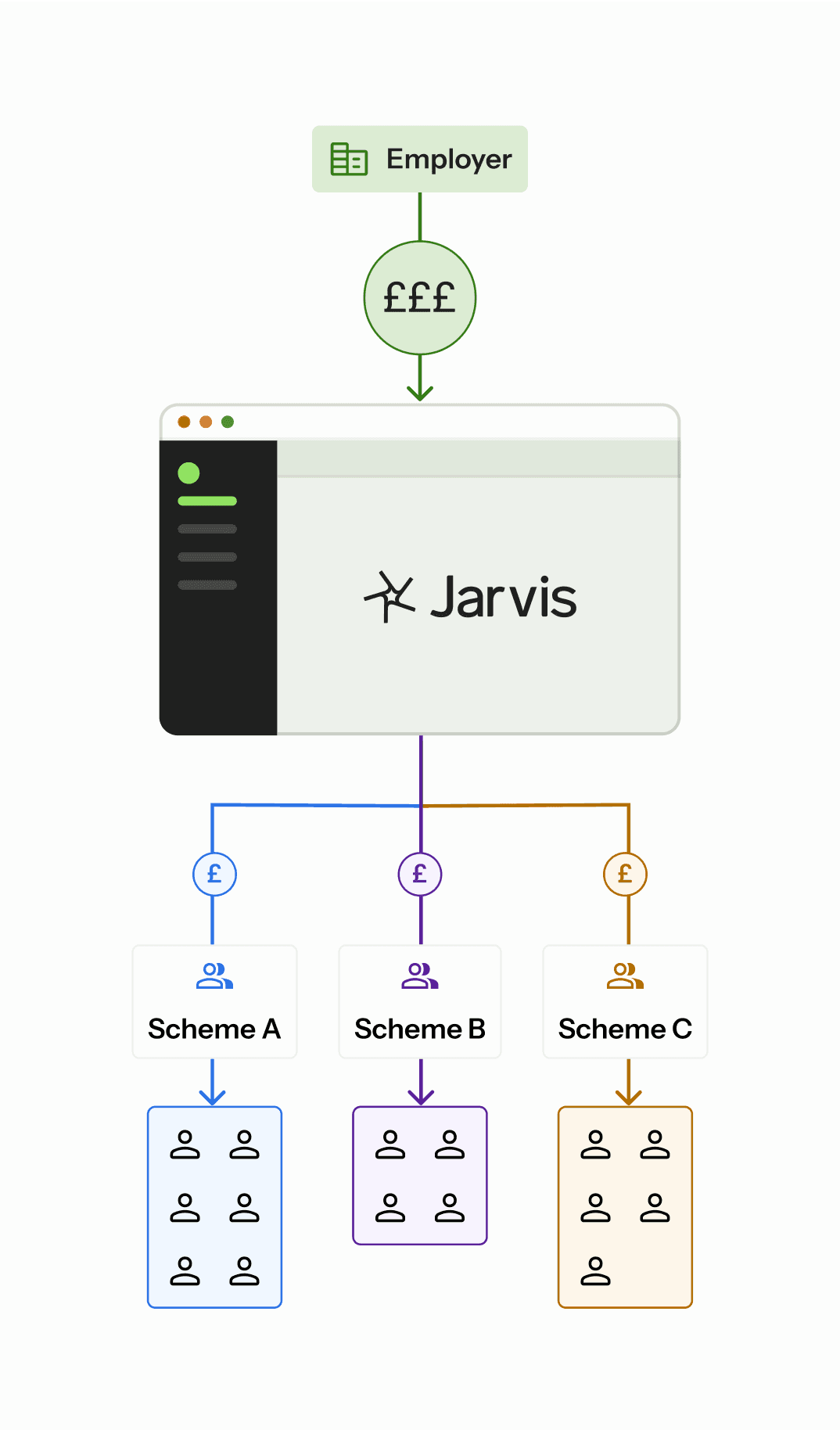
Jarvis is a UK pension provider with an enterprise web app(MVP) that helps employers manage multiple workplace pension schemes, automate & track payments, and maintain compliance.
✦ SUMMARY
TL;DR
Led decision-framing workshops to create JTBD-driven roadmap for high-impact features.
Transformed fragmented MVP into a polished demo platform showcasing Jarvis's core value.
Built modular UI system with reusable components for scalable enterprise solutions.

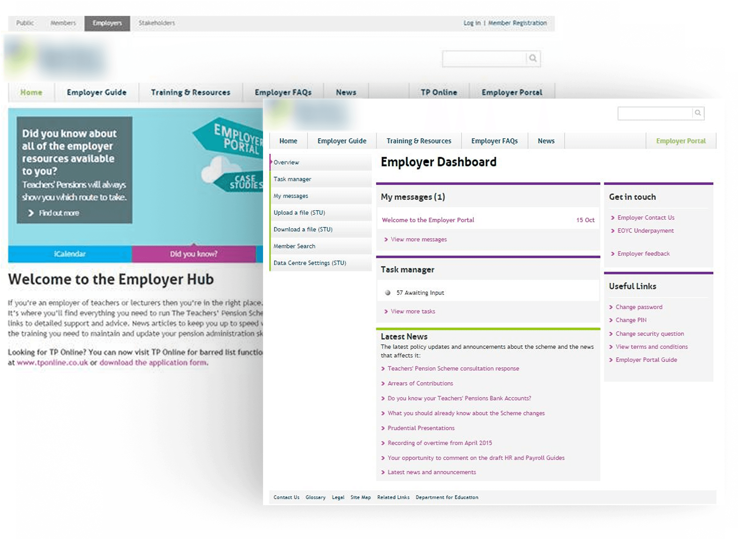
✦ Inherited Functionality
We Started with A Barebones Functional Prototype
The MVP was primarily built to prove backend functionality, with minimal attention to hierarchy or workflows.
Multiple screens, with no unified view for tracking contributions or compliance.
The existing backend architecture required thoughtful UI layering; we couldn’t just “scrap and rebuild.”
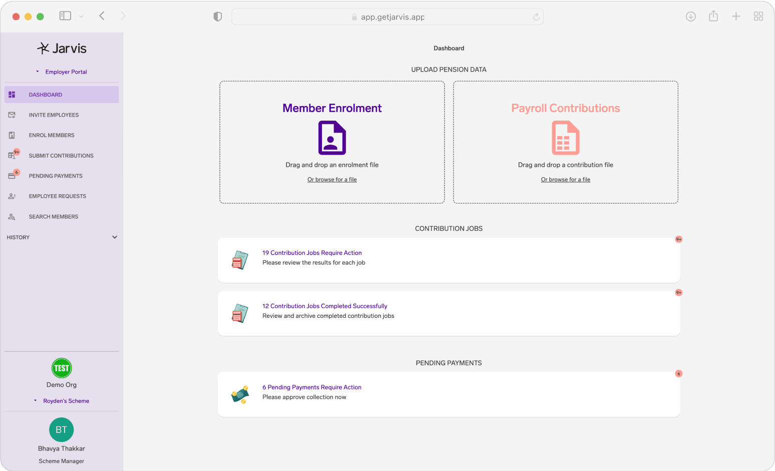
Screenshot of the initial MVP
✦ Constraints as Catalysts
Lean ≠ limited
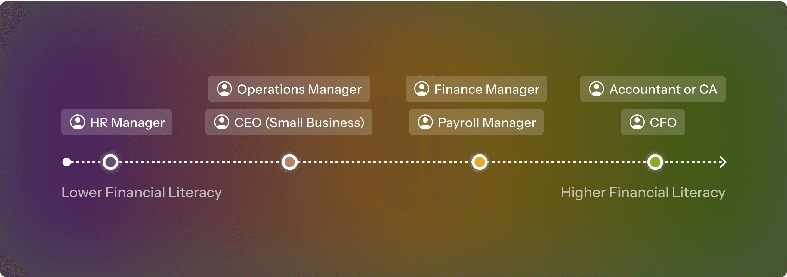
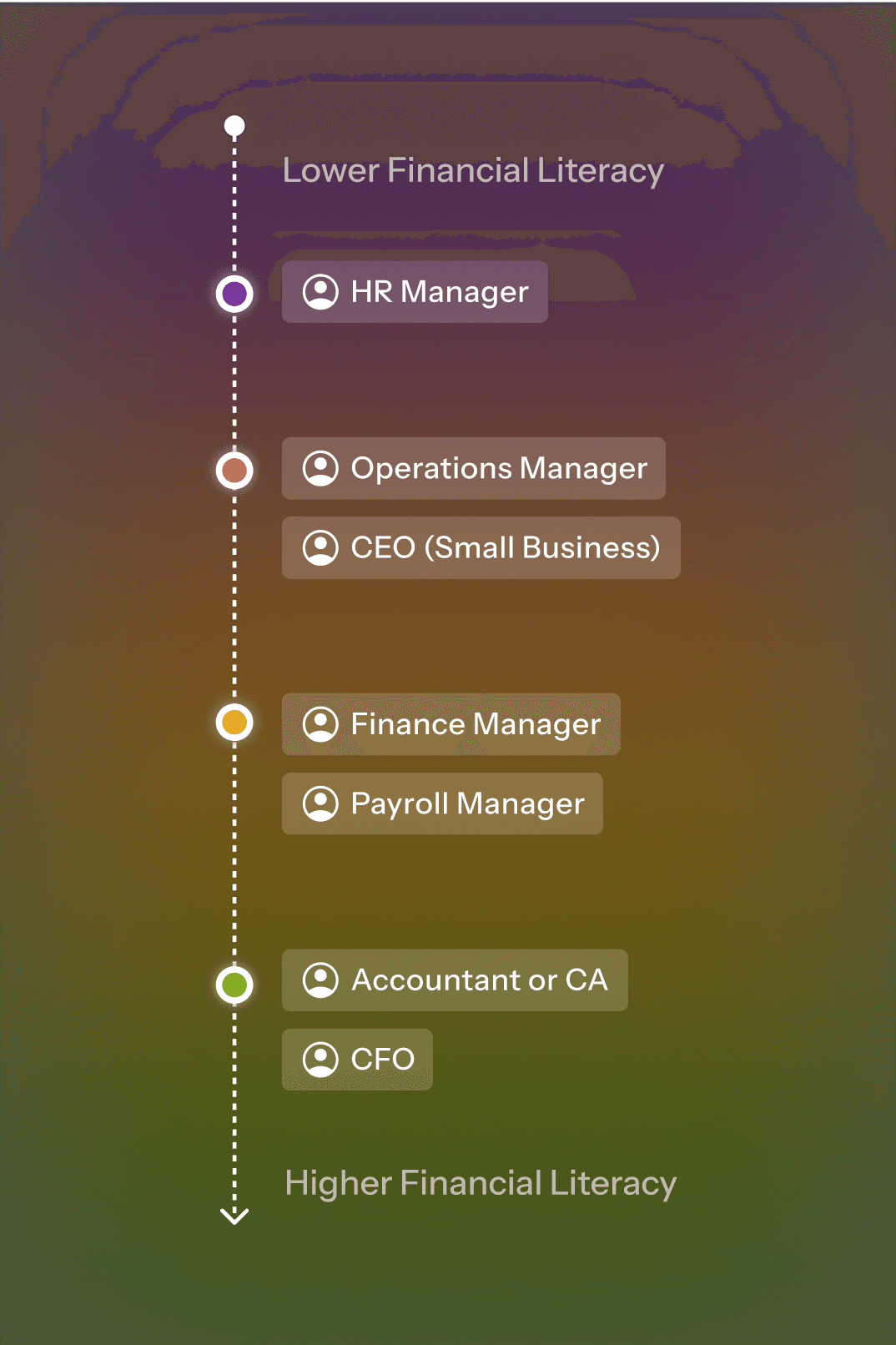
No formal user testing due to time and budget.
Rely on proxy user research (CEO’s domain knowledge + Desk research + Prospect calls insights) and heuristic evaluations (Nielsen’s principles) to spot critical issues.
Desk finding 1
Desk finding 2
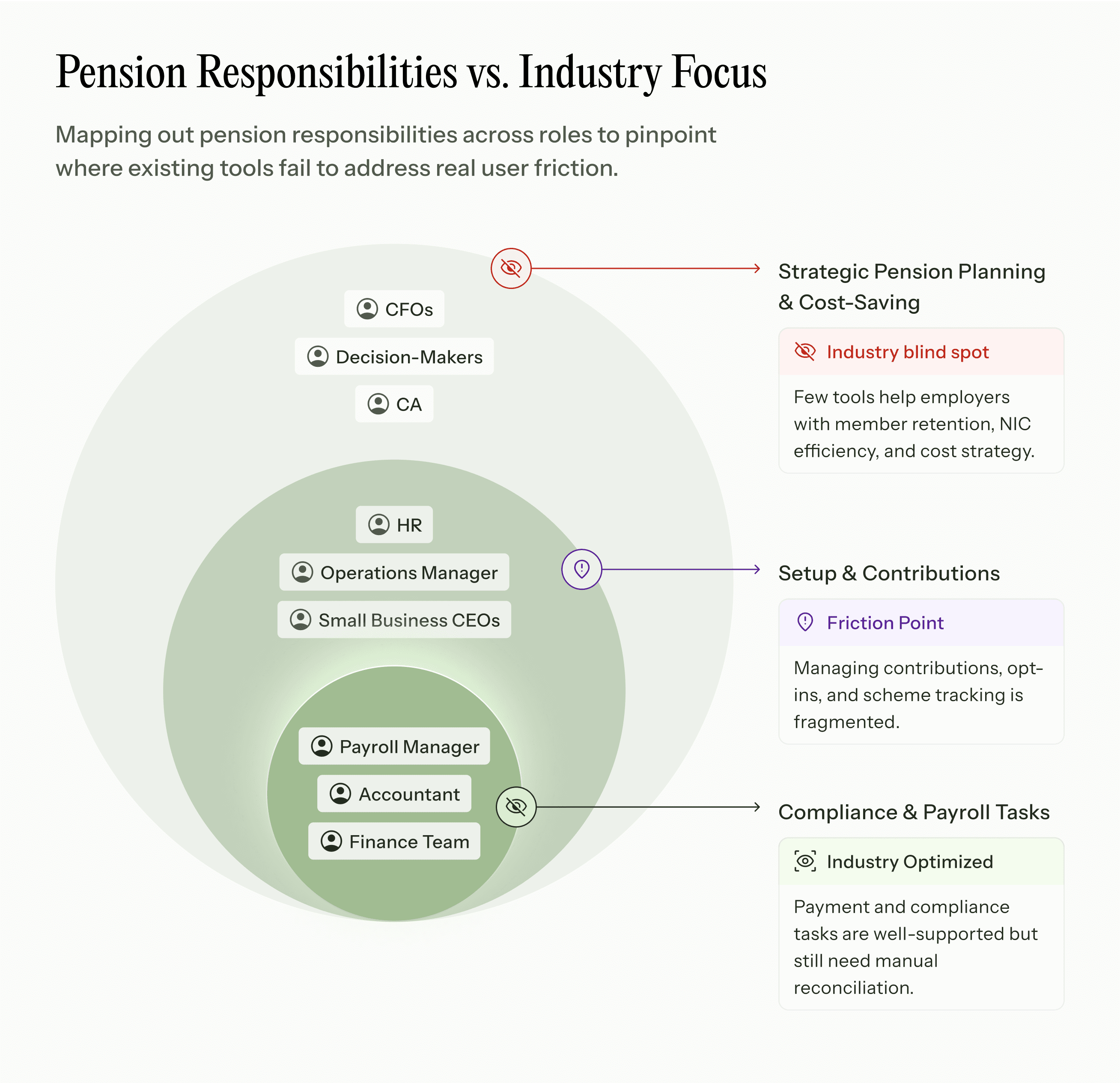
✦ Market Research Insights
Industry Norm
Pension Tools are often:
Task-driven & Info-heavy
Focused on data dumps, leaving users to figure out what’s urgent.
Visually Outdated
Compliance is front and center, but rarely user-friendly.
Gaps in Strategic Gains
No clarity on cost-saving opportunities or holistic oversight.
"We shouldn't need a financial degree to manage basic pension tasks."
"I track pension schemes across 12 Excel sheets—it’s chaos."
"I worry we’ll miss penalties because everything’s scattered."
"We track everything manually because that's how it's always been done."
"I'm constantly switching between platforms just to check basic information."
"Every month-end is just endless data checking."
"Most mornings, I’m just checking if we missed deadlines."
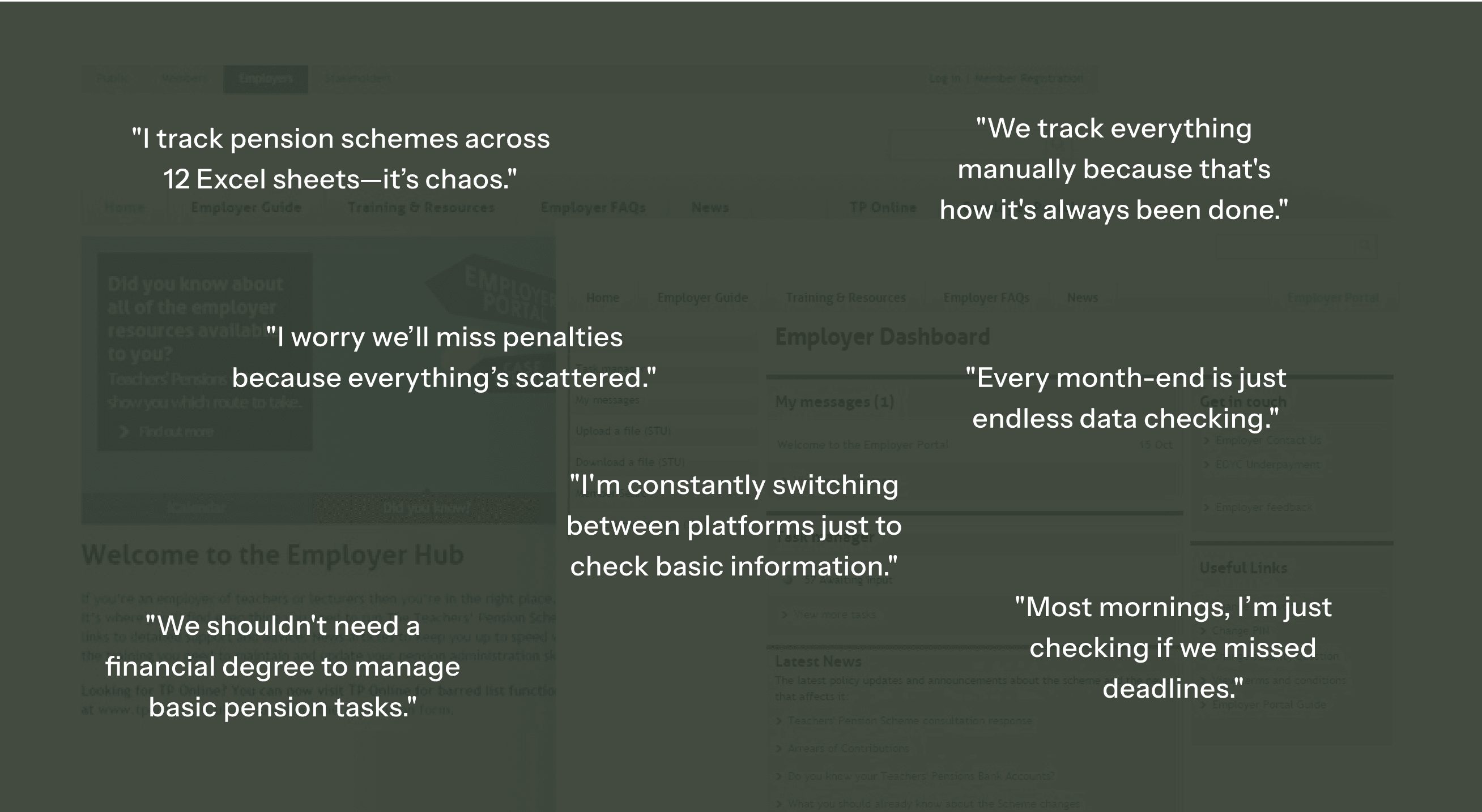
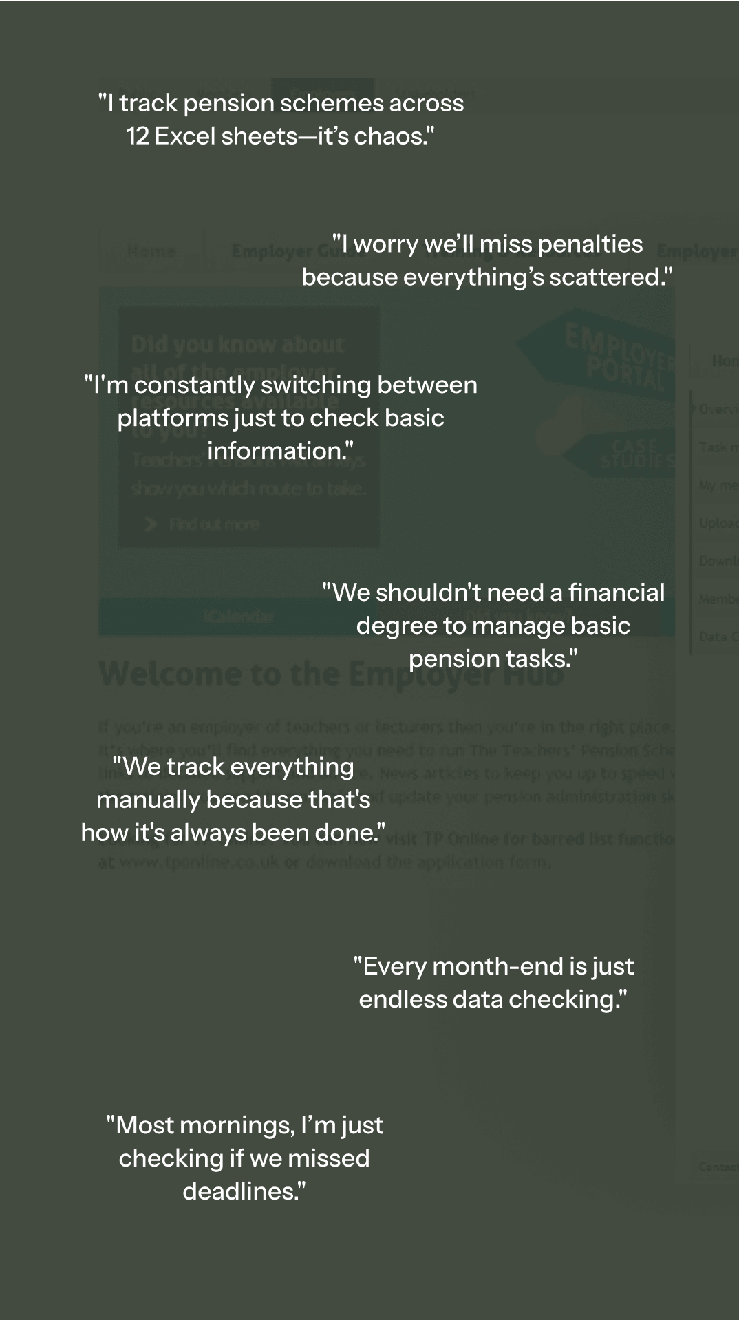
User Research Analysis
✦ Opportunity
A New Kind of Pension Platform
Employers needed a system that:
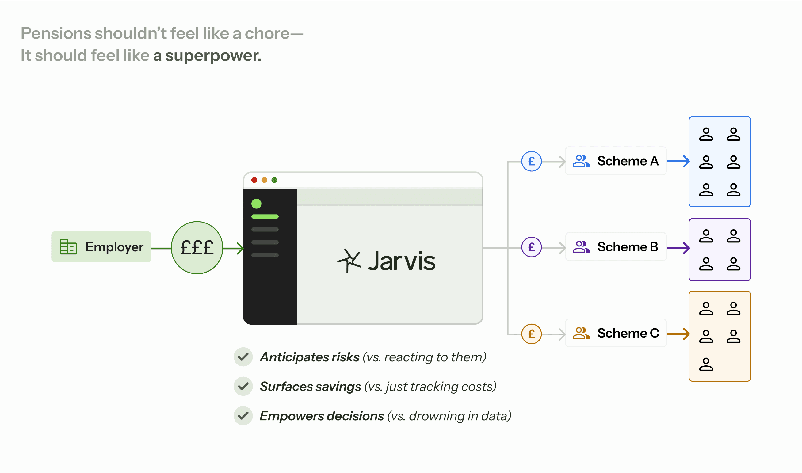
Product Philosophy
✦ Approach
Guiding Design Principles
Time-to-Action (TTA)
Reduce steps needed to identify and resolve tasks.
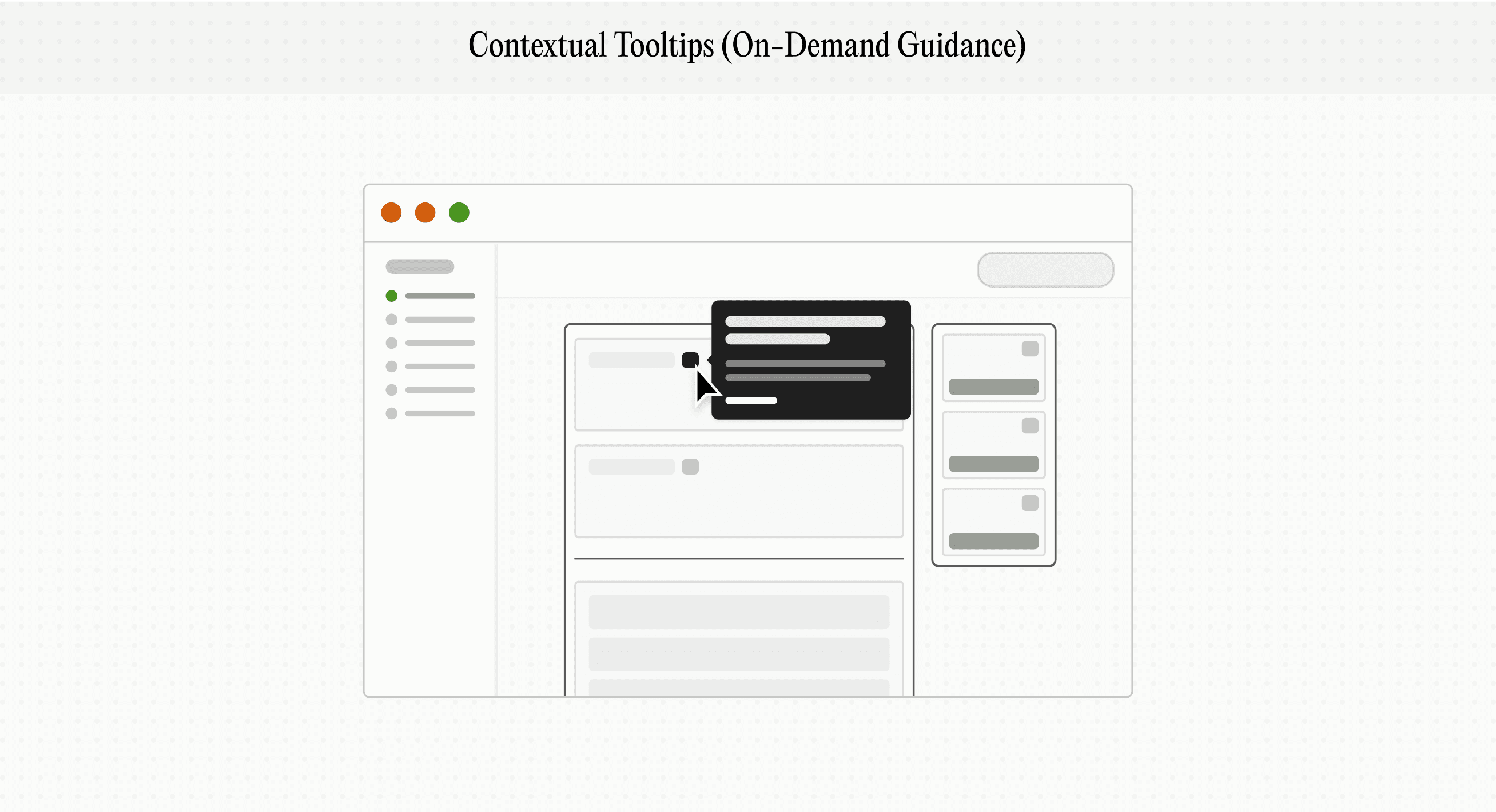
Guidance, Not Noise
Activities as workflow tools, not interruptions.
Empowerment Through Context
Show the “Why”, "How" & "What next" behind data.
Scalable Simplicity
Design flows/UI patterns that grow with business.
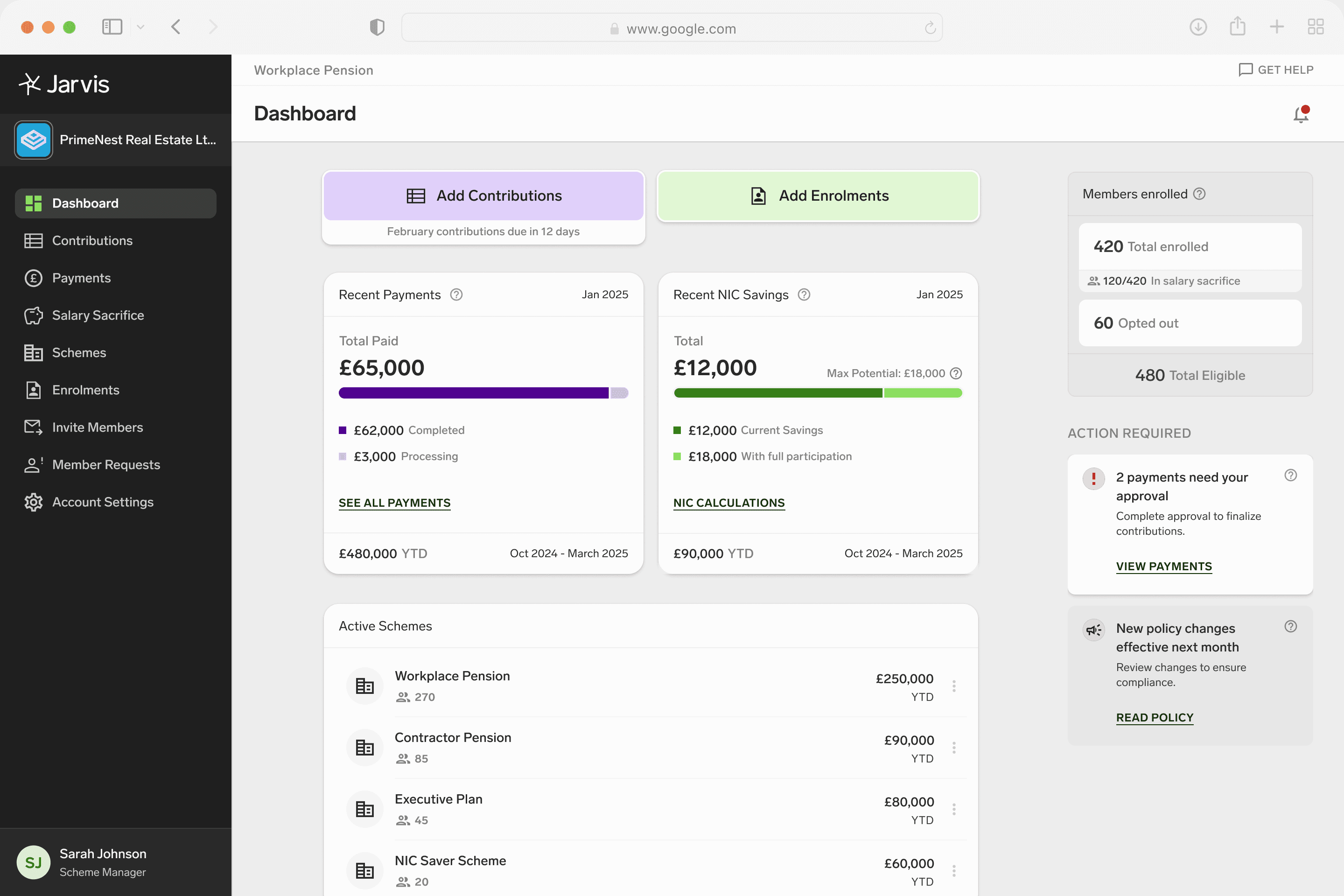
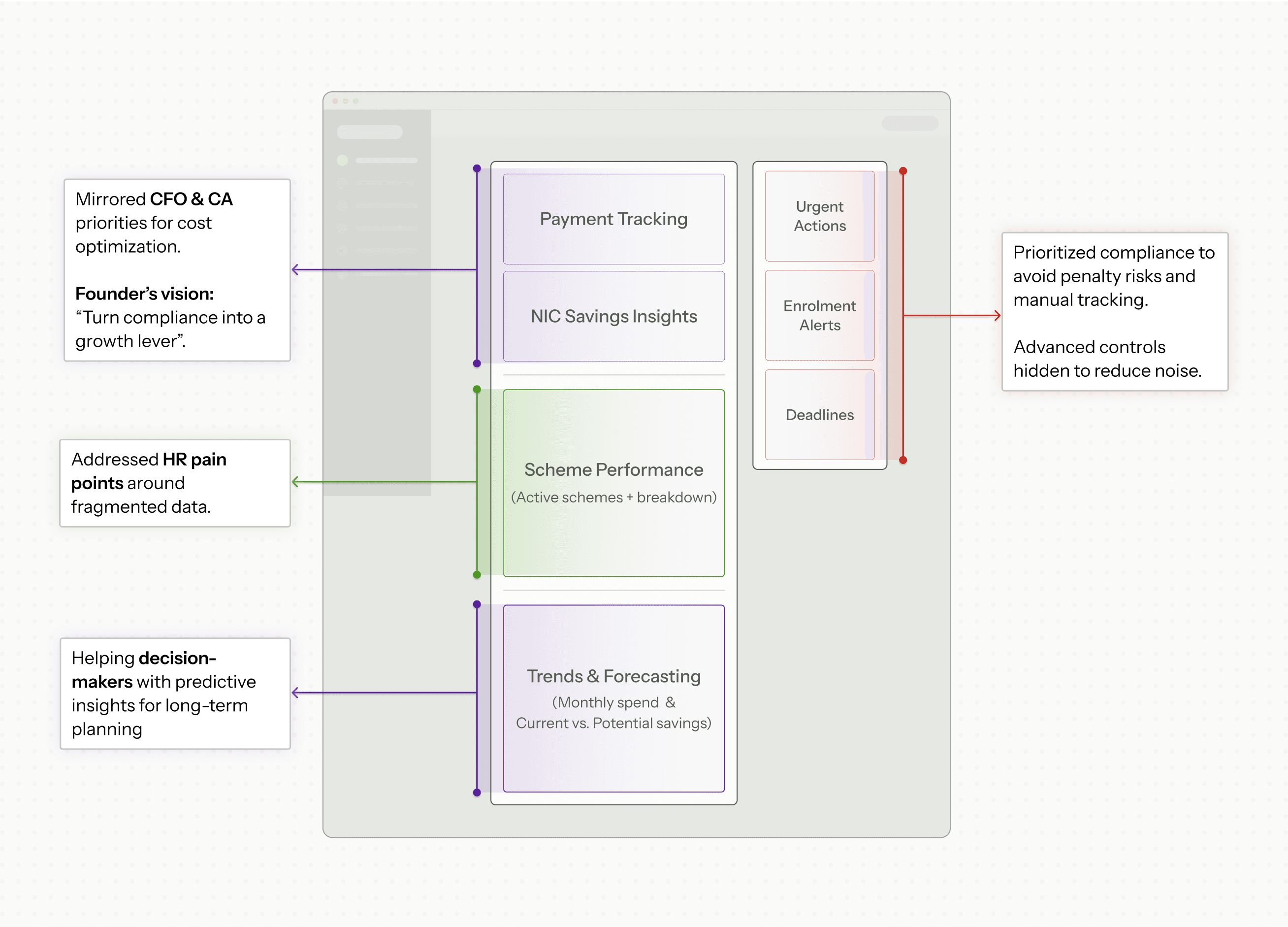
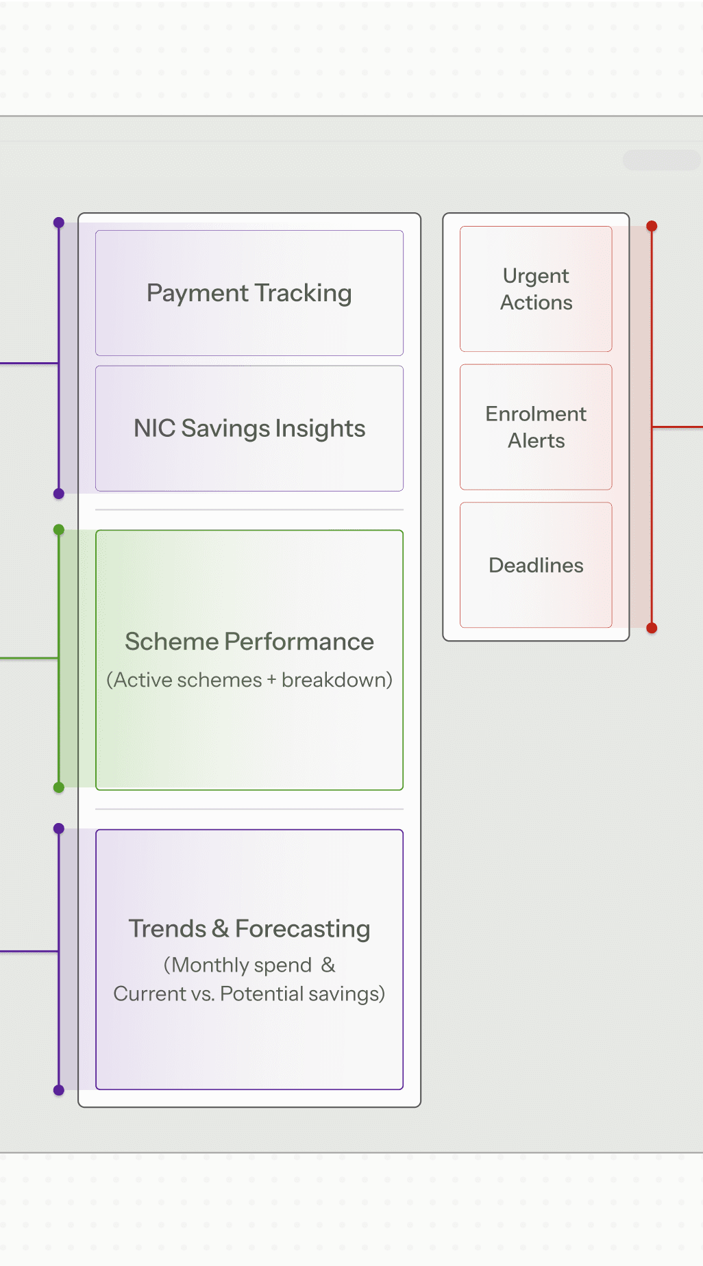
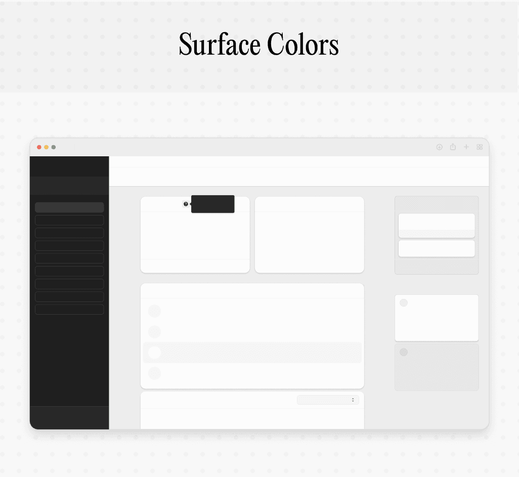
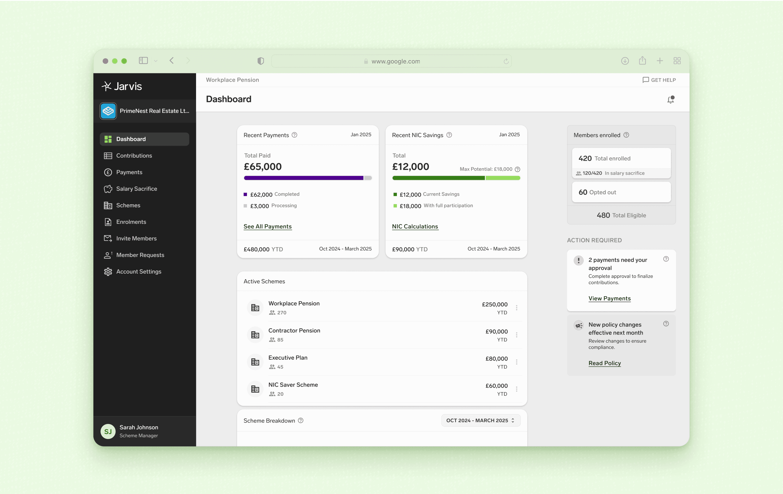
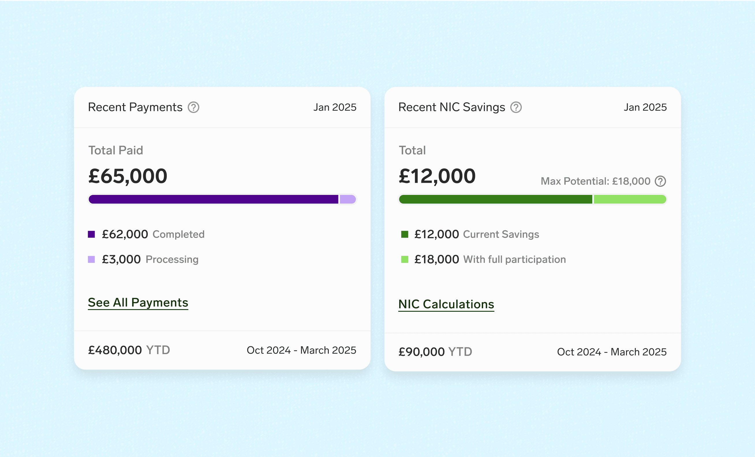
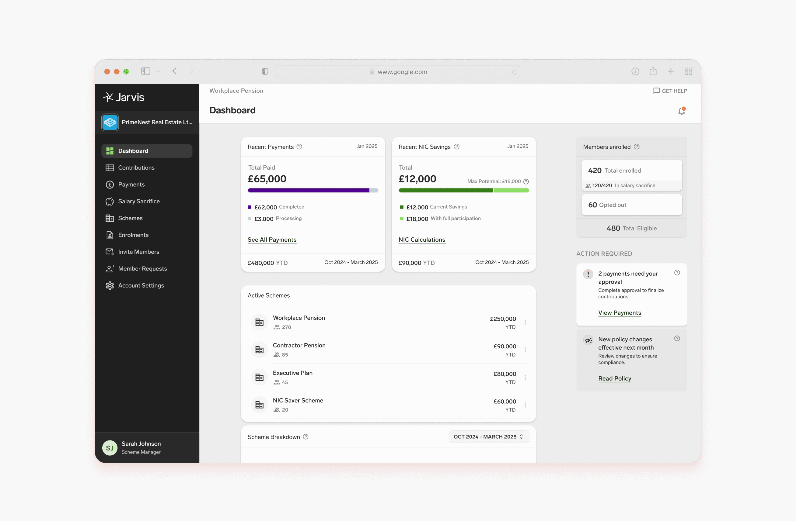
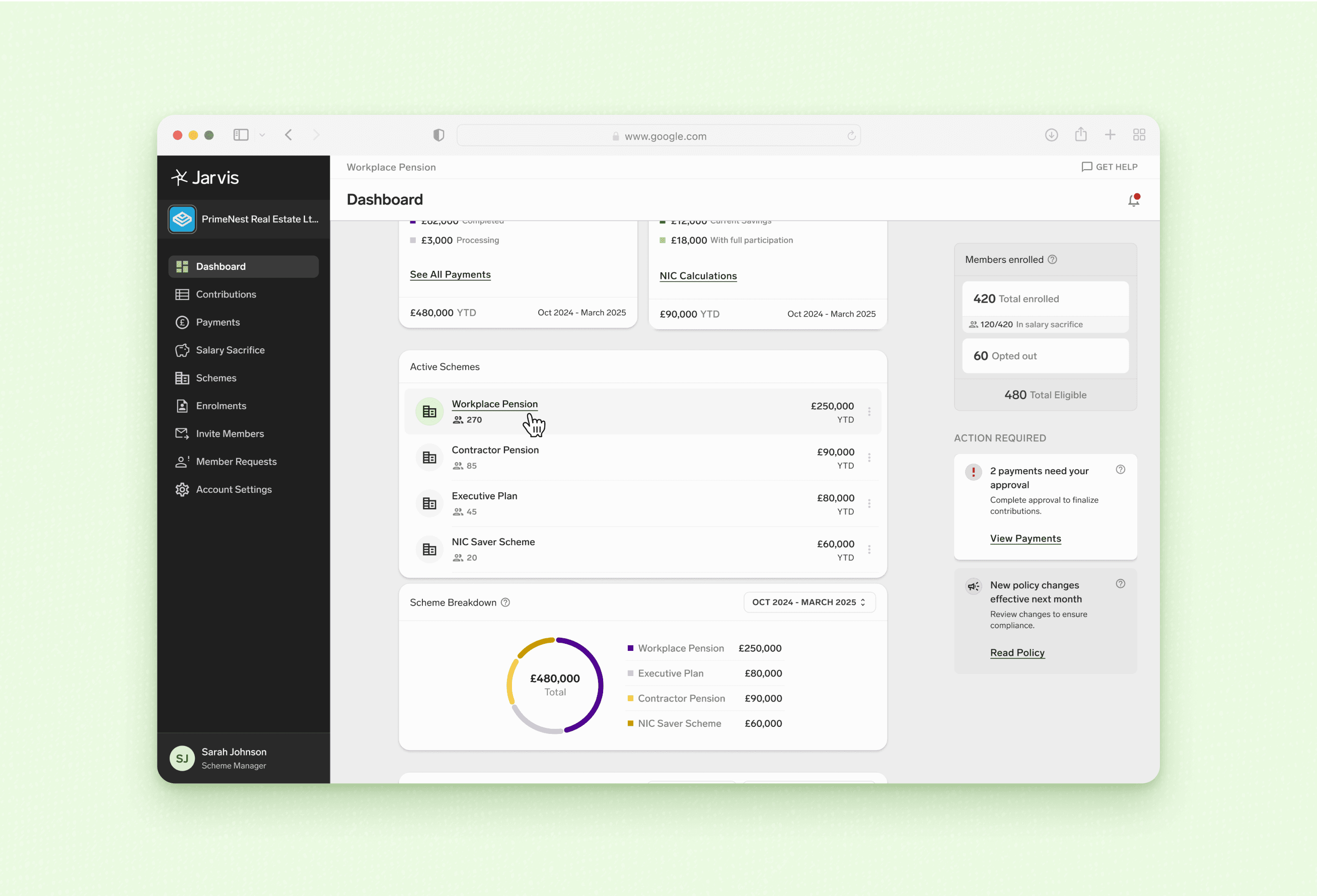
✦ Dashboard Ecosystem
Bringing Compliance & Strategy Under One Roof
After identifying critical gaps and defining our product philosophy, the next step was reimagining the dashboard’s architecture to reflect how employers actually work.
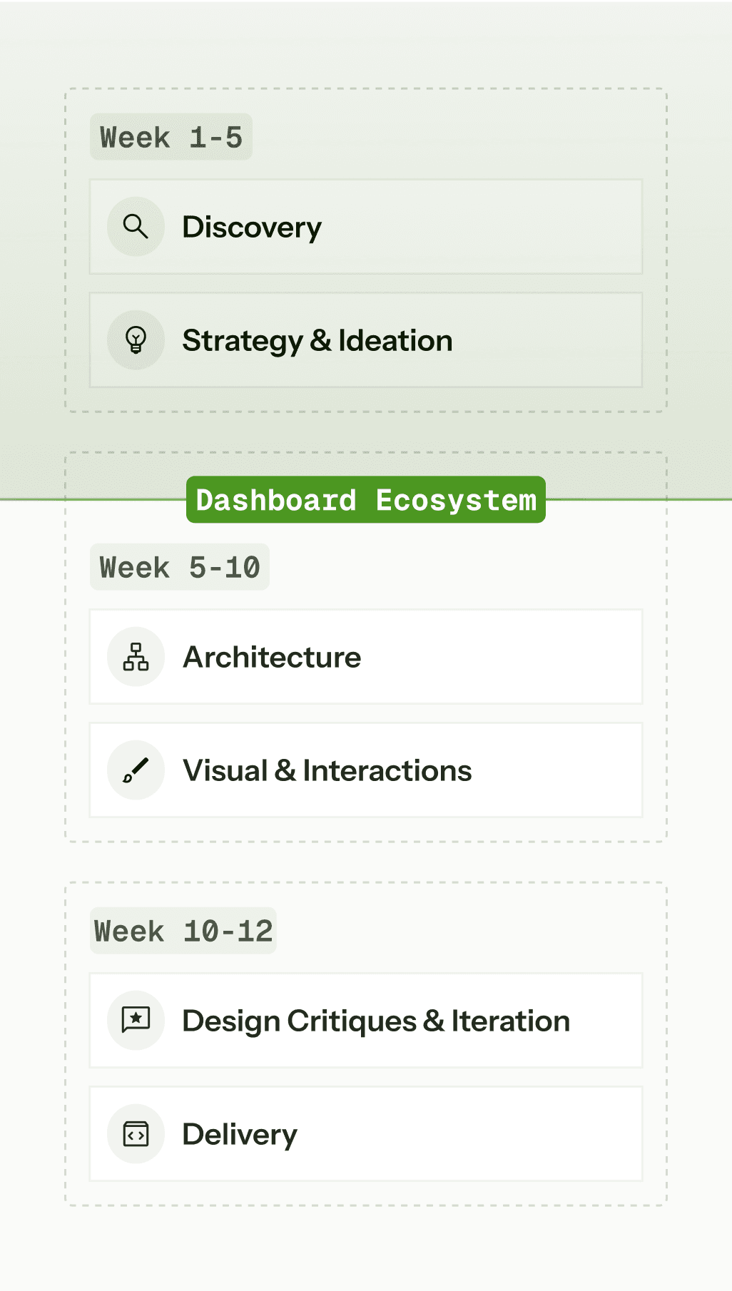
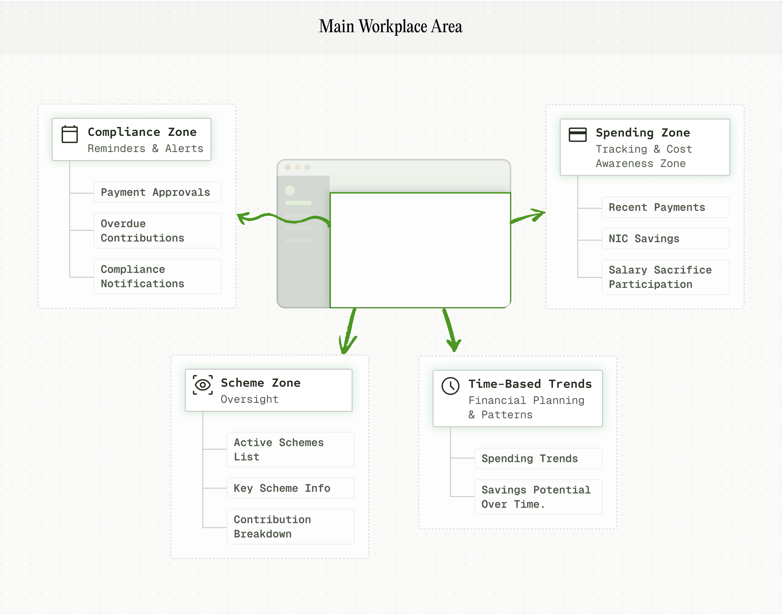
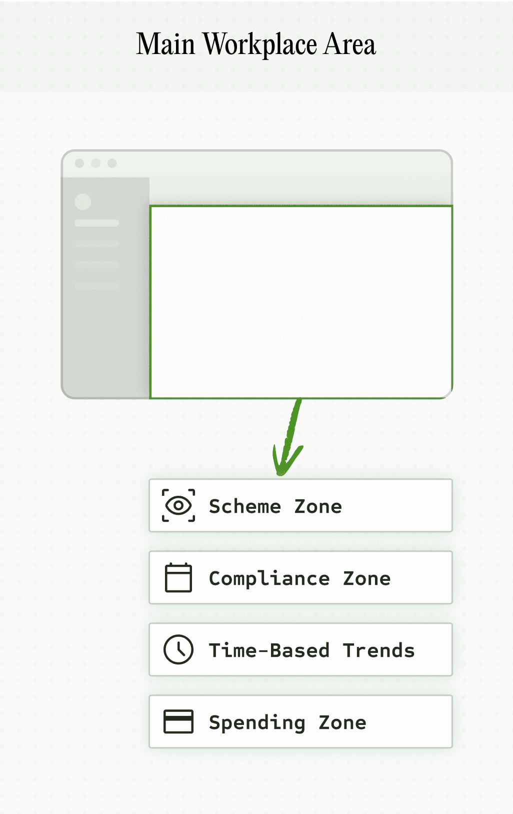
Core Layout & Architectural Strategy
Left Column
Positions pensions as value drivers, not cost centers.
Right Panel
Heuristic analysis identified buried deadlines —proximity to actions keeps them in focus.
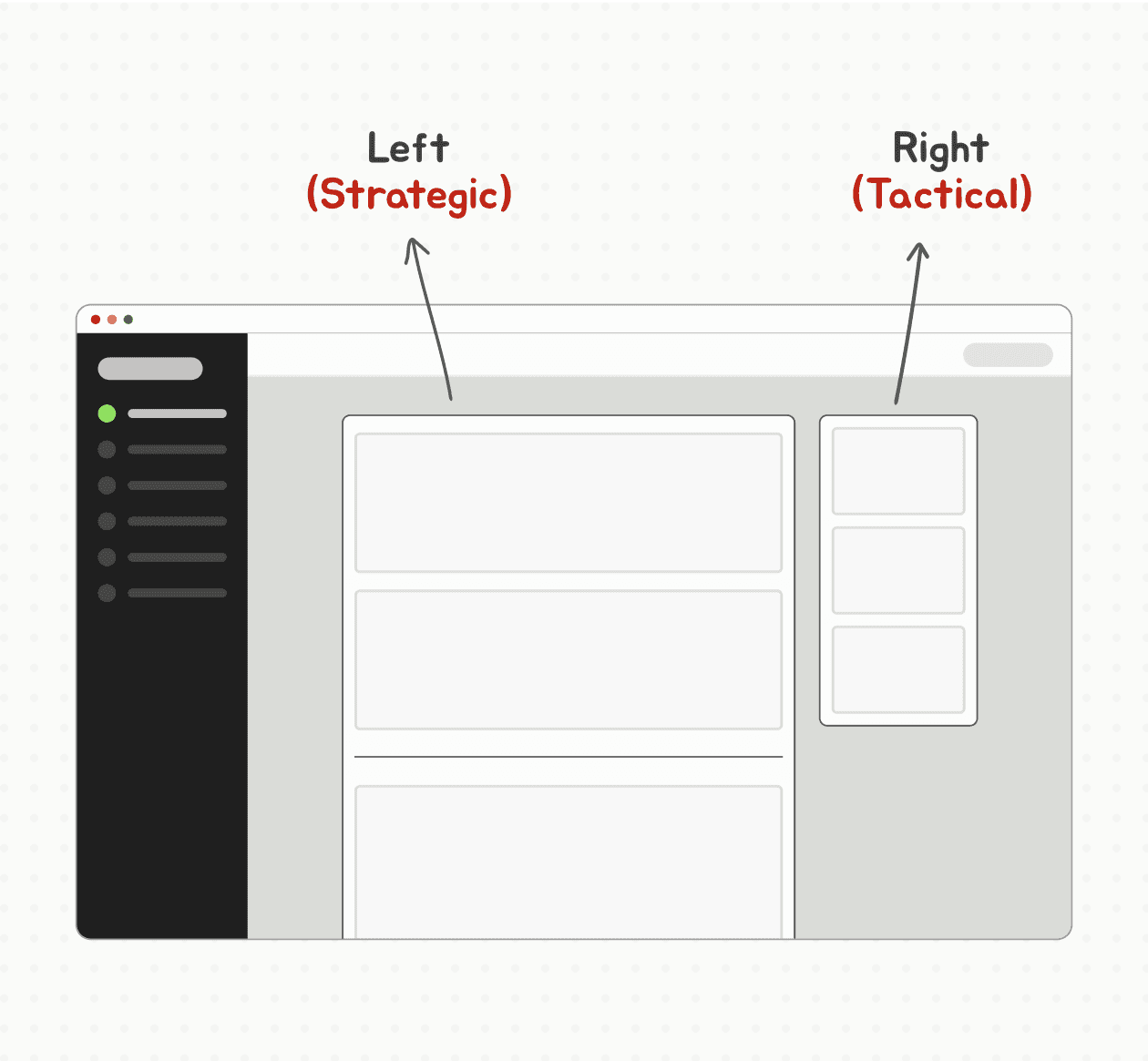
Mental Model Alignment
Structured the UI around how employers balance “act now”, “plan ahead” & “How are we doing overall?”.
Risk Mitigation
Surfacing deadlines upfront: “We need to show we keep clients penalty-free.”
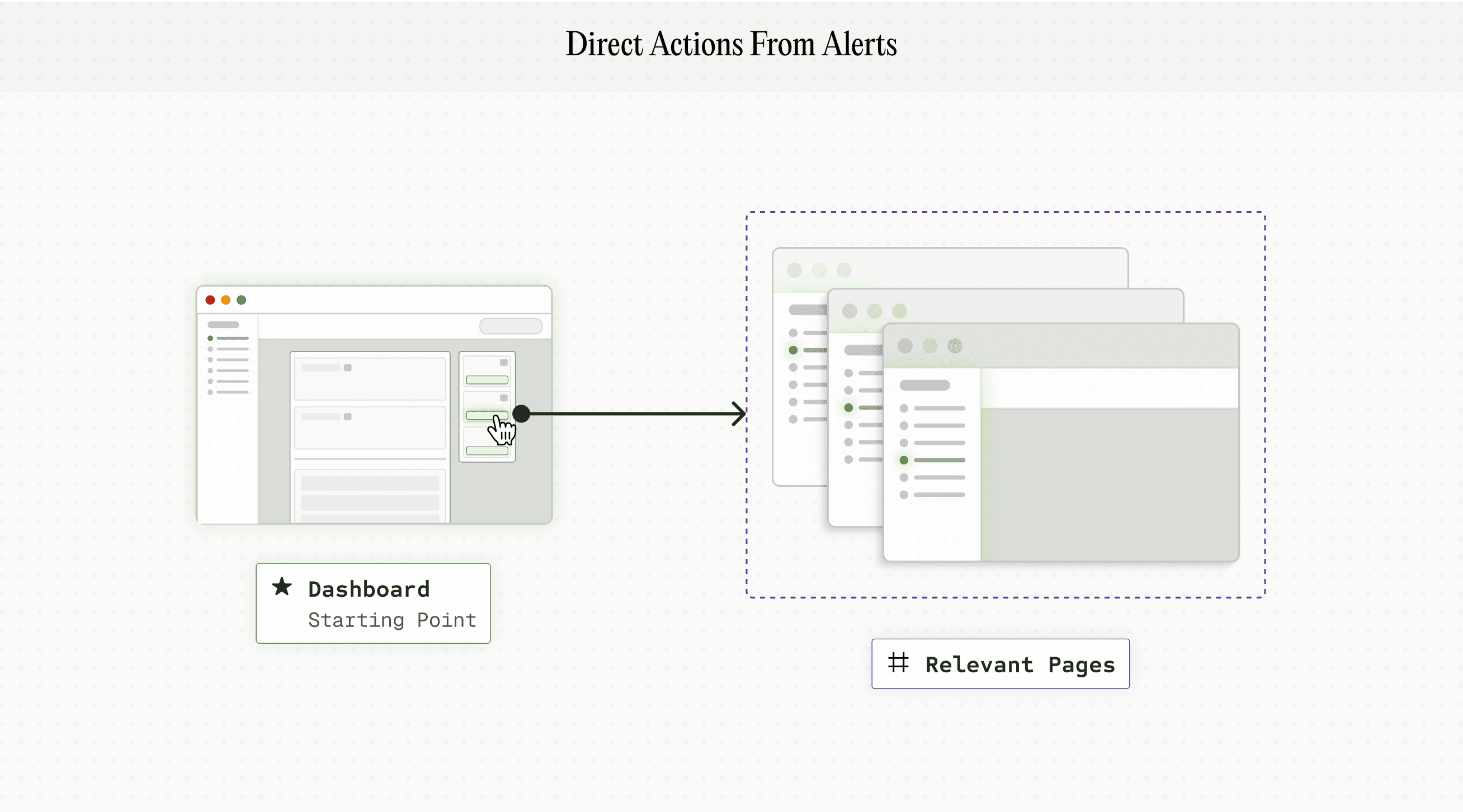
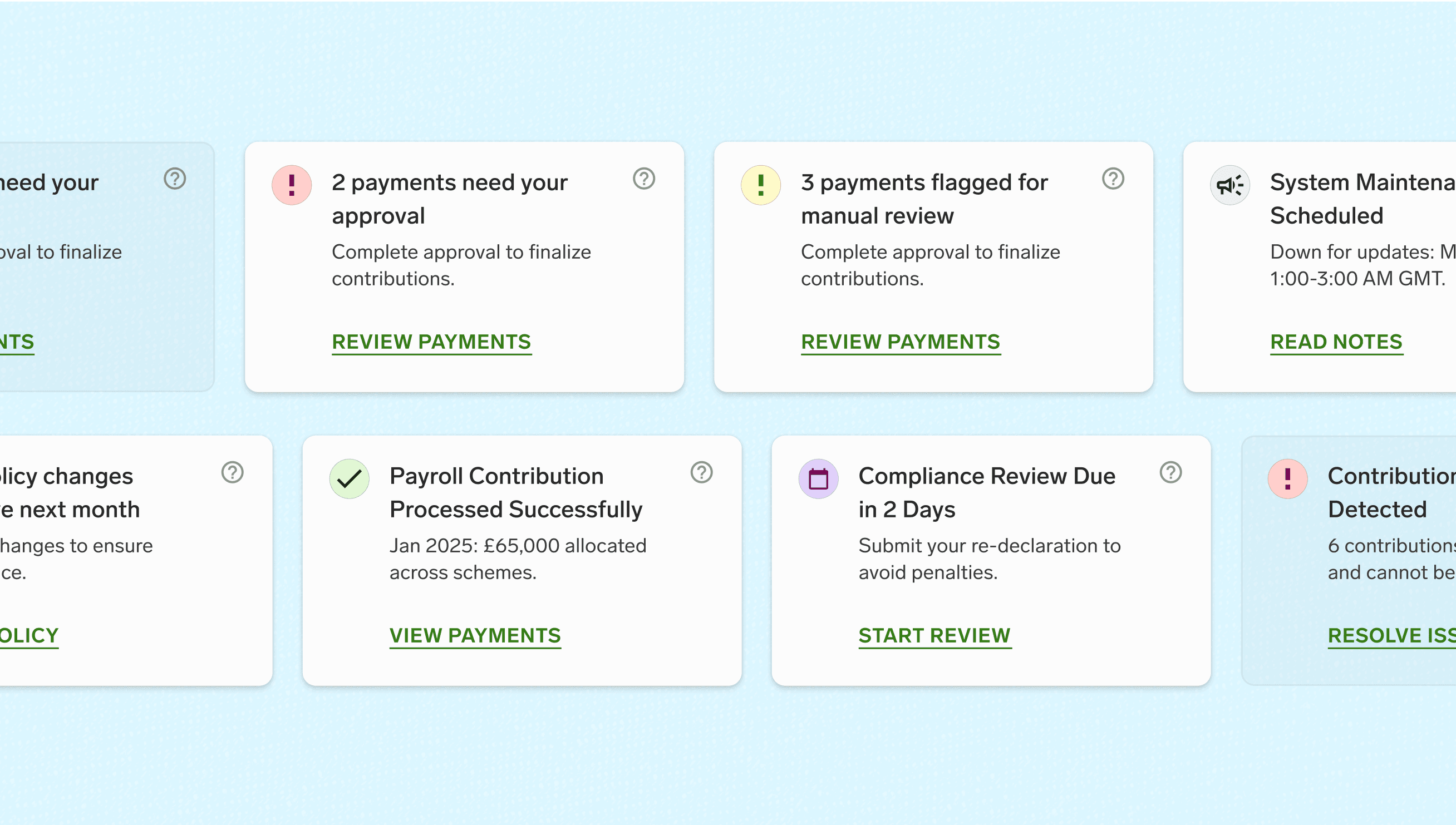
Dashboard Interactions & Guided Flows
“I waste time switching platforms and tabs just to check basic information.”
User review
01 / 04
02 / 04
03 / 04
04 / 04
✦ Bringing Jarvis’s UX to Life
Building a Scalable Visual Language
Next, we focused on turning research and interaction patterns into a cohesive visual system—clarifying color roles, simplifying layers, and setting a consistent design language.
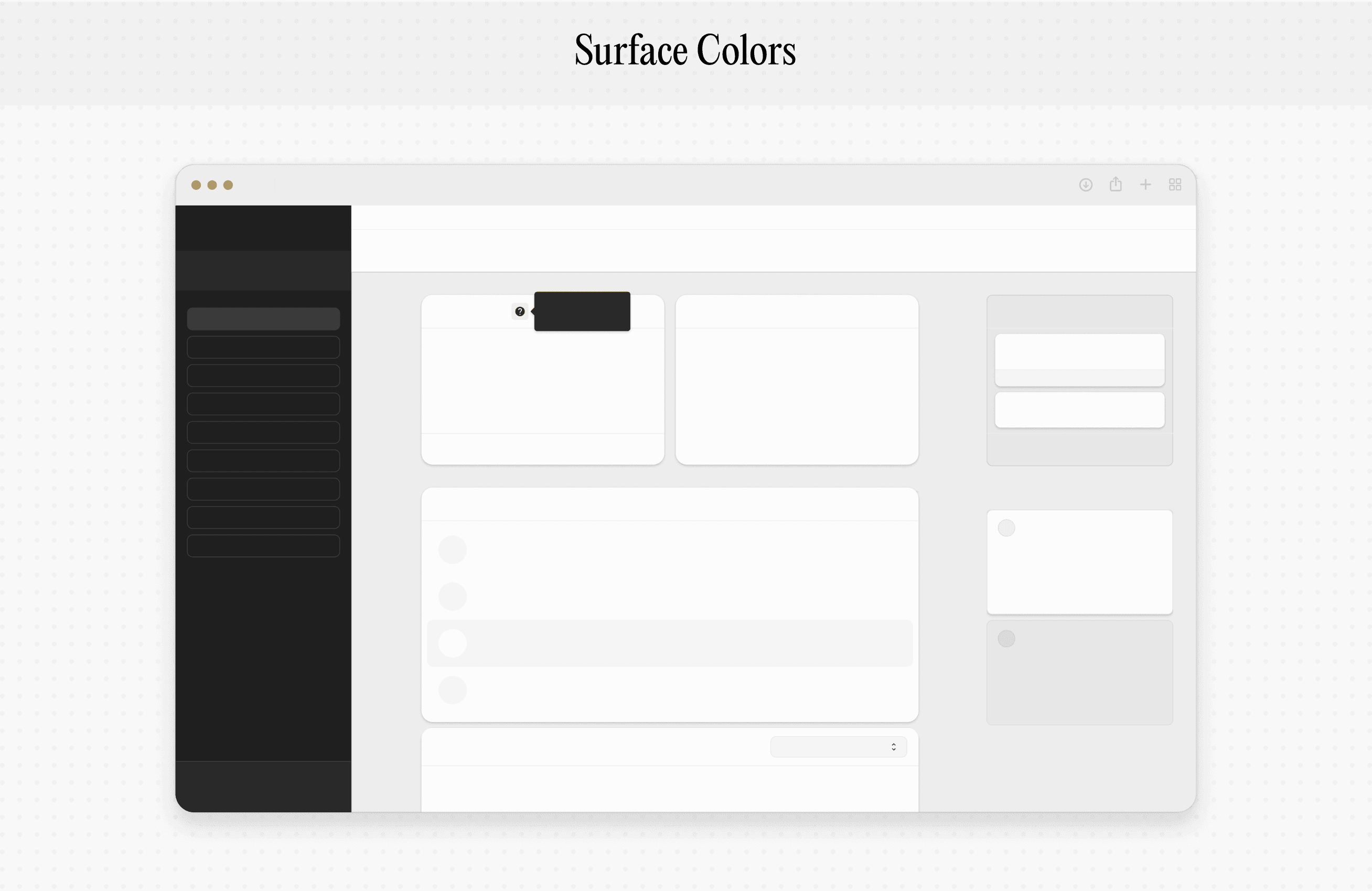
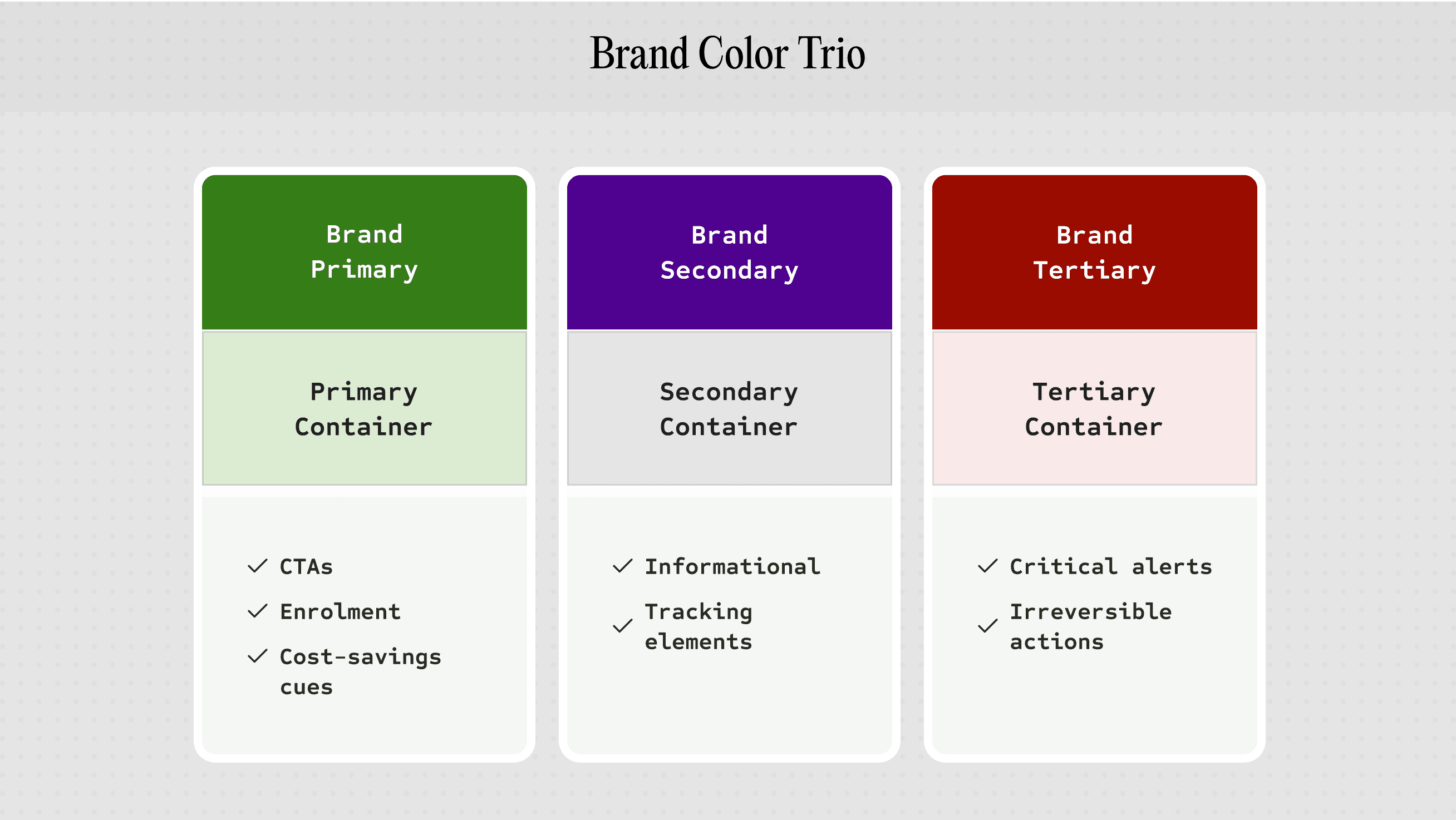
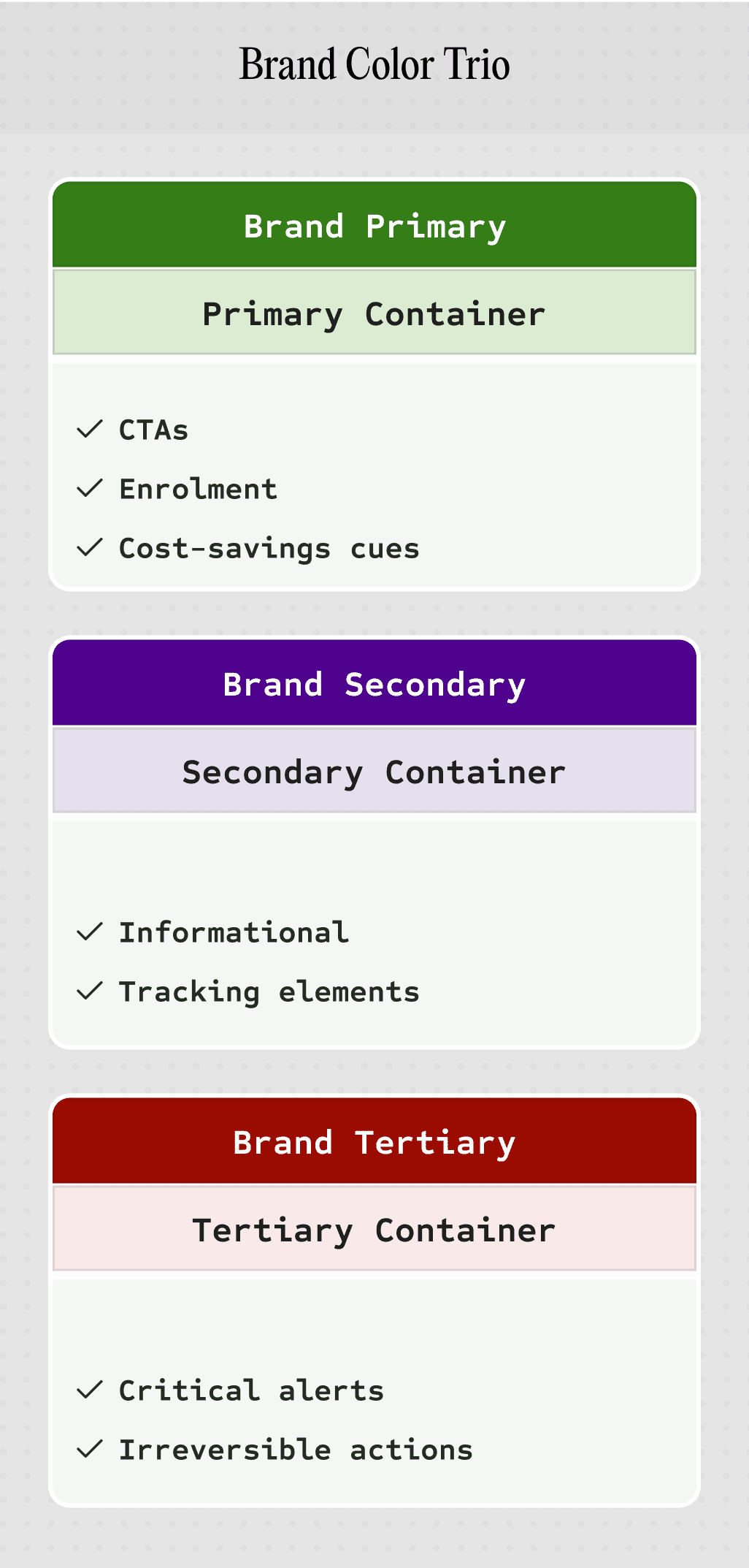
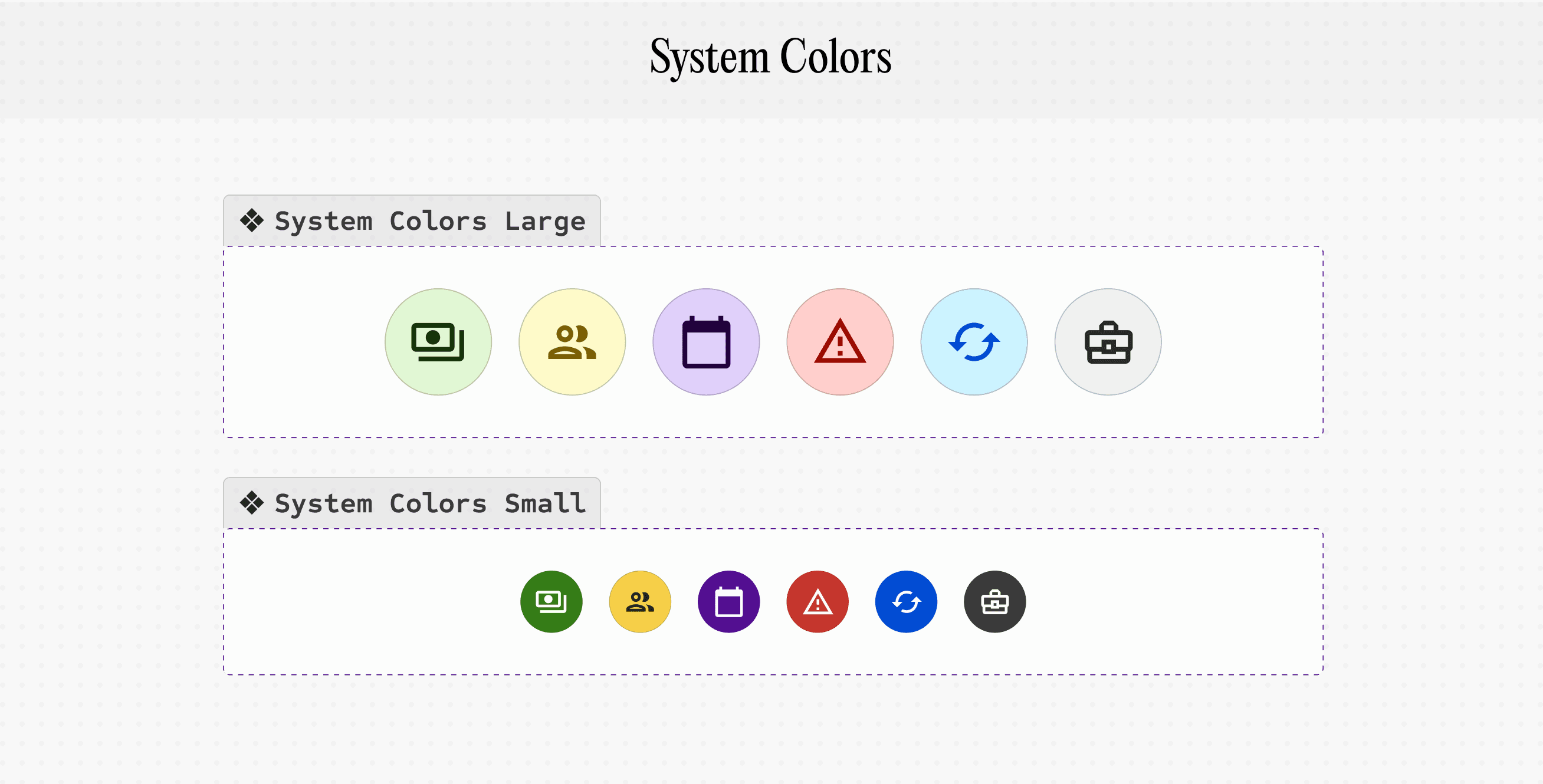
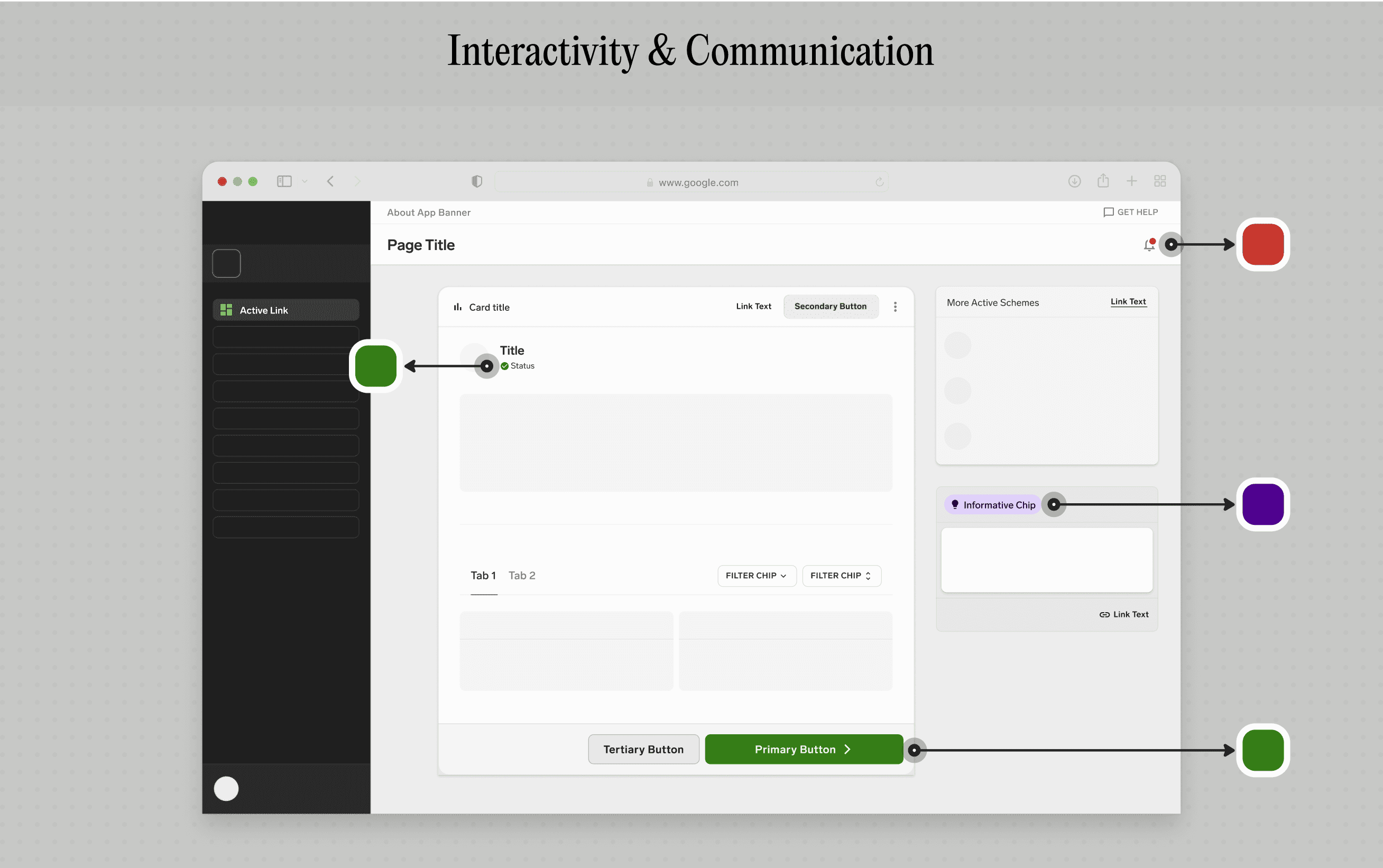
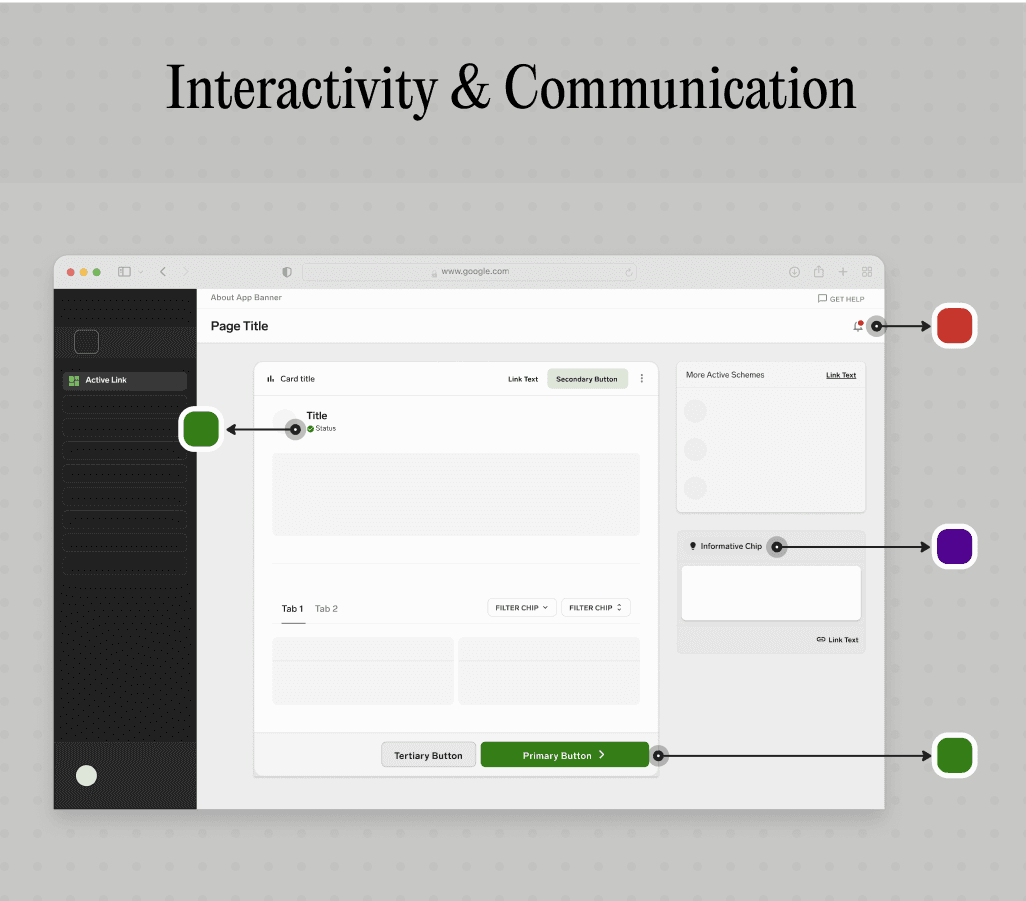
Component Curvature
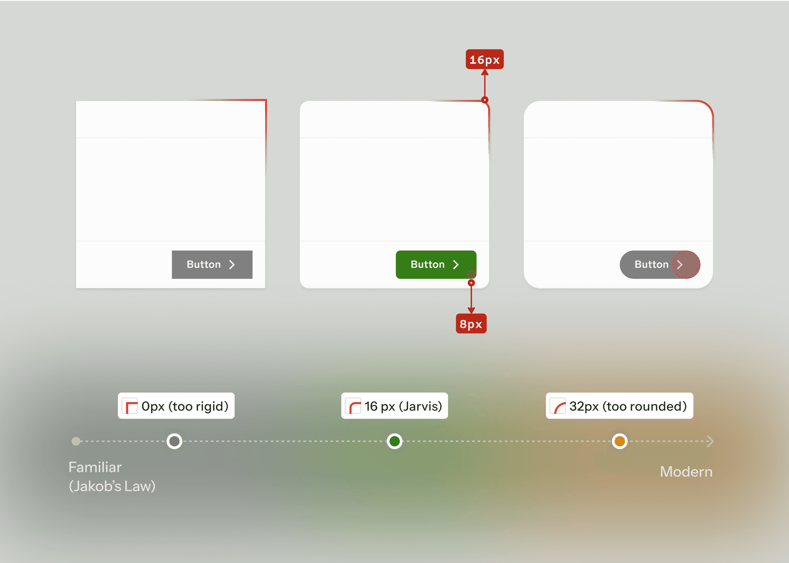
Bringing it all together
Critique Insight
✦ Main screen Design Critique
Interaction Cost for Critical Tasks
Before
Key Adjustments
Frequently used actions deserve surface-level access—removing the need to remember navigation paths for recurring tasks.
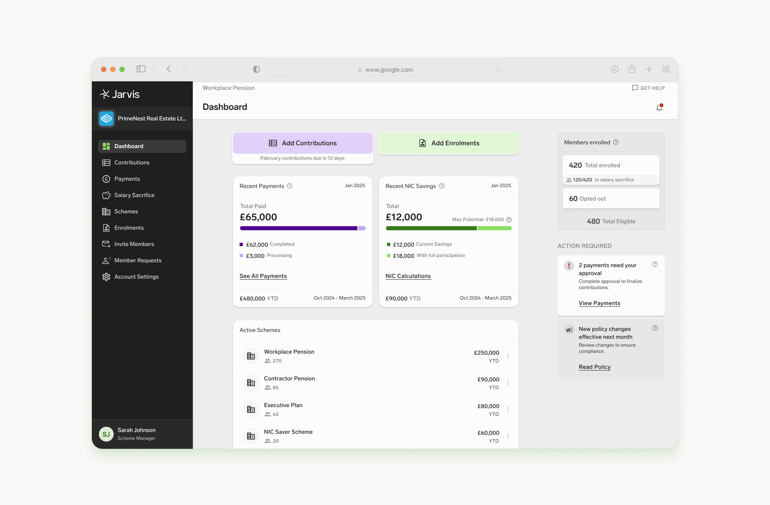
After
Larger buttons with high contrast reduce targeting time.
Cut navigation steps from 3 (global nav → page → upload) to 1 (single click).
Research Insight
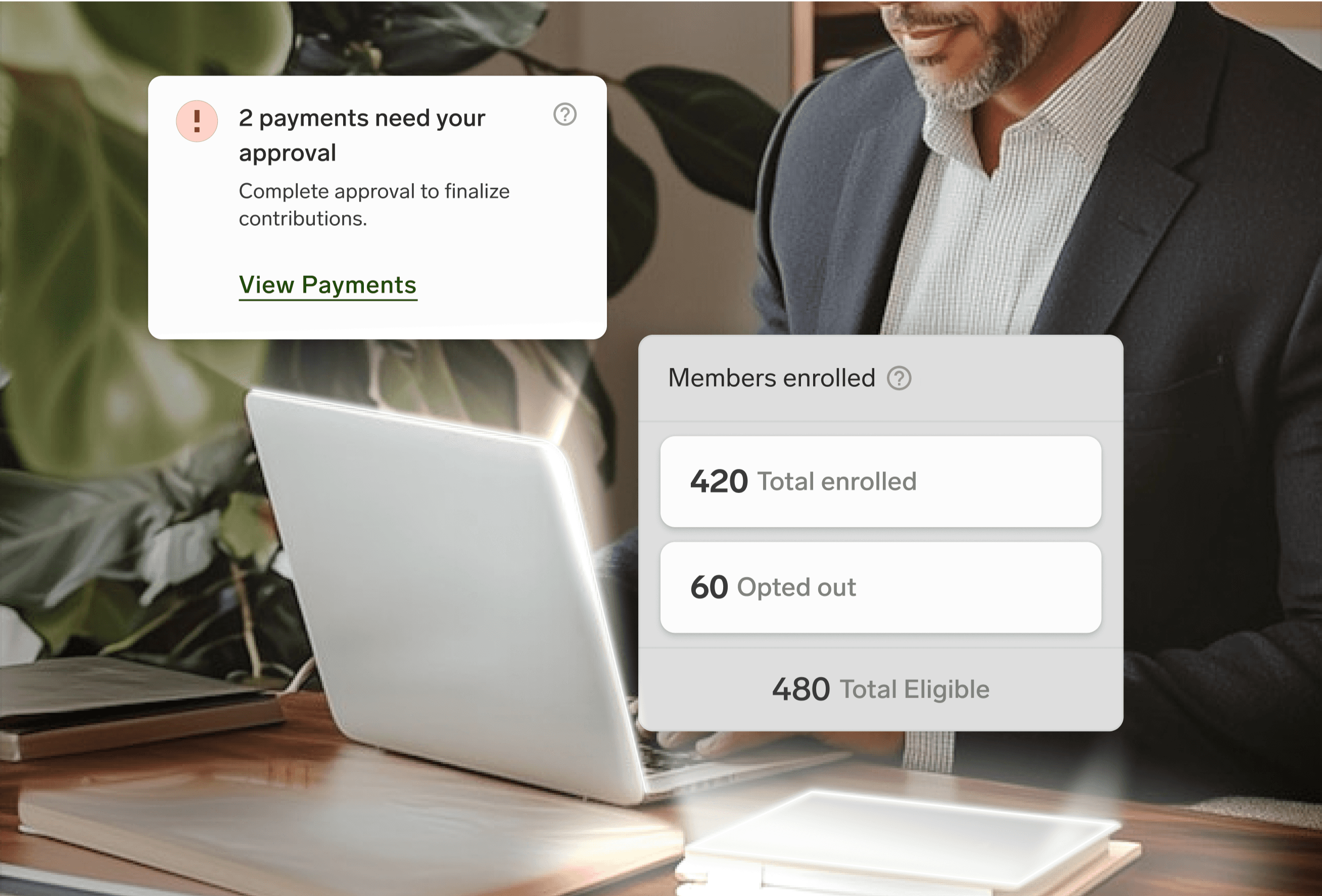
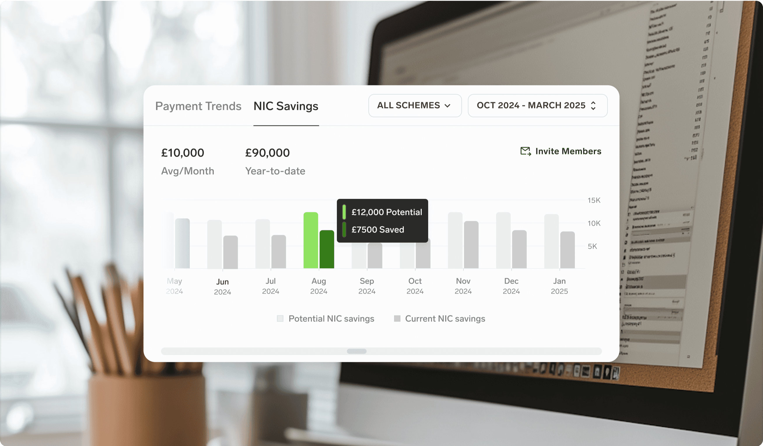
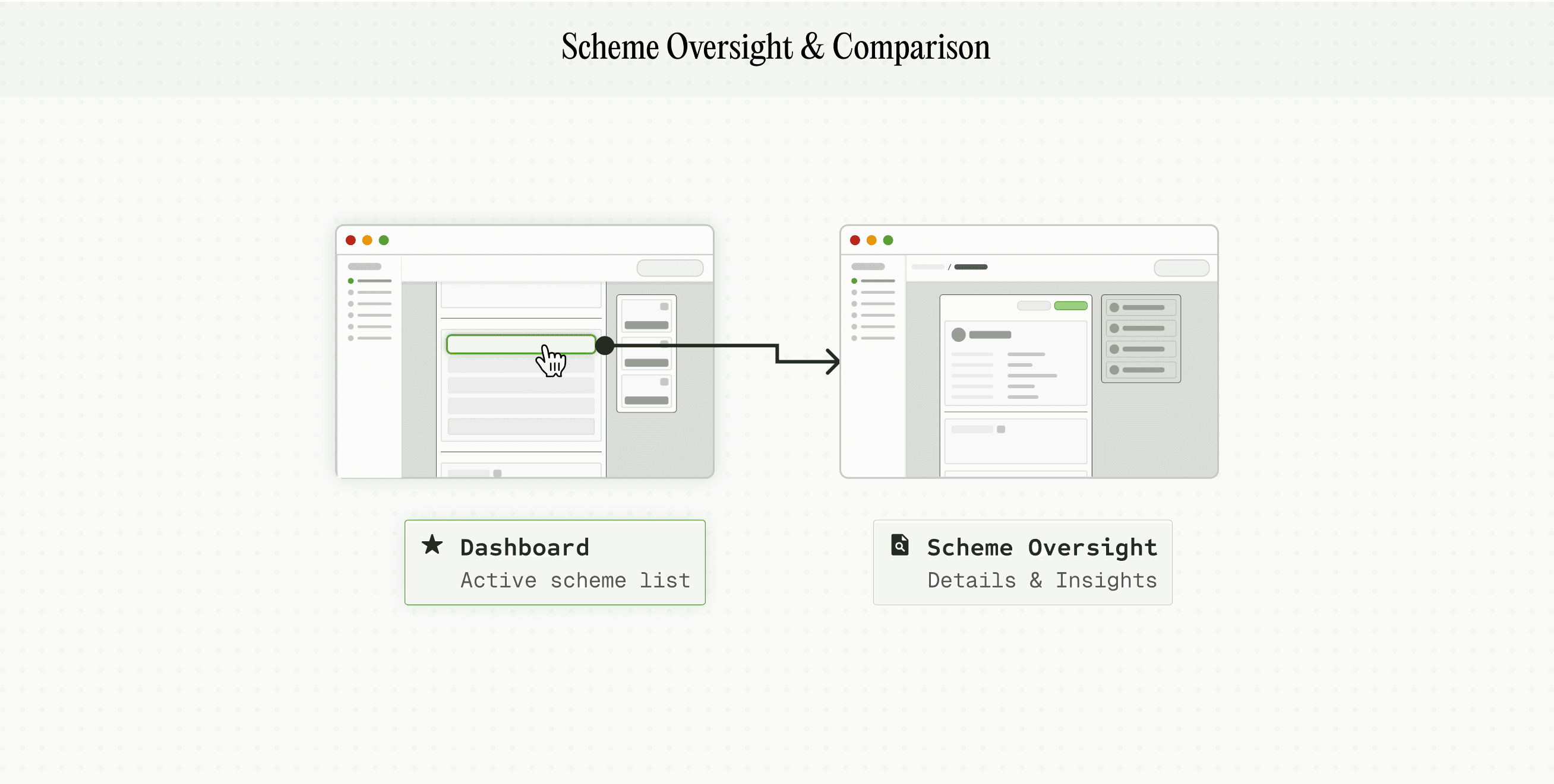
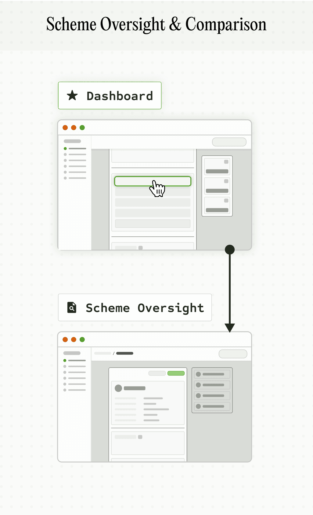
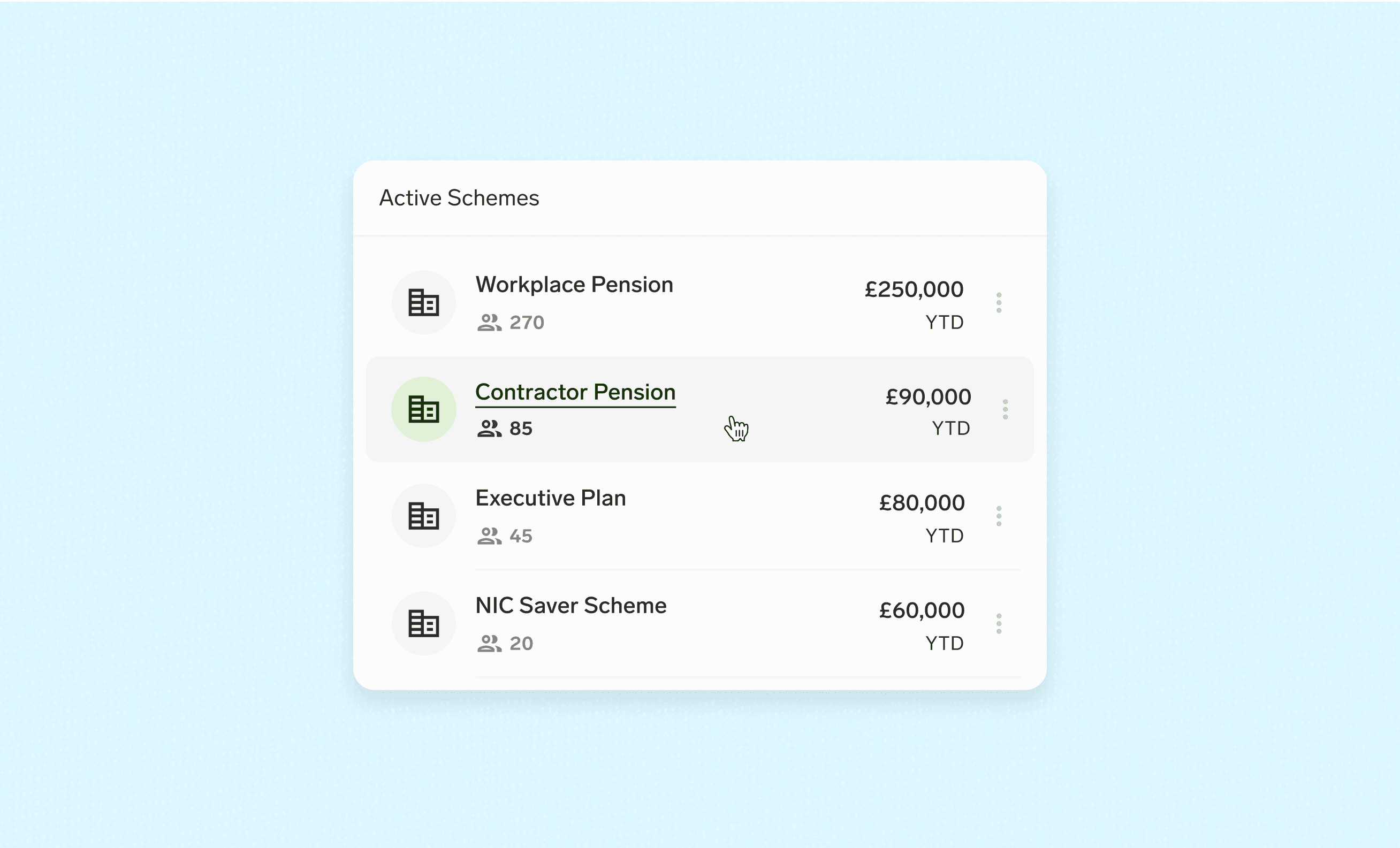
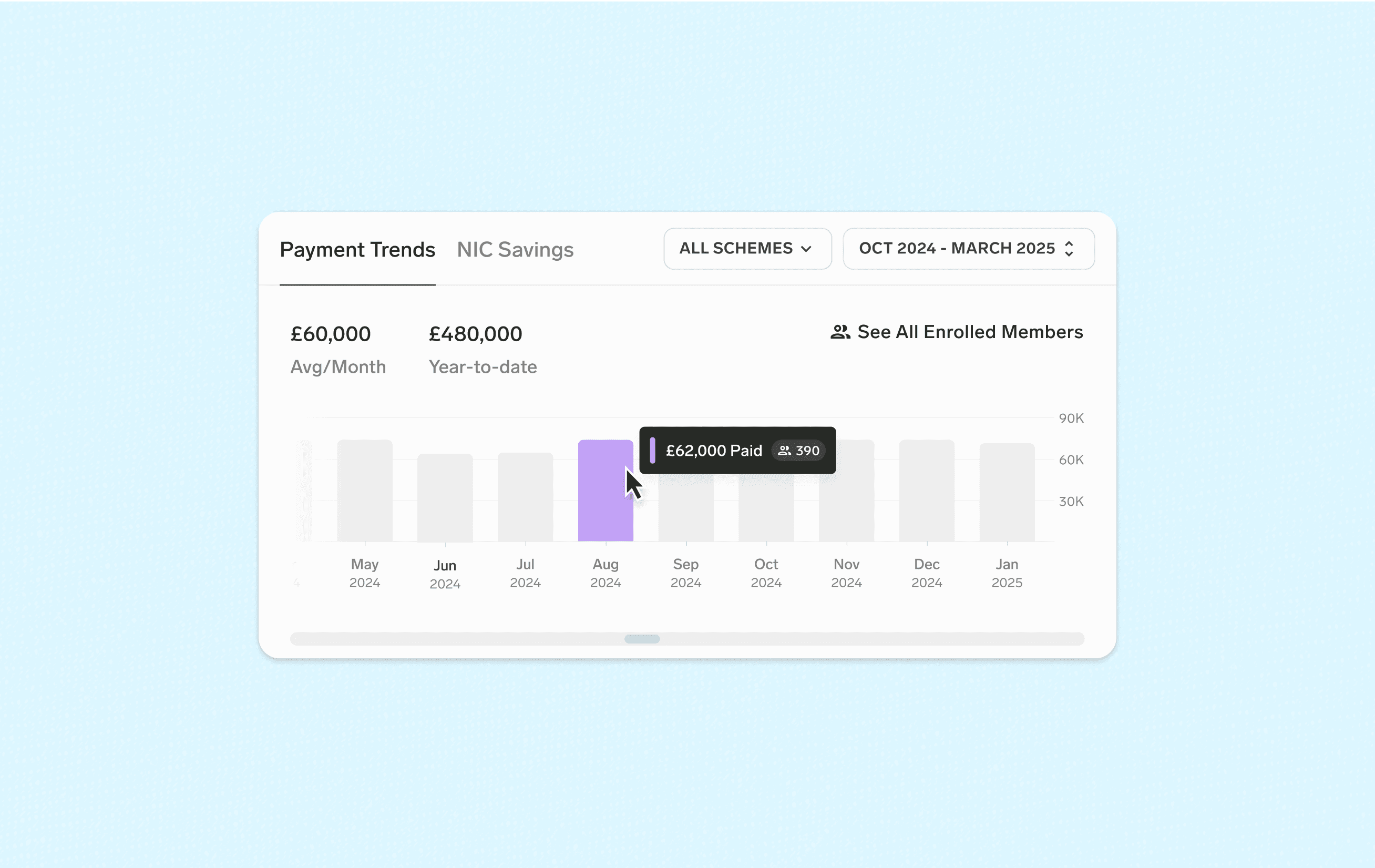
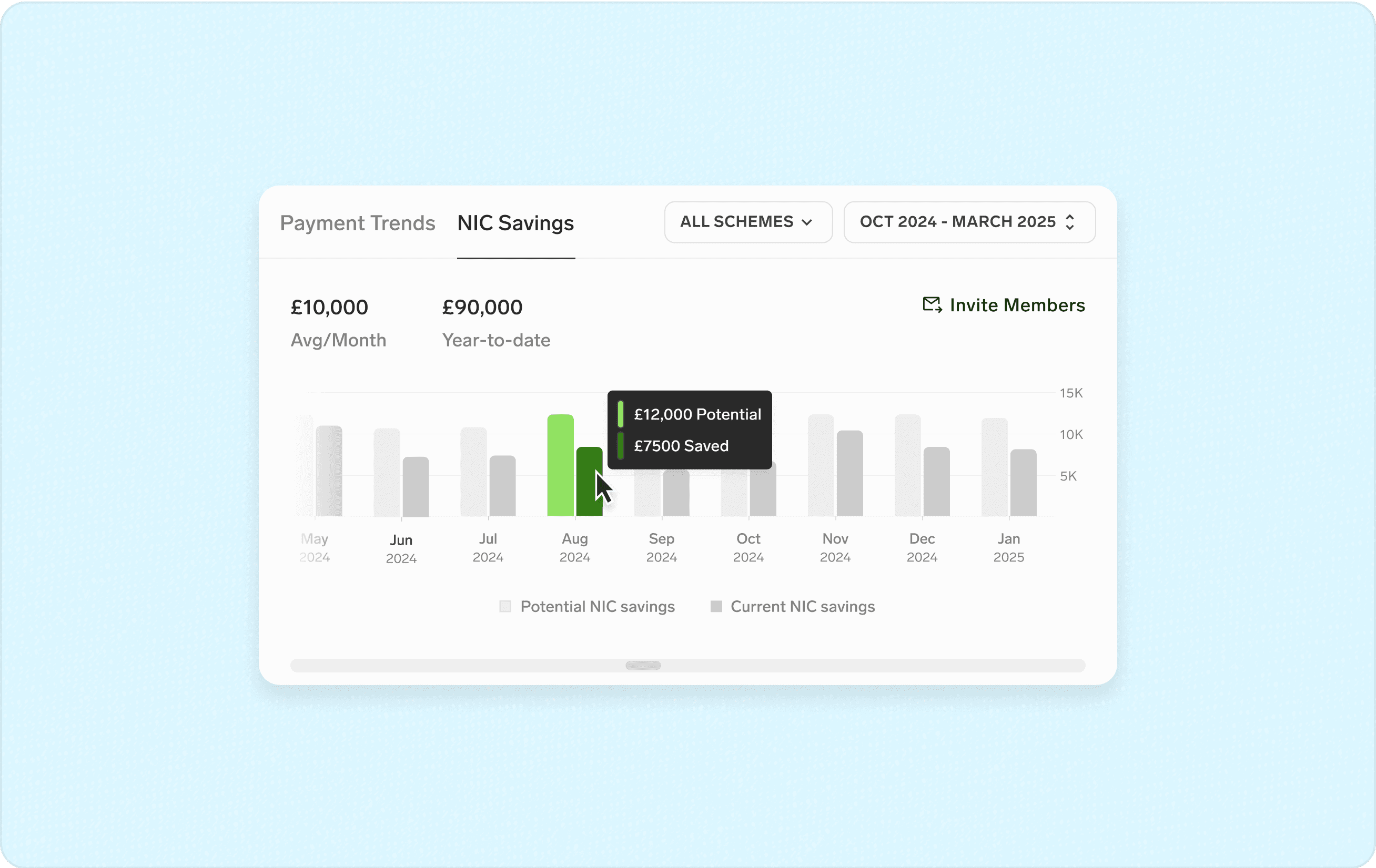
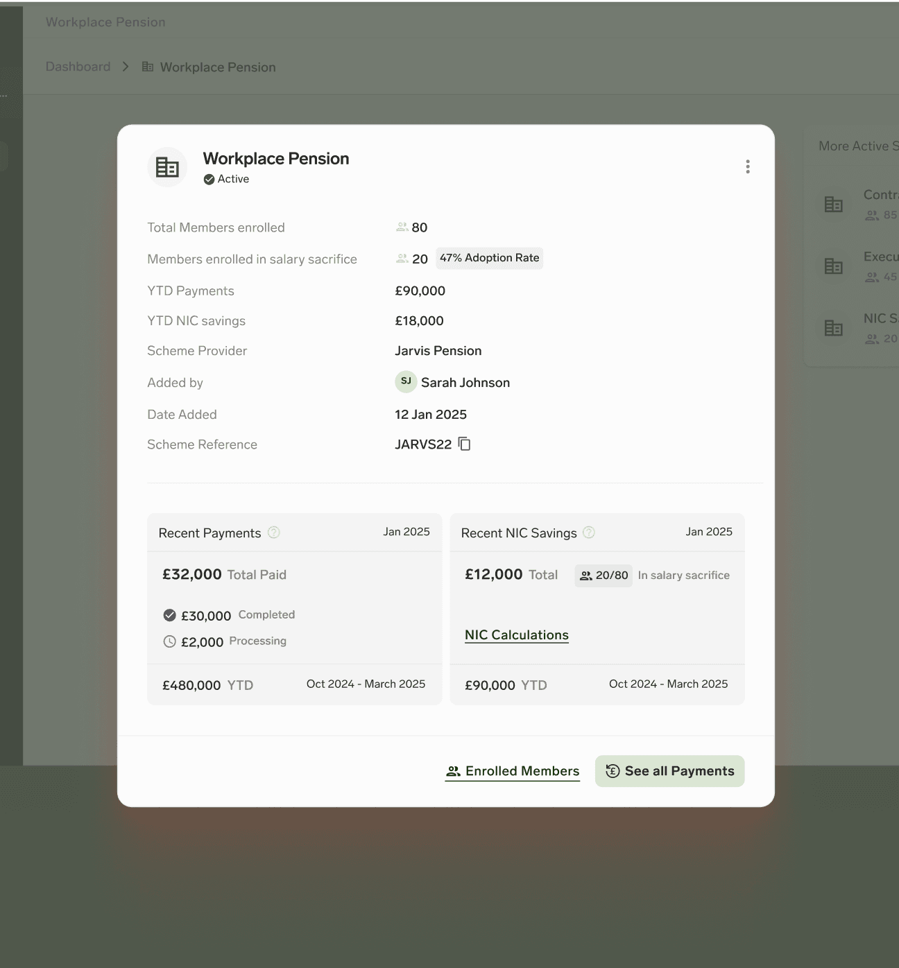
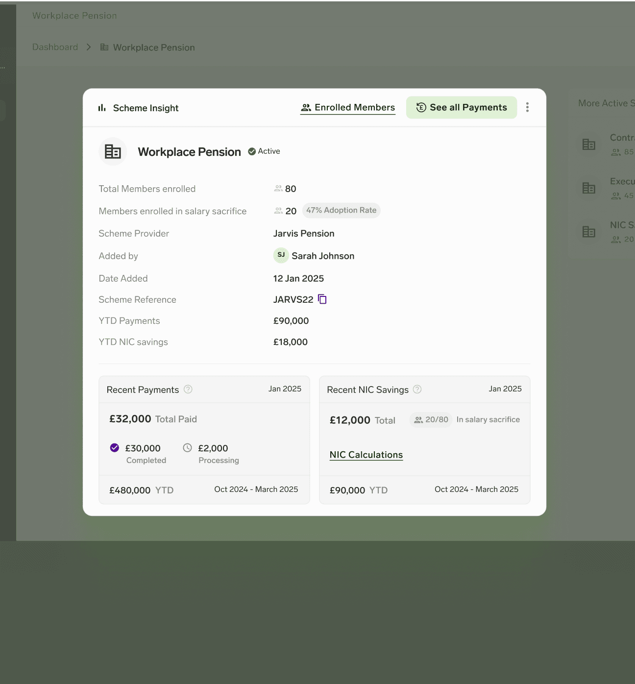
Scheme Insights
By clicking an active scheme directly from the dashboard, users land on immediate, scheme-specific insights.
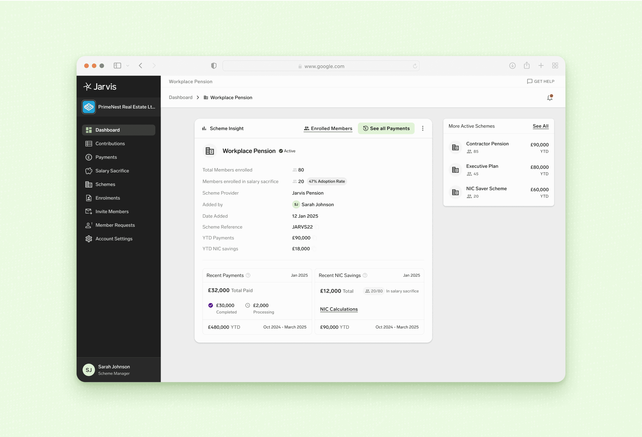
✦ Scheme Insights
Inclusive Workflows for Diverse Personas
How might we support different decision depths without breaking user flow?
How might we simplify multi-scheme scanning without relying on recall?
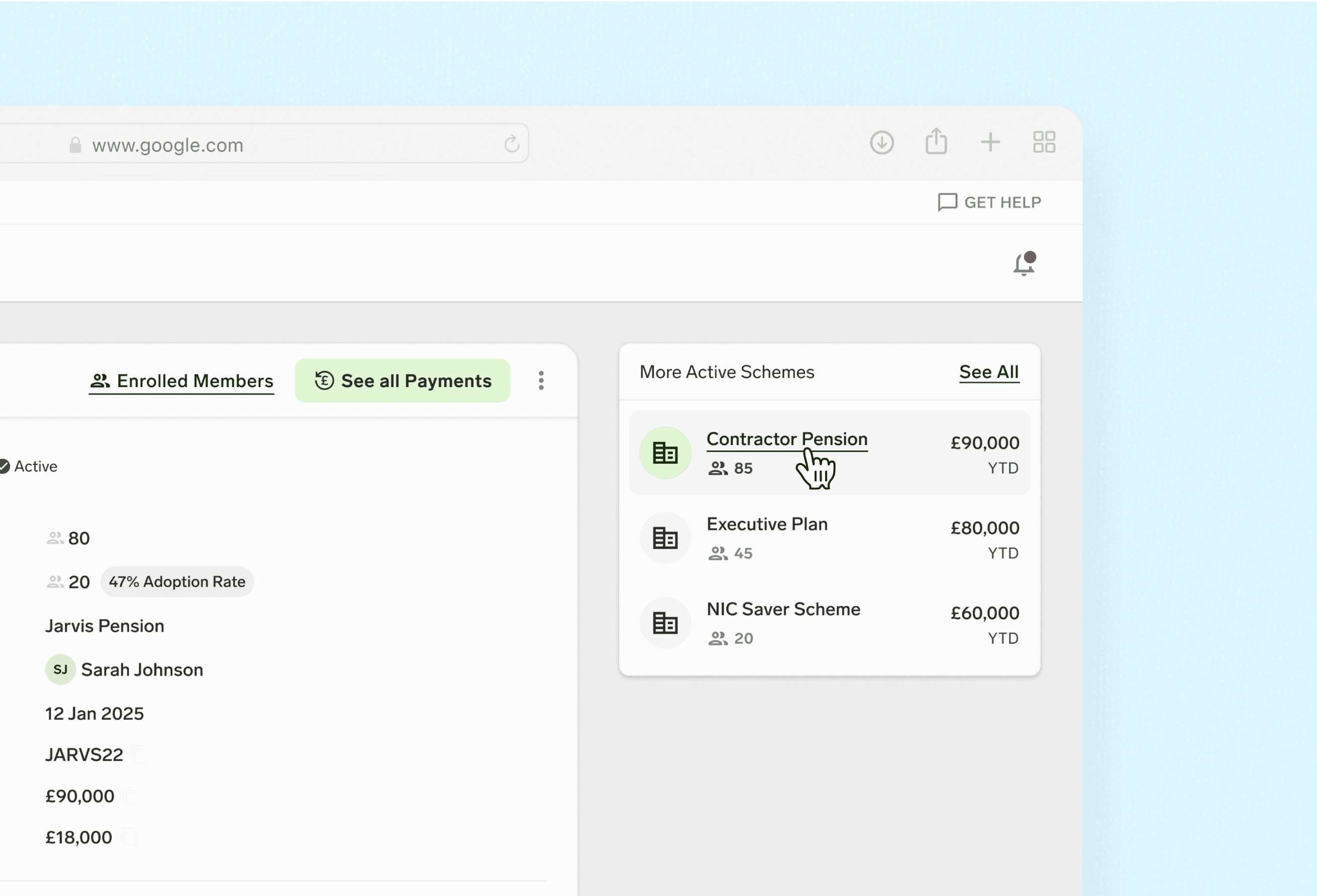
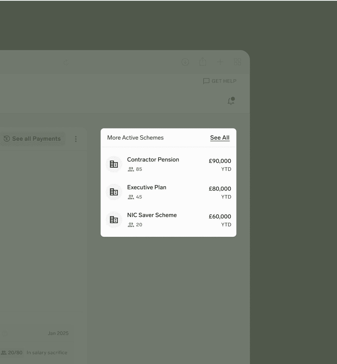
View other active schemes’ insights without returning to the dashboard.
The design supports different personas—balancing strategic views, day-to-day tasks, and member-level data across varied workflows.
Iterative Evolution (#1)
Before
After
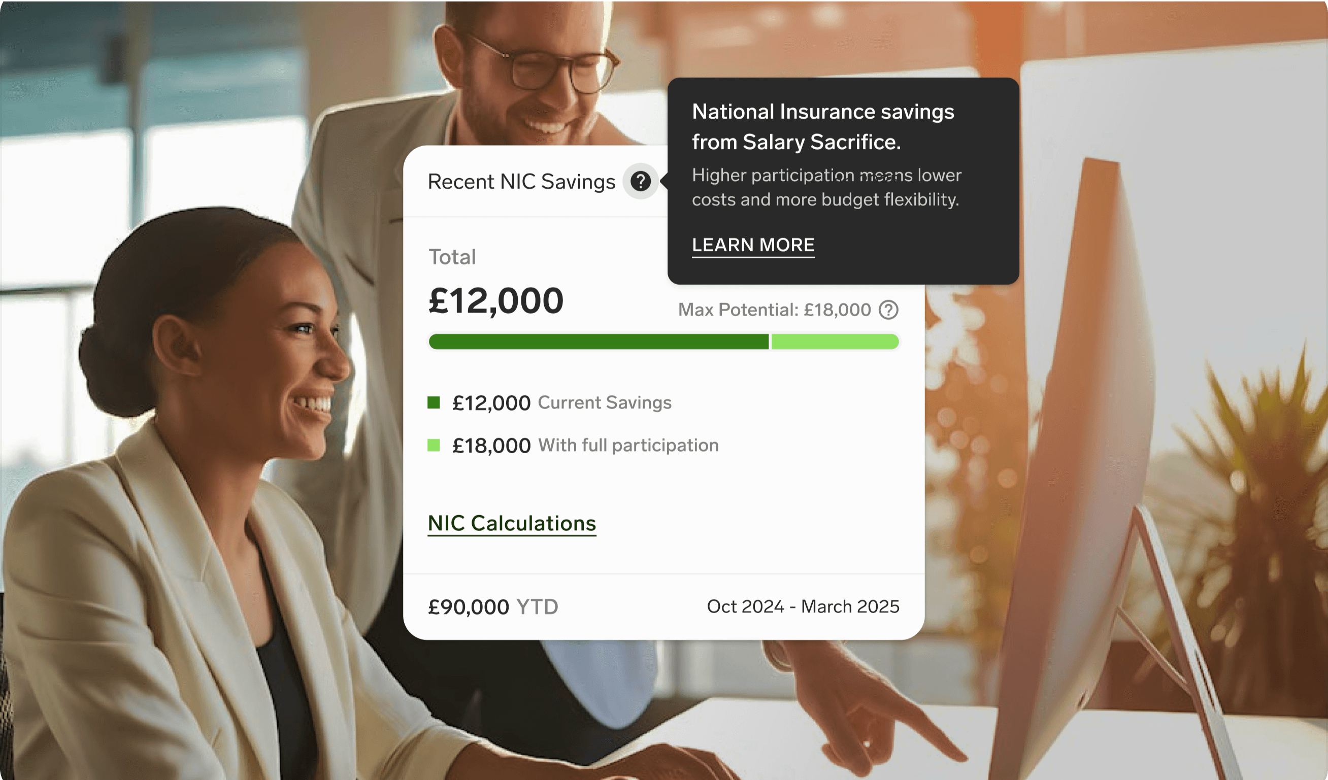
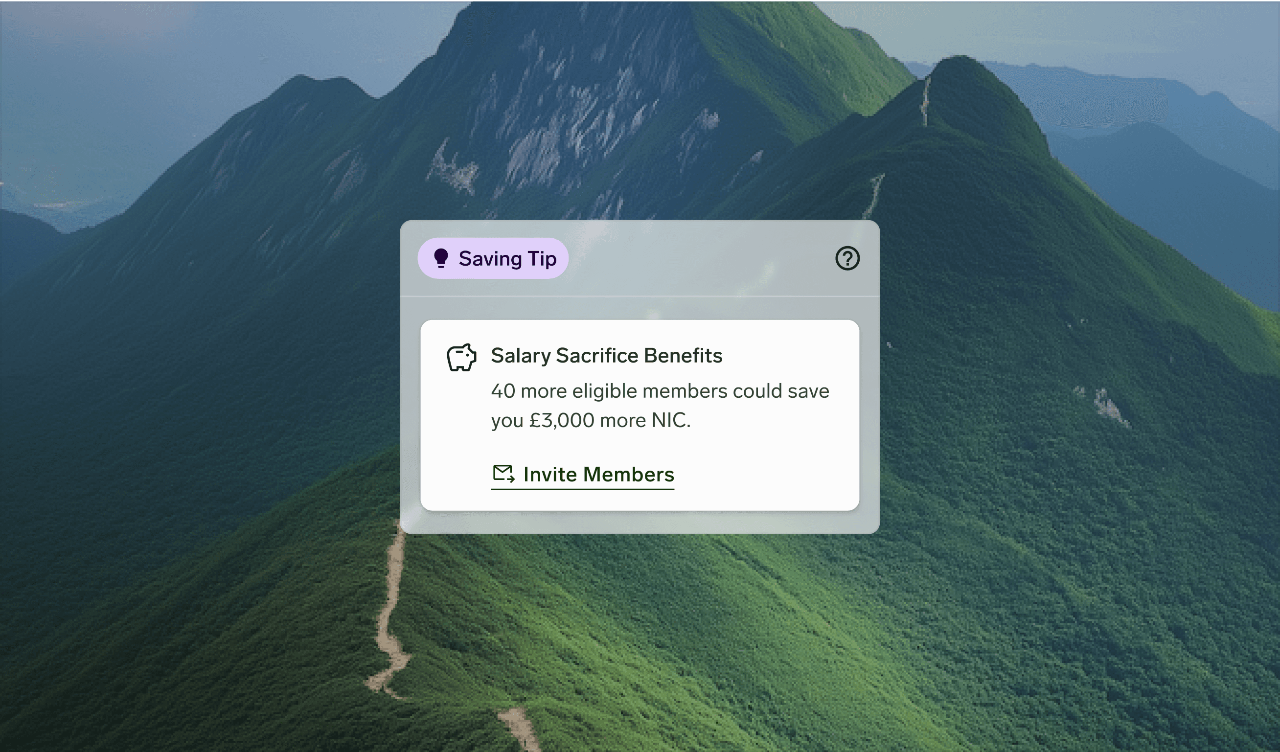
Iterative Evolution (#2)
Brought salary sacrifice insights into focus with a contextual tip card, helping employers spot untapped NIC opportunities.
Before
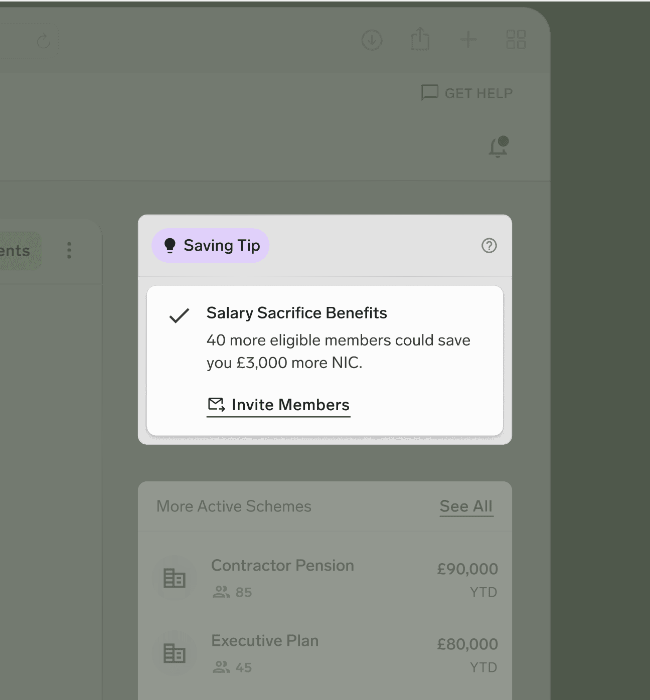
After
Epiphany Moment
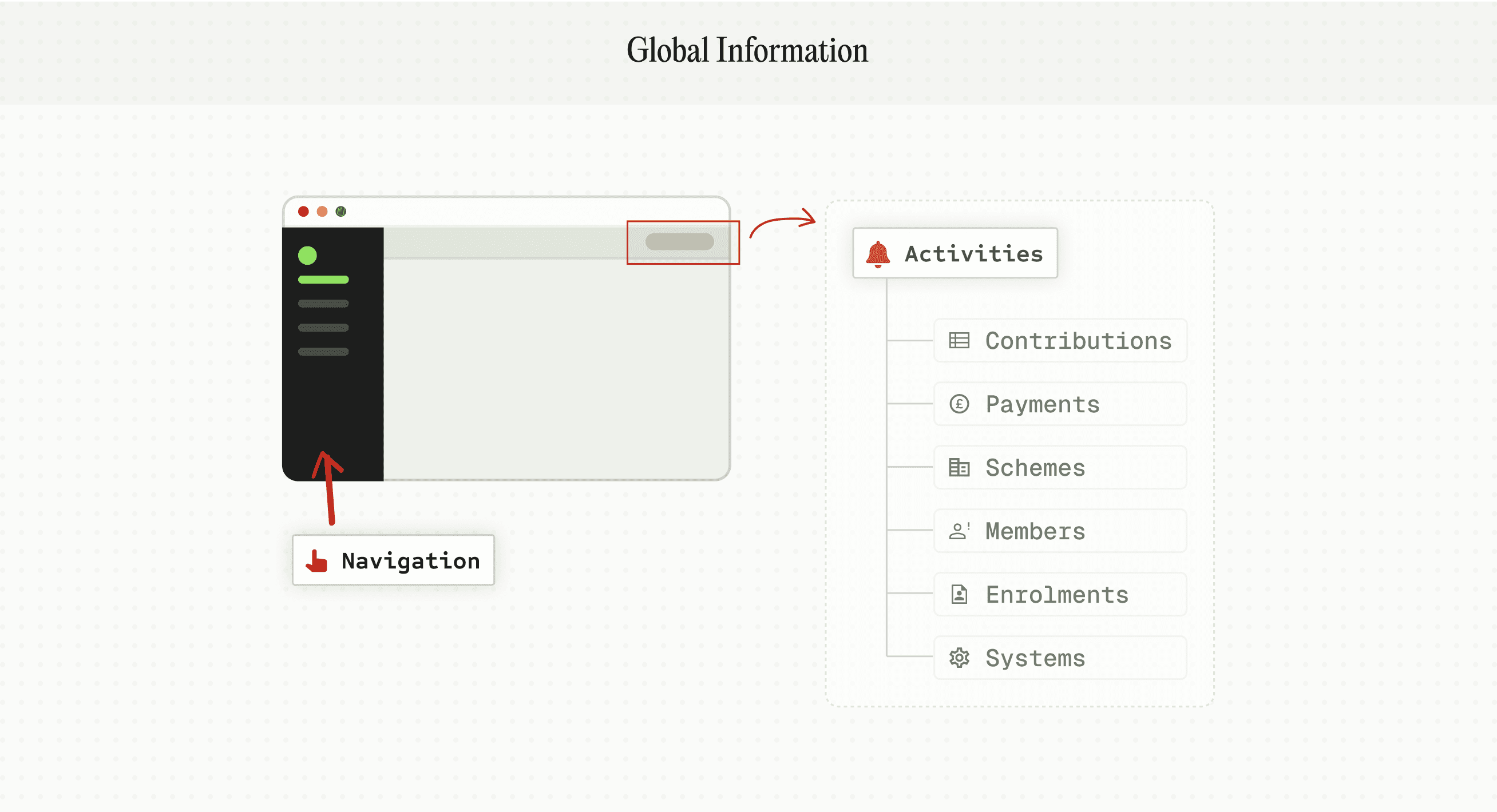
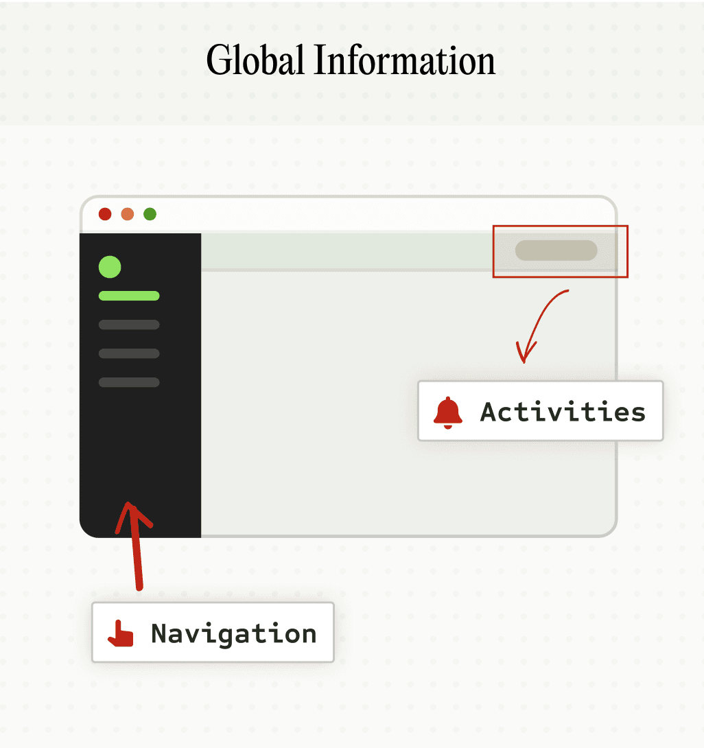
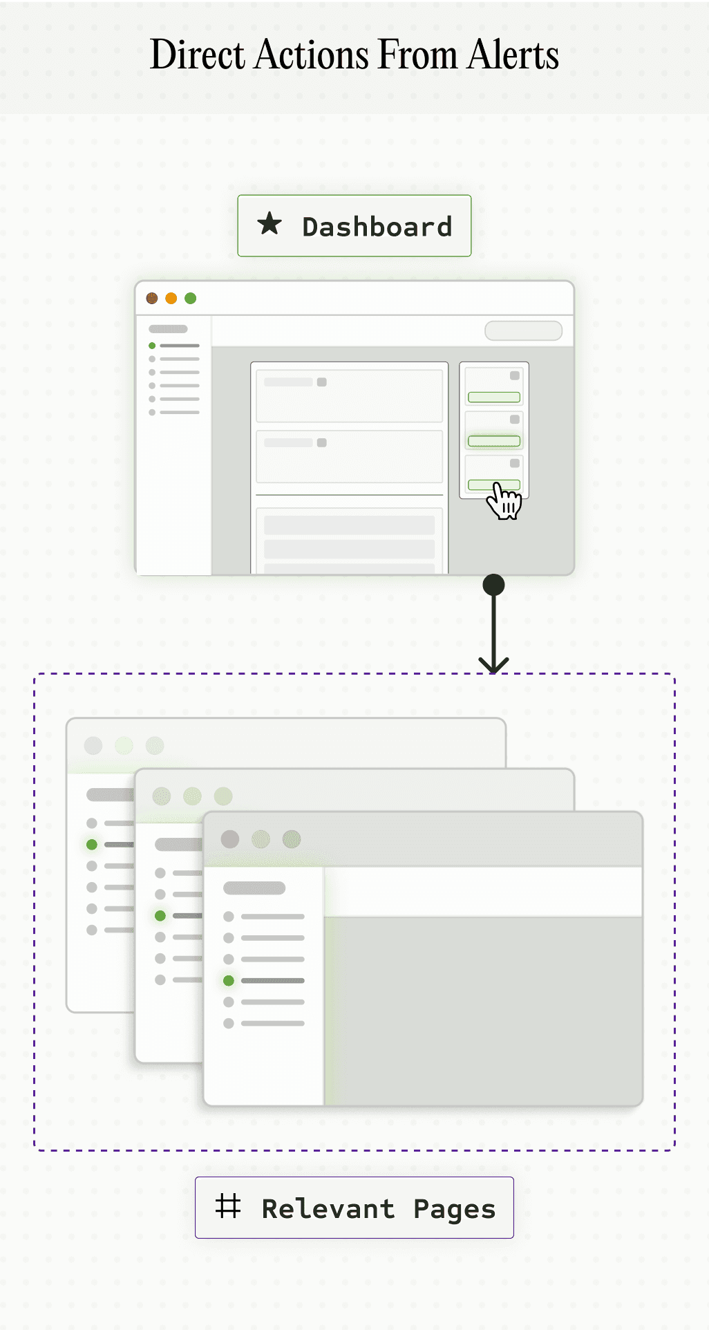
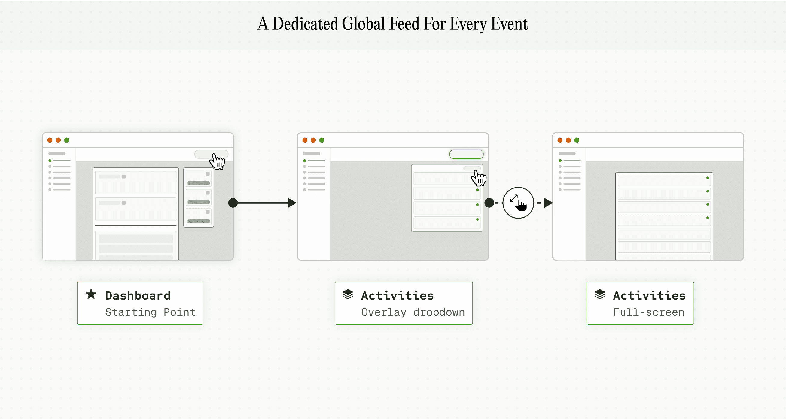
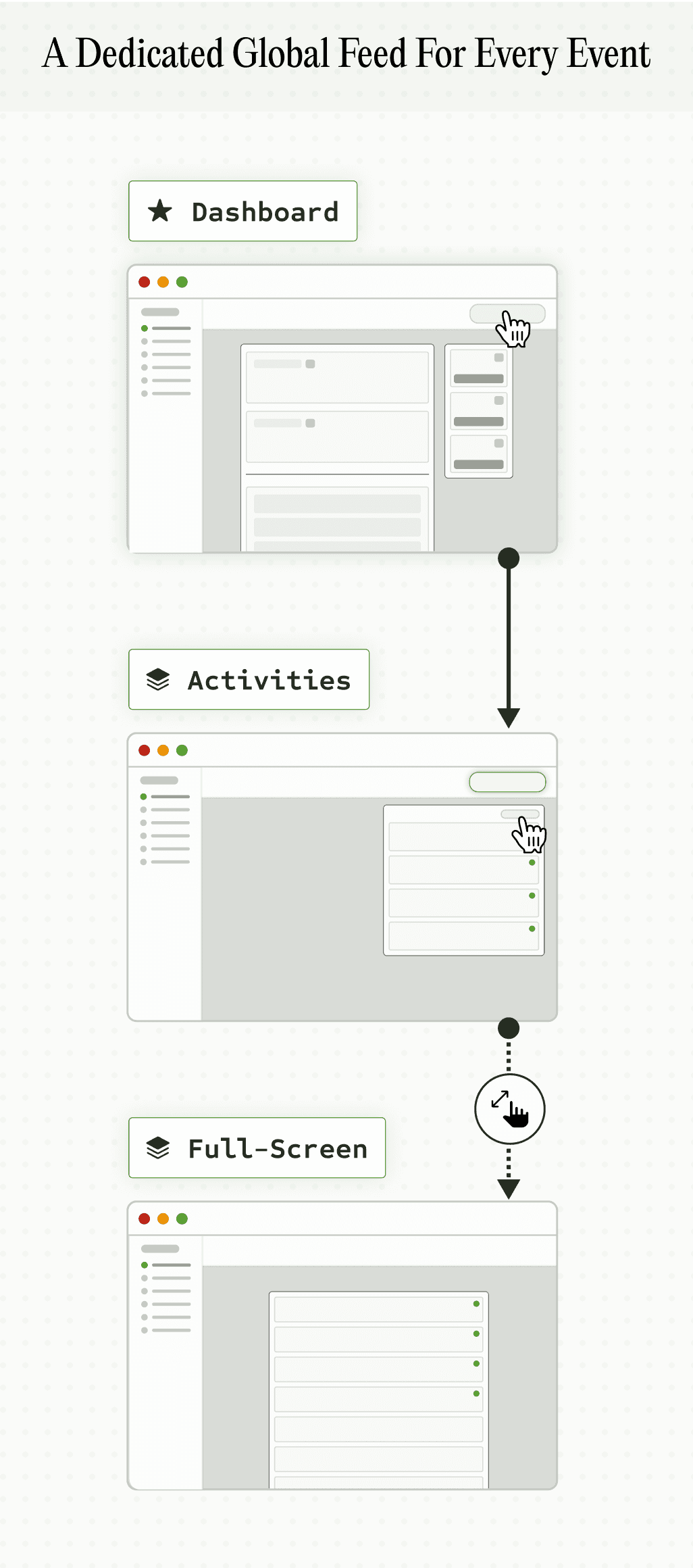
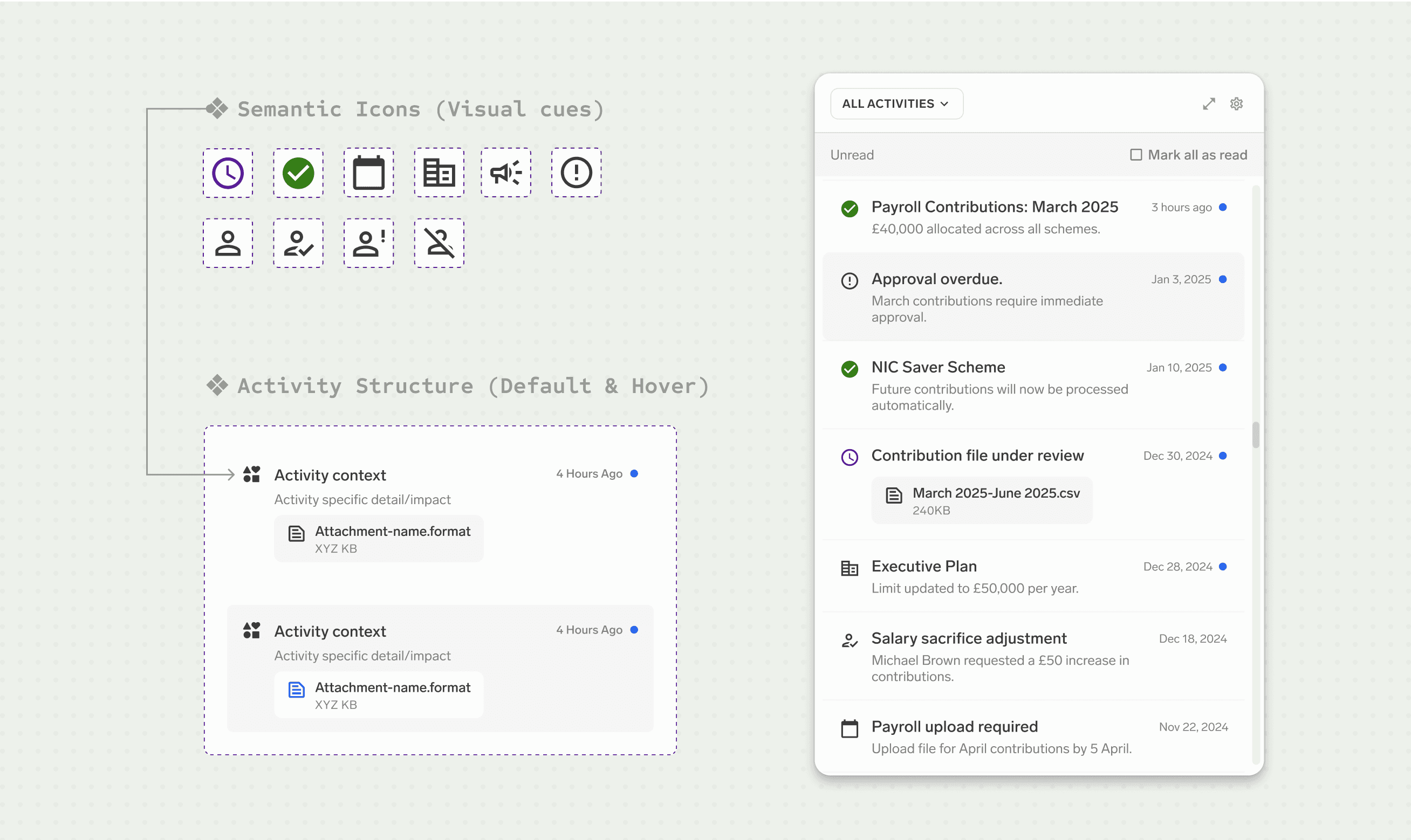
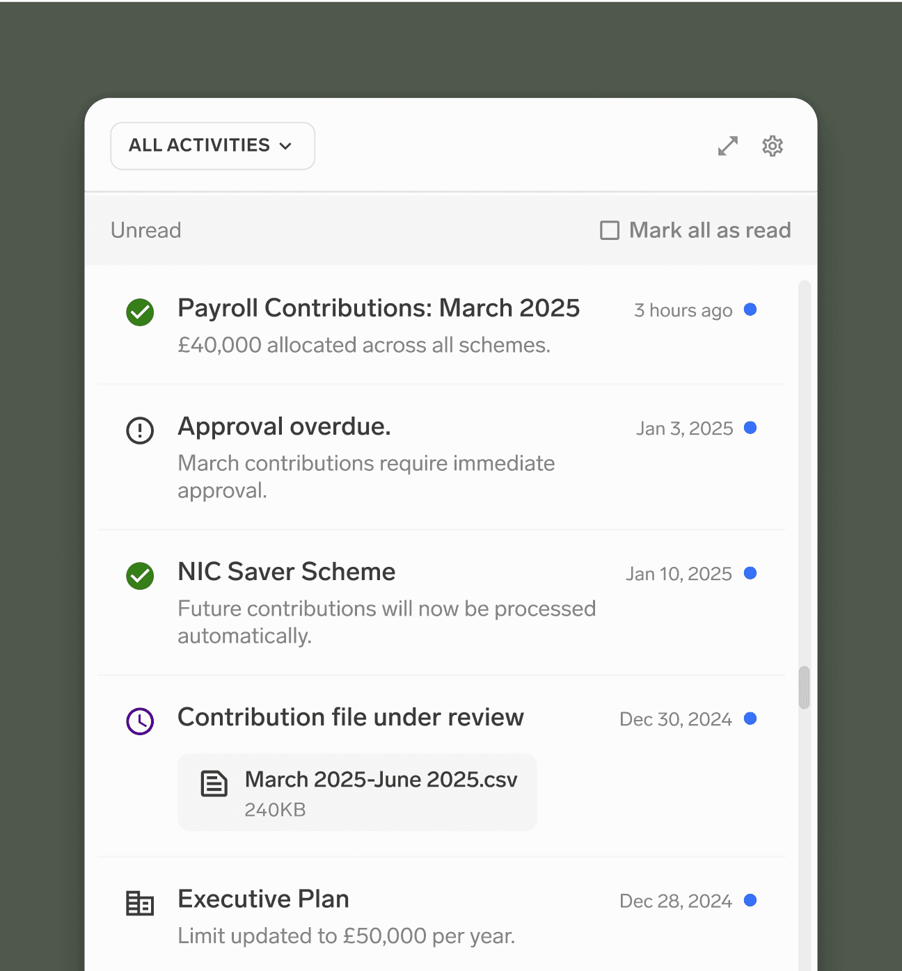
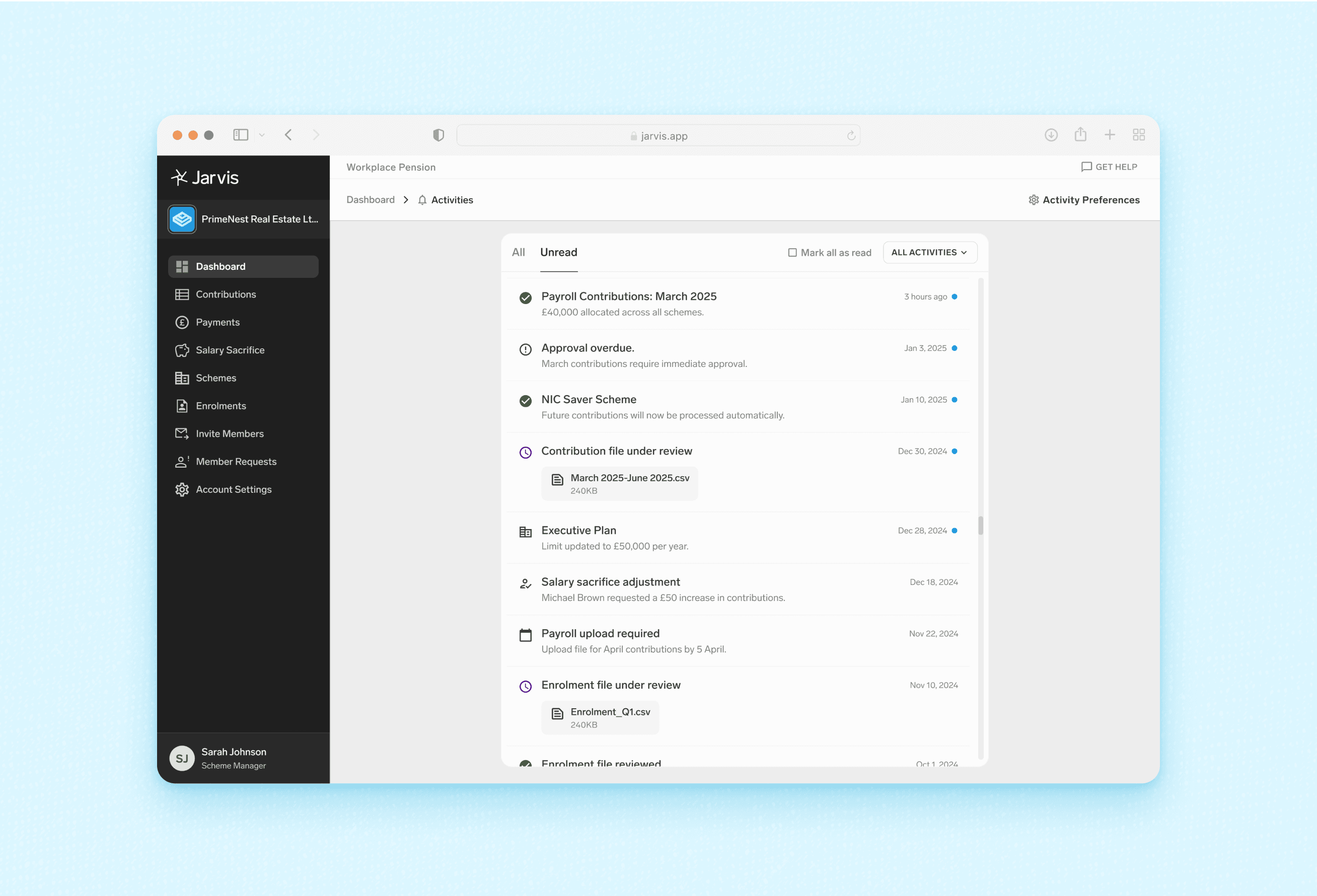
✦ “Activities” Paradigm
Centralize all event history in one place
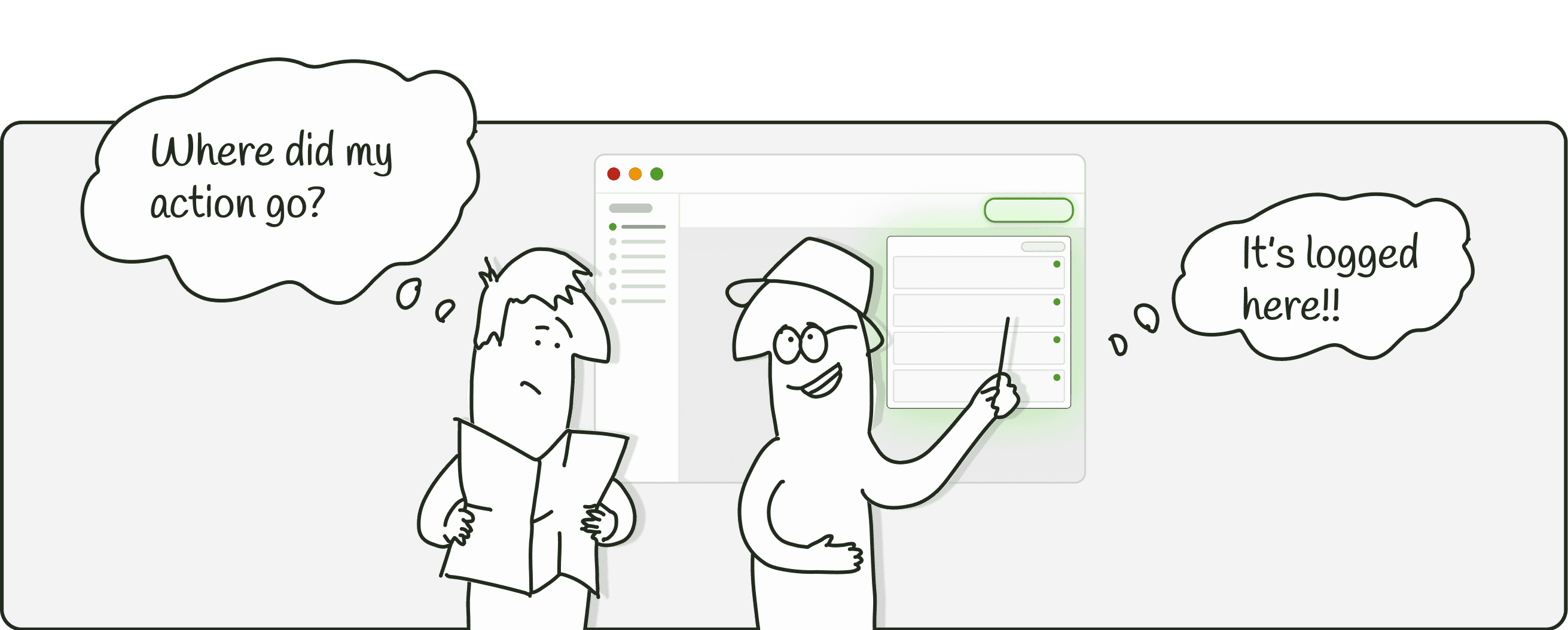
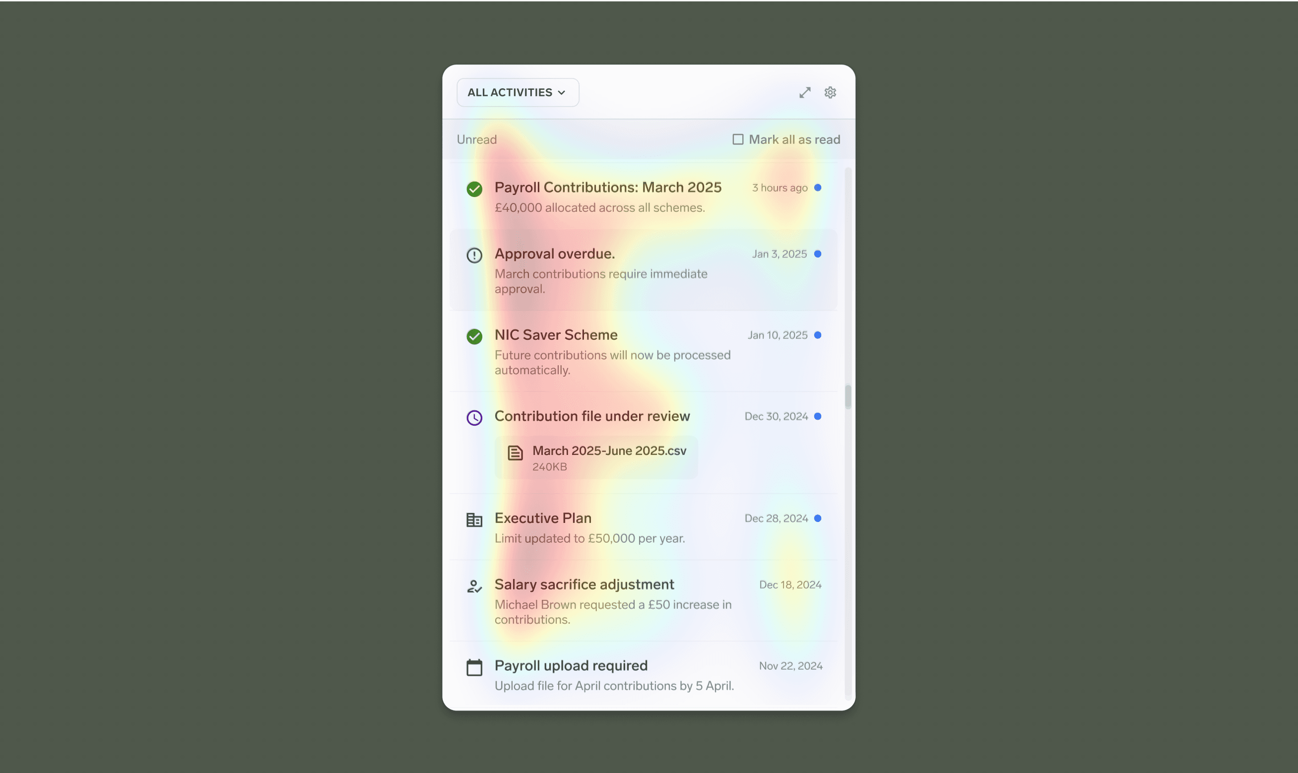
Users no longer need to hunt for confirmations in obscure submenus—Activities offers an accessible feed of everything.
Once an action is done, it instantly appears in Activities, assuring the user that the system registered the change.
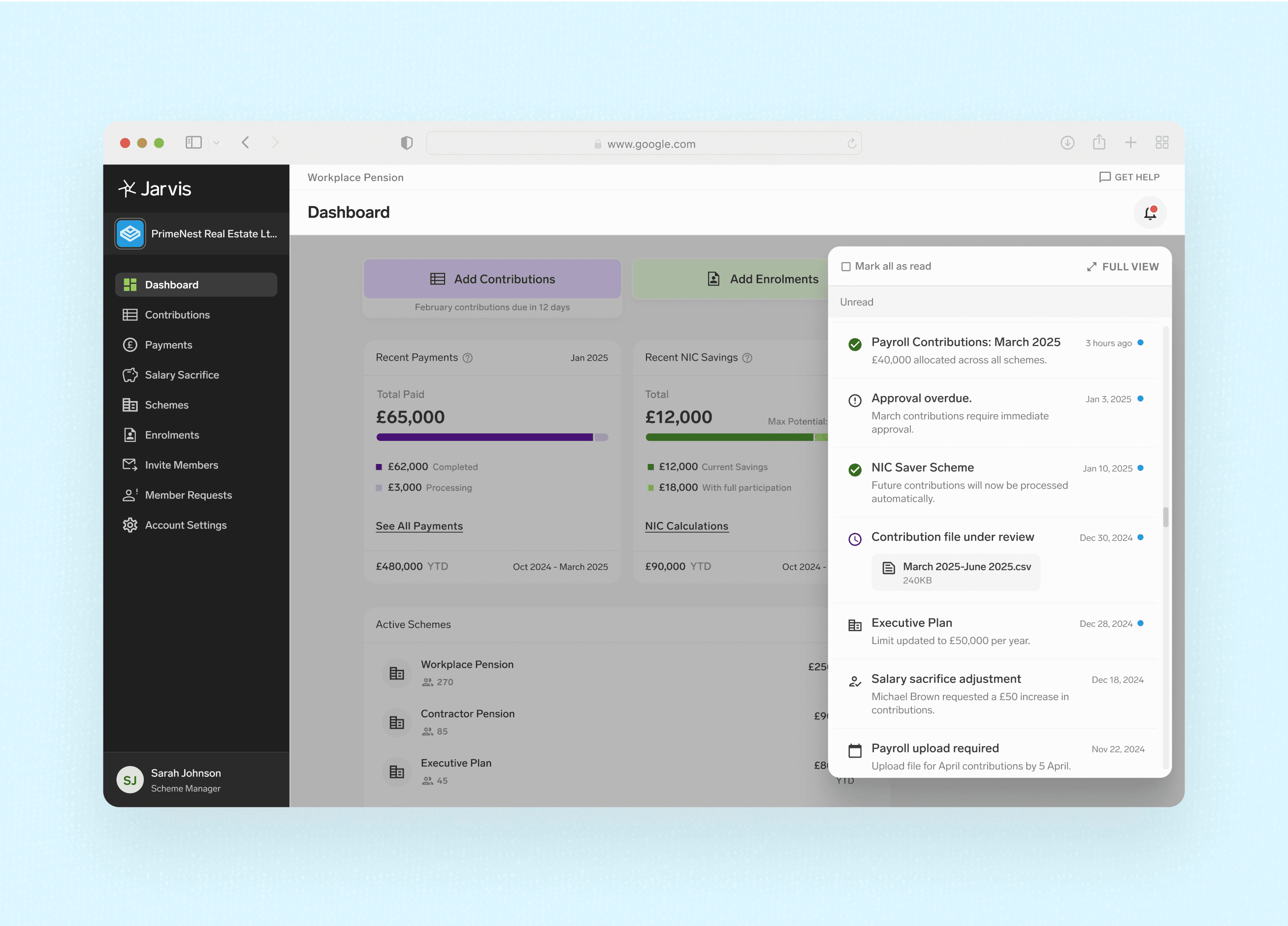
✦ Activities
Taxonomy for Clarity & Control
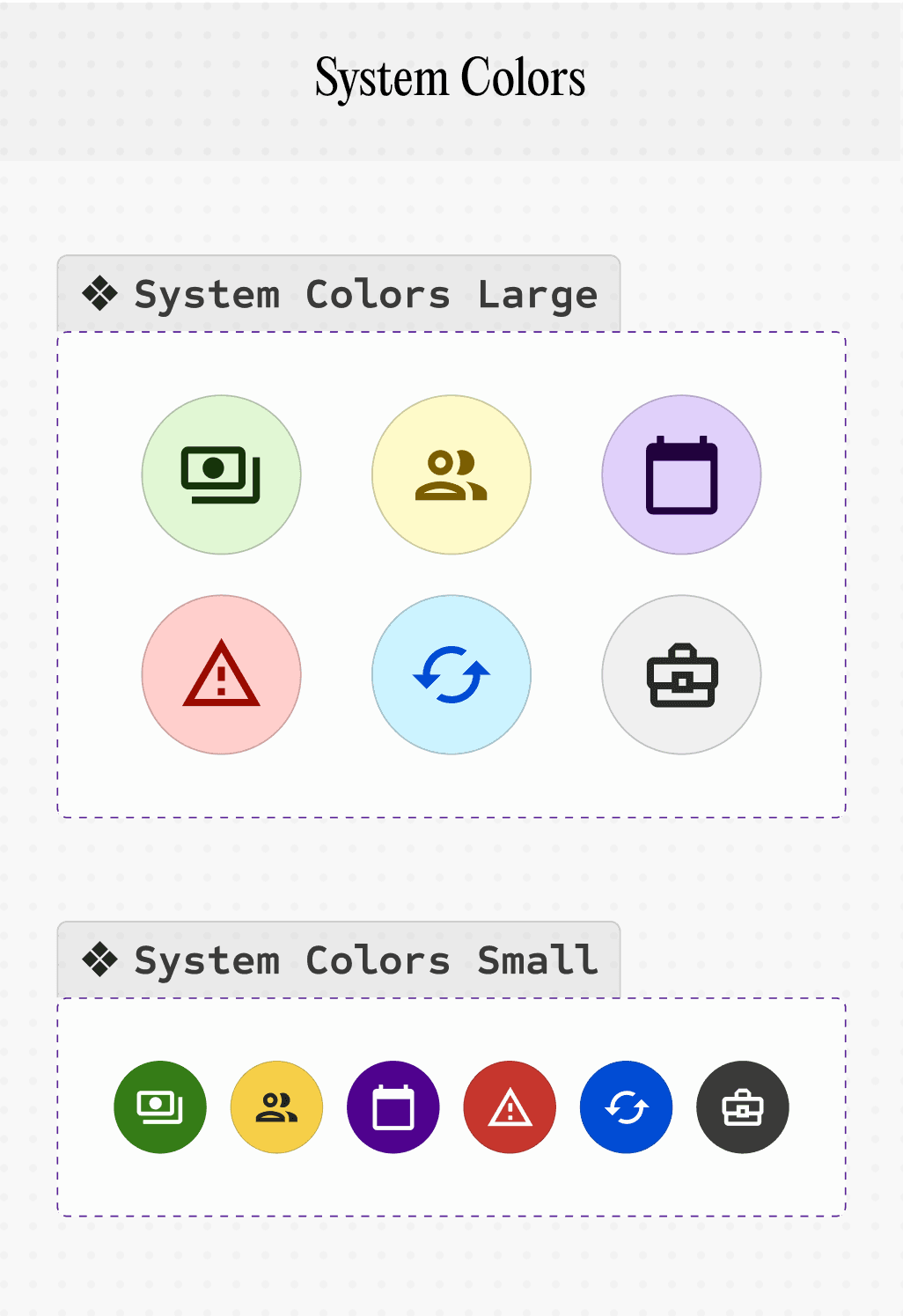
I inventoried (Audit & Categorization) all possible actions, grouping them into six intuitive categories:
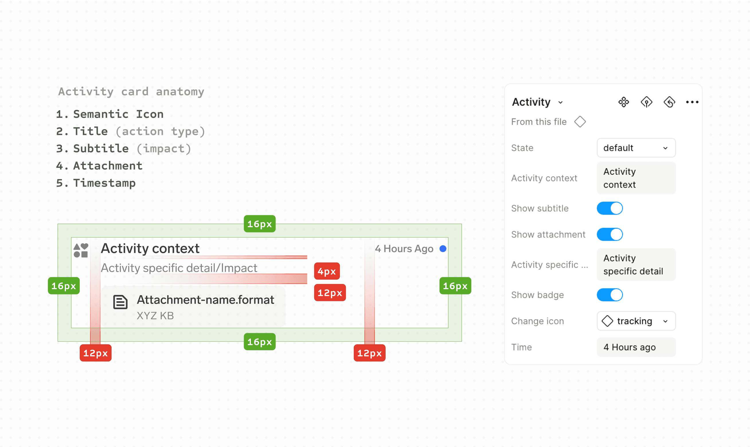
Thoughtfully curated semantic icons and consistent labeling make scanning quick and intuitive.
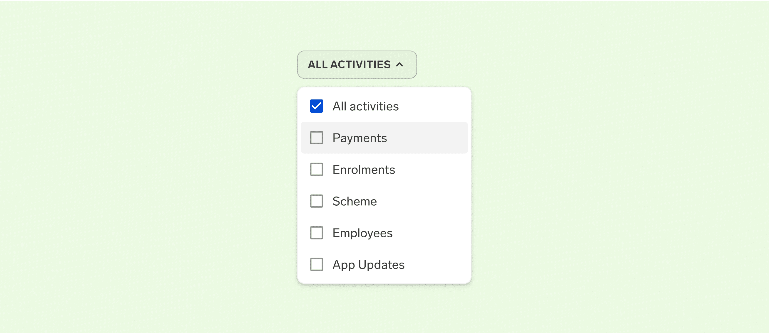
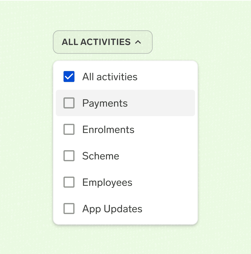
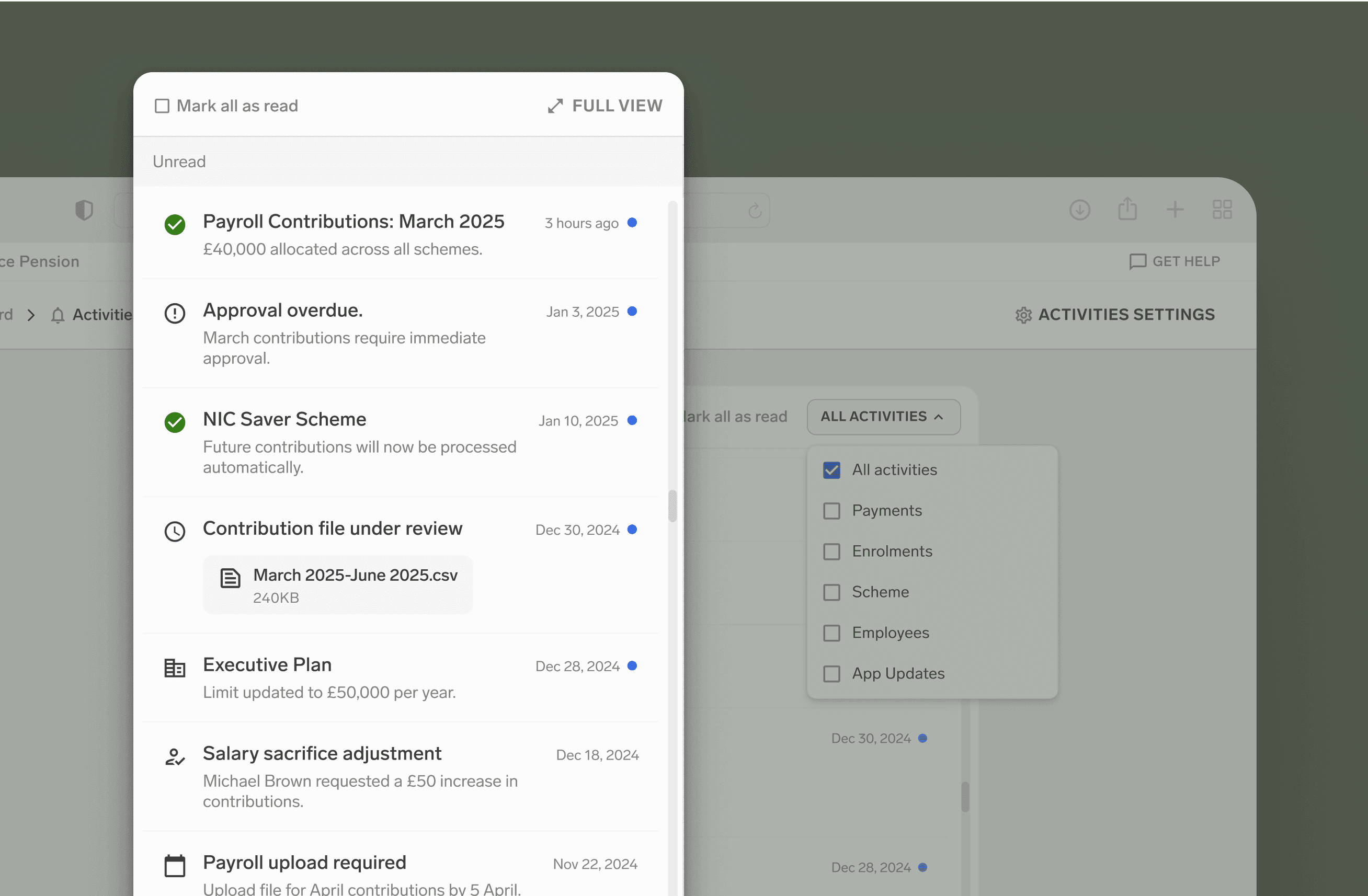
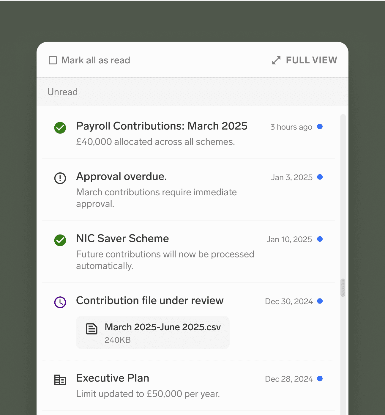
A structured feed with intuitive & user-centered filters keeps updates clear.
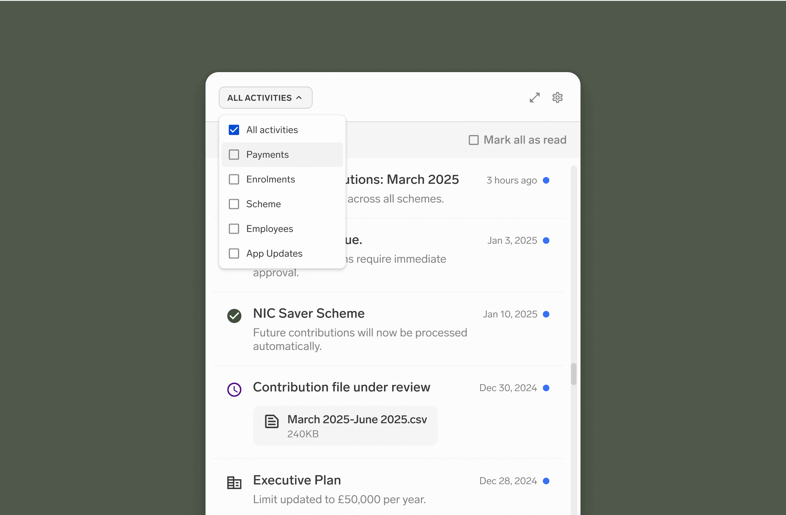
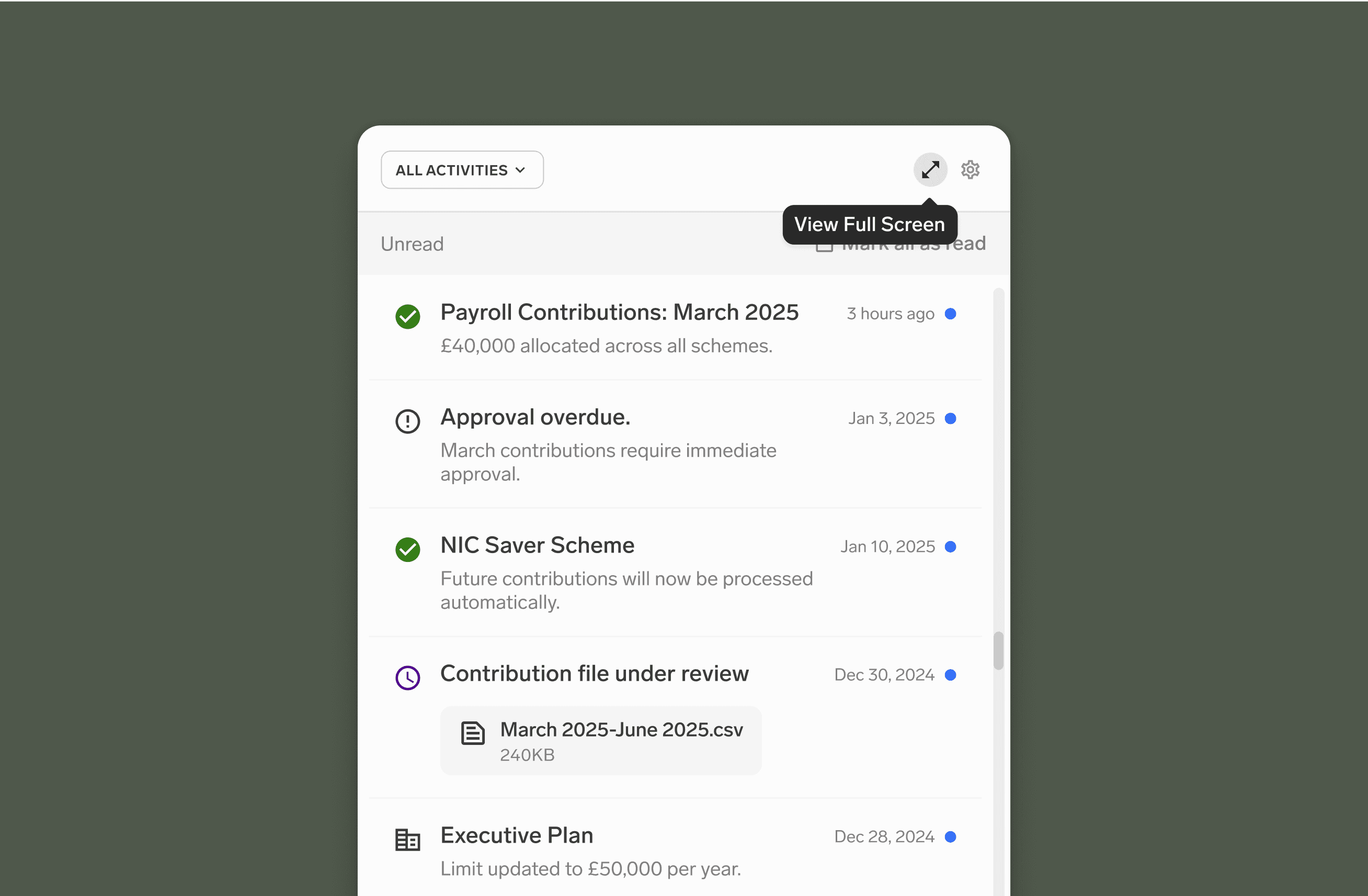
✦ Activities Design Critique
Iterative Refinement
Initially, filters and preferences were only accessible in full-screen Activities, forcing extra steps.
For quick controls, icon + text created unnecessary cognitive friction; we missed the opportunity to use simpler inline hints for faster recognition.
Before
Key Adjustments
Let users filter immediately—no need to expand to main-page & come back. Saves at least two clicks for quick tasks or searches.
Activity preferences are accessible from the popup, enabling users to disable alerts or refine categories without needing to go to the Activity main page.
Before
After
✦ Closing
Next Steps
Future-proof UI for UK auto-enrolment changes without technical debt
Partner with data engineering to implement KPI tracking and measurement frameworks